DISTRIBUTION OF TIZEN-BASED WATCH APPS HAS BEEN DISCONTINUED
Design Principles
Overview
Watch design principles are based on how users wear watches. Understanding the basic approaches to design for the watch’s compact circular display will help you deliver a better user experience for your app.
Scannable
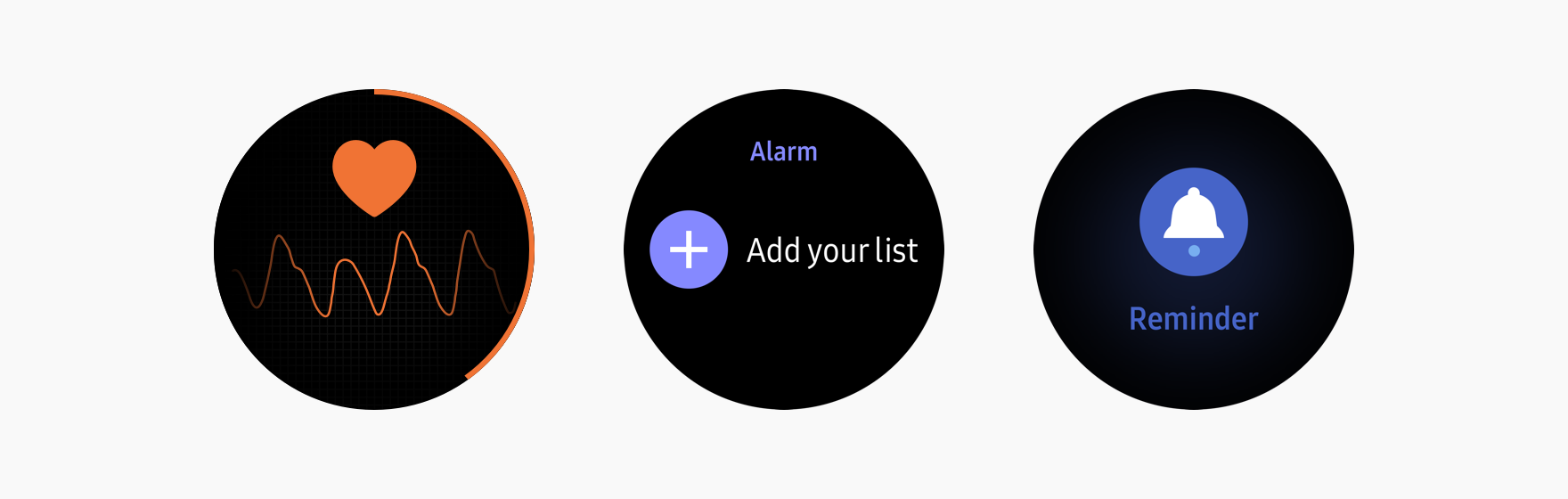
The watch is worn on the wrist and its interactions with users take place in a split second. So, apps using the watch’s small circular display should show information at a glance. Design your apps to be easily scannable and incorporate the principles of scannability to ensure smooth user interactions.
Focus on a central theme
Your app will have a greater impact when you focus on a simple, core idea. Place the main content in the center of the screen in a font large enough to draw the user’s attention. Excessive detail or features detract from the central theme, so keep it simple and streamline the flow between screens. Increase your app’s scannability by allowing tasks to be completed in only a few steps.
Design your screens to be readable
Graphic elements enhance the visibility of your main idea. They can also be more effective than several lines of text when conveying meaning. When you need to use text, select a font size that’s easy to read. You can also pick colors that contrast with the background to emphasize key information, or use dark-colored themes to make your content easy to read when outdoors. Refer to Visual Design for more details.
Easy to follow
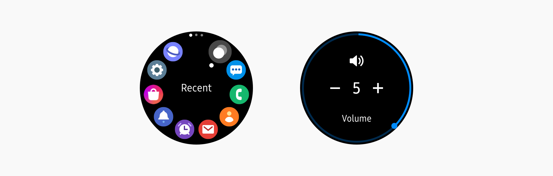
Users should be able to control the watch quickly and conveniently. Avoid making your design complicated for users to complete their task. Consistent, meaningful, and intuitive designs help users navigate pages and orient themselves within your app.
Suggest interactions intuitively
Intuitive and meaningful connections between interactions and components on the screen can help users better understand the information and its context. For example, bezel controls should suggest how users use the bezel to navigate and interact with your app.
Keep a consistent theme
Deliver a consistent user experience throughout your app by maintaining visual continuity. Your screens should have a consistent layout, brand color, and font. Give your app one common theme that represents the content it provides.
Responsive
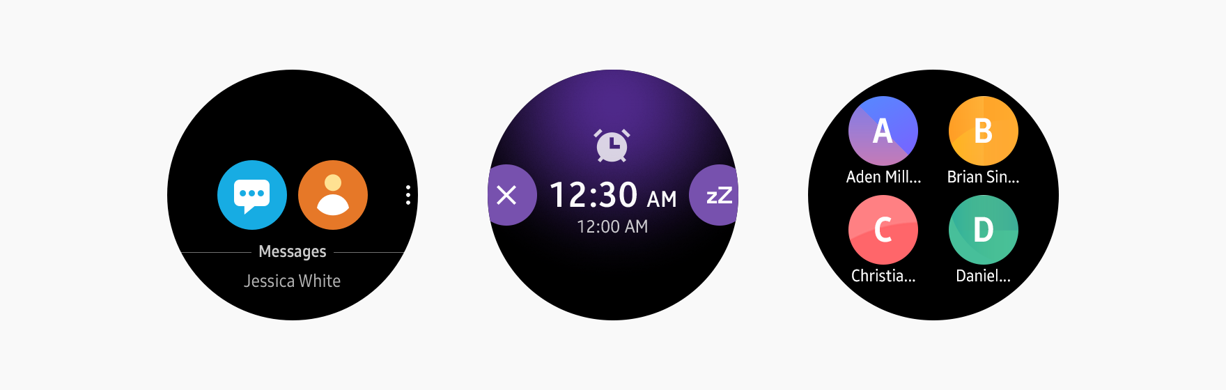
The watch should respond immediately to user input. Responsive designs give users confidence in the watch and a greater sense of control.
Provide natural and responsive feedback
Your app should provide immediate feedback as a natural response to user input by using visual, audible, and haptic feedback. Avoid nonessential screens that require additional user interactions to complete tasks.
Make your components easy to use
Adequately sized on-screen UI elements make interacting with your app easier. The watch can be difficult to use if its buttons are too small or components take up too much screen space.
Desirable
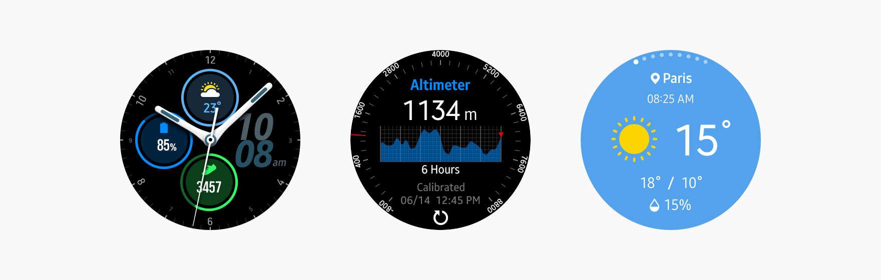
It’s not enough to simply make an app that works. Users will only download your app if the aesthetic aspects of your design are desirable, and if the user benefits are clear.
Concentrate on benefits, not features
Users will decide whether or not to download your app by asking themselves how it will improve or benefit their lifestyle. Keep this in mind when you are designing your app. Brainstorm a range of user scenarios and be clear on how your app will be beneficial in each situation.
Design stylish screens
The watch is a fashion accessory as well as a smartwatch. Stylish designs that incorporate typographic and graphical elements for decorative purposes will make your app more attractive.
Manage Your Cookies
We use cookies to improve your experience on our website and to show you relevant
advertising. Manage you settings for our cookies below.
Essential Cookies
These cookies are essential as they enable you to move around the website. This
category cannot be disabled.
Company
Domain
Samsung Electronics
developer.samsung.com, .samsung.com
Analytical/Performance Cookies
These cookies collect information about how you use our website. for example which
pages you visit most often. All information these cookies collect is used to improve
how the website works.
Company
Domain
Samsung Electronics
.samsung.com
Functionality Cookies
These cookies allow our website to remember choices you make (such as your user name, language or the region your are in) and
tailor the website to provide enhanced features and content for you.
Company
Domain
Samsung Electronics
developer.samsung.com, google.account.samsung.com
Preferences Submitted
You have successfully updated your cookie preferences.