Responsive Design: The Dark Mode
Lola Odelola
Web Developer Advocate
Photo by Alexander Andrews on Unsplash
As promised in my last post about dark mode, I bring you a dark mode tutorial 🌚. If you just want to see the code, a refactored version lives on Glitch. Let’s get straight into it.
Prerequisites
This tutorial is beginner friendly but not if you’ve done absolutely no HTML, CSS, JavaScript. You’ll also need a small HTML and CSS site that you’d like to add dark mode to. I’ll be using my own personal site.
System Preferences
Many operating systems now have dark and light mode settings which we should respect. A safe assumption to make is that if someone has their operating settings set to “dark” then they probably also want to view your site in dark mode too.
We can do this with the CSS media query [prefers-color-scheme](https://developer.mozilla.org/en-US/docs/Web/CSS/@media/prefers-color-scheme), this media query allows us to recognise the operating system’s colour scheme and define some CSS rules within it. So, just to make sure things are working let’s set the background to black if the operating system is set to dark:
@media (prefers-color-scheme: dark) {
  body {
    background-color: black;
  }
}
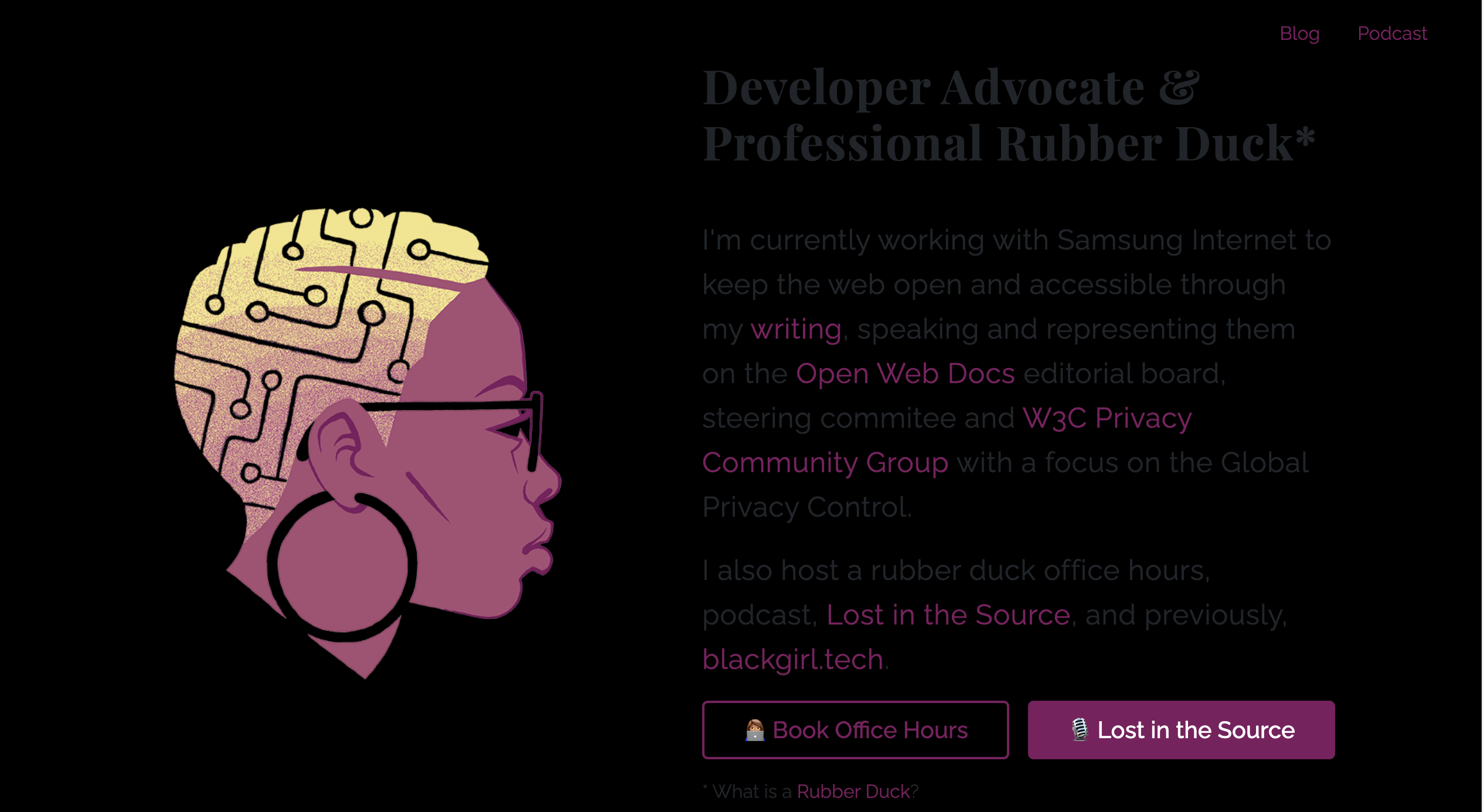
This is my result. The media query can read what the operating system has as its colour scheme and applies the appropriate rules. You can test this by toggling the colour scheme settings on your computer.
Toggle colours
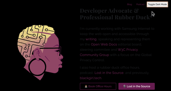
Okay, but what if the visitor wants to view your site in a different colour scheme than what the operating system is? We should give them that choice and we can do so by adding a toggle button and using JavaScript to switch between light and dark colour schemes.
HTML
First, let’s add a meta tag the head of our HTML:
<meta name="color-scheme" content="dark light">
This will act as a fallback for the browser should it not have prefers-colour-scheme since it can act as an indicator for browser to know that the content supports colour schemes.
Then we want to add the button to our body.
<button id="colourModeBtn">Toggle Dark Mode</button>
Finally on the body, we want to add a specific class (which will be important later on):
<body class="`systemDarkPreference">
   `<button id="colourModeBtn">Toggle Dark Mode</button>
`</body>`
CSS
Next, we want to set some CSS rules for a light theme within our prefers-color-scheme: dark block. We’re doing this so that if someone has set their operating system to “dark” everything that happens is within a dark OS context since we can’t override that setting. Now, we need to switch gears in how we’ve been thinking about our colour scheming. Sure, it’s light vs dark but it’s also system settings vs overridden, and this is important. It‘s helpful to think of @ media (prefers-color-scheme: dark) as the system dark context within which we also want some rules for that media query and also when we want to override the system setting. It may be complicated but hopefully the code sheds some light:
@media (prefers-color-scheme: dark) {
  body.systemDarkPreference {
    background-color: black;
  }
}
So within our dark context, we’ve added a systemDarkPreference to the body class as a way to apply our dark theme within the system dark context. We don’t need a class for our light theme because we’re going to be toggling the systemDarkPreference. So if the body is in our dark context but doesn’t have the systemDarkPreference class, then it will fall back to what rule it finds for the body element.
So, what happens if a visitor switches off the dark theme? Or their operating system colour scheme is set to light and they want to switch to dark? Or what if the visitor’s operating system doesn’t allow users to change their colour themes? To ensure these visitors are properly served, we’ll want to add some rules outside of the media query.
/* Default */

  body{
    background-color: white;
  }

/* Dark */

body.dark {
    background-color: black;
  }
We want to define the body element’s ruleset without any classes as the default behaviour for anyone who visits the site. Then a .dark class for those who want to toggle to a dark theme. There is a bit of repetition here since all the dark rules will have to be defined both inside and outside of the prefers-color-scheme media query but the default theme only needs to be defined once.
JavaScript
Remember to ensure your JavaScript is within <script></script> tag in your HTML or, if you prefer, is in a JavaScript file which is being called from your HTML like so: <script src="your_file.js"></script>.
Without the JavaScript the visitor won’t be able to interact with the page. So next, we’ll add an event listener to the button we created earlier. Let’s get the button element:
const ***toggleColourModeBtn ***= ***document***.getElementById("colourModeBtn");
Then we can add the event listener to the button:
***toggleColourModeBtn***.addEventListener("click", function () {});
At the moment this won’t have any functionality since we’re not asking it to do anything in the listener. Within the listener, first we want to make a few checks :
***toggleColourModeBtn***.addEventListener("click", function () {
  const hasSysDarkClass = ***document***.body.classList.contains('systemDarkPreference');

  const currentSysIsDark = ***window***.matchMedia("(prefers-color-scheme: dark)").matches;

  const isDark = (hasSysDarkClass && currentSysIsDark) || ***document***.body.classList.contains('dark');
});
Let’s see what each variable is checking:
-
hasSysDarkClasschecks that the body has thesystemDarkPreferenceclass on it. -
currentSysIsDarkchecks if the operating system is set to dark using theprefers-color-schemesimilar to what we’re doing in our CSS. -
isDarkchecks that the first two variables (hasSysDarkClassandcurrentSysIsDark) are both true at the same time *or *that the body has the.darkclass.
This could have been one variable but it’s far easier to read split up like this. Before we apply the correct styles to our body, we need to remove the hard coded systemDarkPreference since as soon as someone presses our button, they are indicating they want to override the system settings.
***toggleColourModeBtn***.addEventListener("click", function () {
  const hasSysDarkClass = ***document***.body.classList.contains('systemDarkPreference');

const currentSysIsDark = ***window***.matchMedia("(prefers-color-scheme: dark)").matches;

  const isDark = (hasSysDarkClass && currentSysIsDark) || ***document***.body.classList.contains('dark');

***  document***.body.classList.remove('systemDarkPreference');
});
Then we want to finally apply the correct CSS rules by toggling the body’s class list to include the .dark class if isDark is false.
***toggleColourModeBtn***.addEventListener("click", function () {
  const hasSysDarkClass = ***document***.body.classList.contains('systemDarkPreference');

const currentSysIsDark = ***window***.matchMedia("(prefers-color-scheme: dark)").matches;

  const isDark = (hasSysDarkClass && currentSysIsDark) || ***document***.body.classList.contains('dark');

***  document***.body.classList.remove('systemDarkPreference');
  ***document***.body.classList.toggle('dark', !isDark);
});
The end result should look like this.
Storing Settings
So that our visitors don’t have to keep readjusting the settings, we should store their preferences. In my last post I spoke about different methods to do this including localStorage and Cookies. Since my personal site is small and doesn’t collect data to be stored on the server, I’ve decided to go with localStorage. When we make any colour scheme change, we want to save it to the browser’s localStorage which we can do in the event listener we just added.
***toggleColourModeBtn***.addEventListener("click", function () {
  ...

  let colourMode;
  if (***document***.body.classList.contains("dark")) {
    colourMode = "dark";
  } else {
    colourMode = "light";
  }

  ***localStorage***.setItem("colourMode", colourMode);
  ***localStorage***.setItem("overRideSysColour", "true")
});
For this first section there are a few moving parts. First we initiate colourMode so that we can dynamically set it later. Next we check if the .dark class is applied to the body element, if it is then we can set colourMode to dark and if it isn’t then we can set it to light. Then we can save this value in the localStorage. Finally, we also want to keep track of the fact that we’ve overridden the system’s settings in the localStorage.
The second section to this is to use what’s in the localStorage to set the page’s colour scheme when the visitor visits the page again. So somewhere outside of and above the event listener, we want to get the colourMode we saved previously and present the correct colour scheme depending on the value.
if (***localStorage***.getItem("overRideSysColour") == "true") {
  const ***currentColourMode ***= ***localStorage***.getItem("colourMode");

    ***document***.body.classList.remove('systemDarkPreference');
    ***document***.body.classList.add(***currentColourMode***);
}
So we’re checking that the system colour scheme has been overridden and if it is, then we remove that hard coded system class then add the value that’s in the localStorage. Something to note here is that this value can either be "light" or "dark" however, we don’t have any rules for the .light class so nothing will be applied to this and it will use the default rules as defined in our CSS. If you have rules for .light this will cause issues, so you may want to use a different name or an empty string when you’re setting the value in localStorage.
Choosing colours
Now, arguably the most important factor of dark themes. Choosing the correct colours. Many sites go for an off-black background and lighter white or off-white text. You want to be careful not to have contrast that’s too sharp but you also need to meet the minimum colour contrast of 4.5:1 for normal text for accessibility purposes. It’s important to make your user experience as comfortable to all visitors as possible. However, you don’t have to be confined to black and white, feel free to be creative. Coolors is a tool that allows you to view colour combinations and ensure they meet the Web Content Accessibility Guidelines.
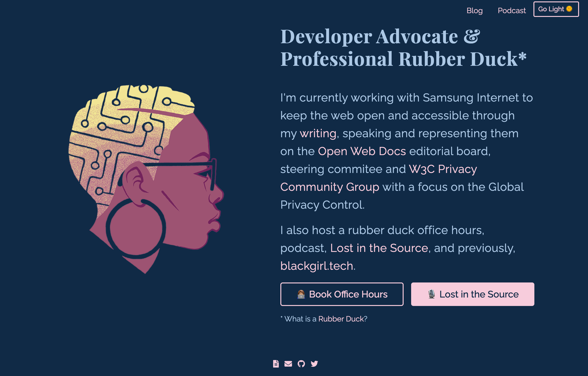
I went for a dark blue, light blue and pink combo.
Finished Page
Play with the finished thing.
Last Words
Samsung Internet is starting to support prefers-color-scheme as a Labs menu item, so web developers can start working with it, and exploring how it helps them to build better UI. In the meantime, Samsung Internet will support force dark mode for the sake of users how expect dark web page when they set the device as dark. So if you want to experiment with prefers-color-scheme on Samsung Internet, make sure to turn it on via the Labs menu for now.
As I mentioned in my last post, there are many ways to implement dark mode and it’s up to you to analyse what the sacrifices for each method is. For example, if a visitor to my website has JavaScript turned off on their browser, then this solution won’t work. However, it’s overkill for me to store the theming data in a database (another method) because I don’t collect user data and don’t need to. The method I went with, while not perfect, is a nice middle ground. There are also other factors you may need to consider, such as the typography and icons which I didn’t have to think about. Check out the final glitch project to see how I refactored the code and managed the state of the button.
If this tutorial is useful to you, feel free to share it and show off your new dark mode sites! ✨