Current Web on Galaxy Fold
Diego Gonzalez
Web Developer Adovcate
Foldable devices are here! Last year Samsung introduced to the market the Samsung Galaxy Fold and other manufacturers have announced similar upcoming devices. While the future looks very exciting for devices and new browser capabilities (and I’ll deep dive into that area very soon), let’s take a look at the present and make sure that our websites look and behave as we expect them to.
The challenge
I’ve been using the Fold for several months now, and the main issues that jump to mind are seeing websites (and apps) that do not take into consideration the different form factor of the screens of the device itself. Don’t get me wrong,** they shouldn’t **(as in they should adapt automatically), but I want to take some minutes and go through some development tips around this device.
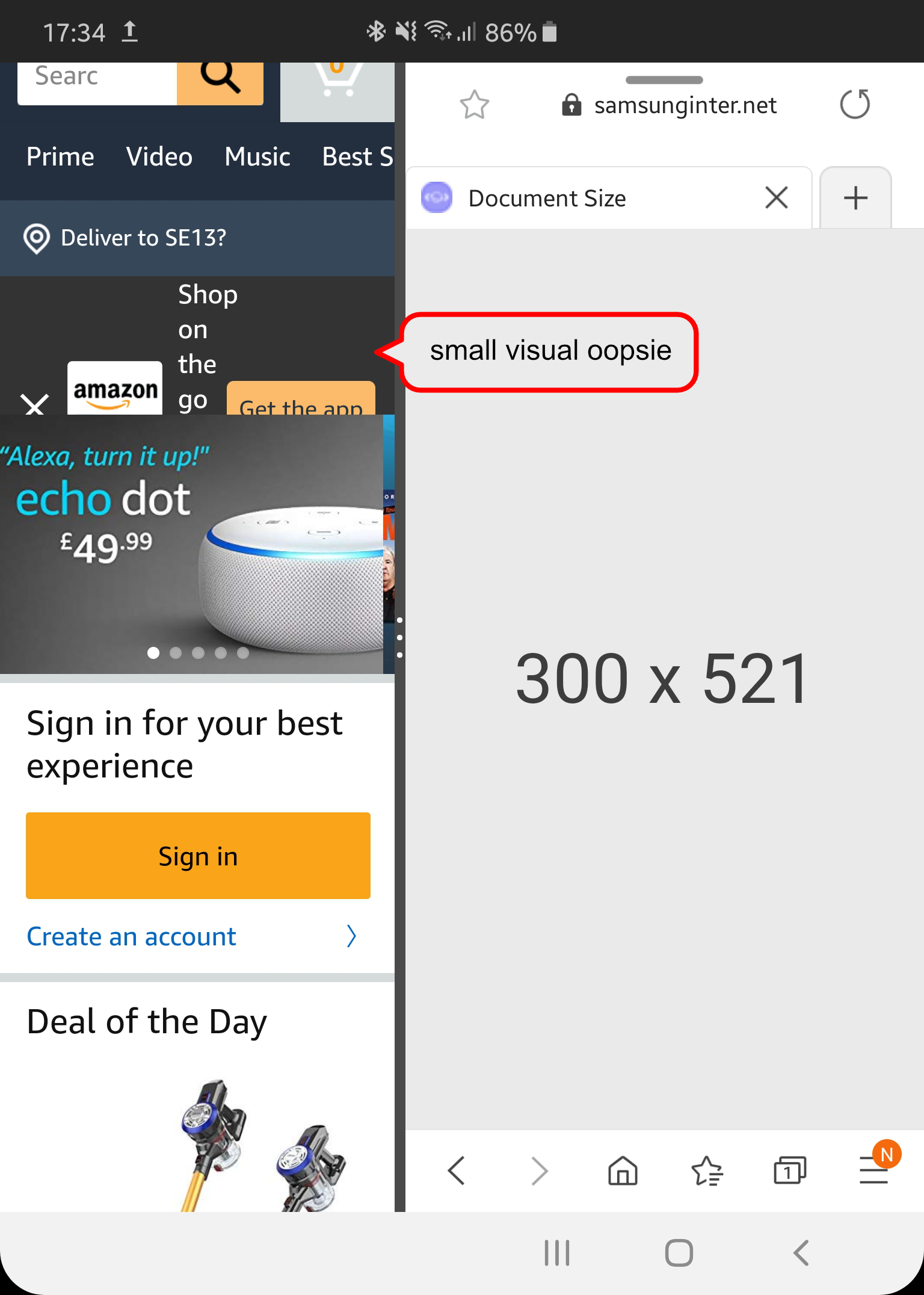
To illustrate the issues that a user might encounter, they can be as harmless as having content not displaying properly (see figure 1 for Amazon) or more serious as completely losing access to a feature (see Figure 2 for Google Maps). Do notice as well that in these screenshots there are only 2 apps open instead of the ‘extreme’ 3 apps scenario (more on this later).
 |
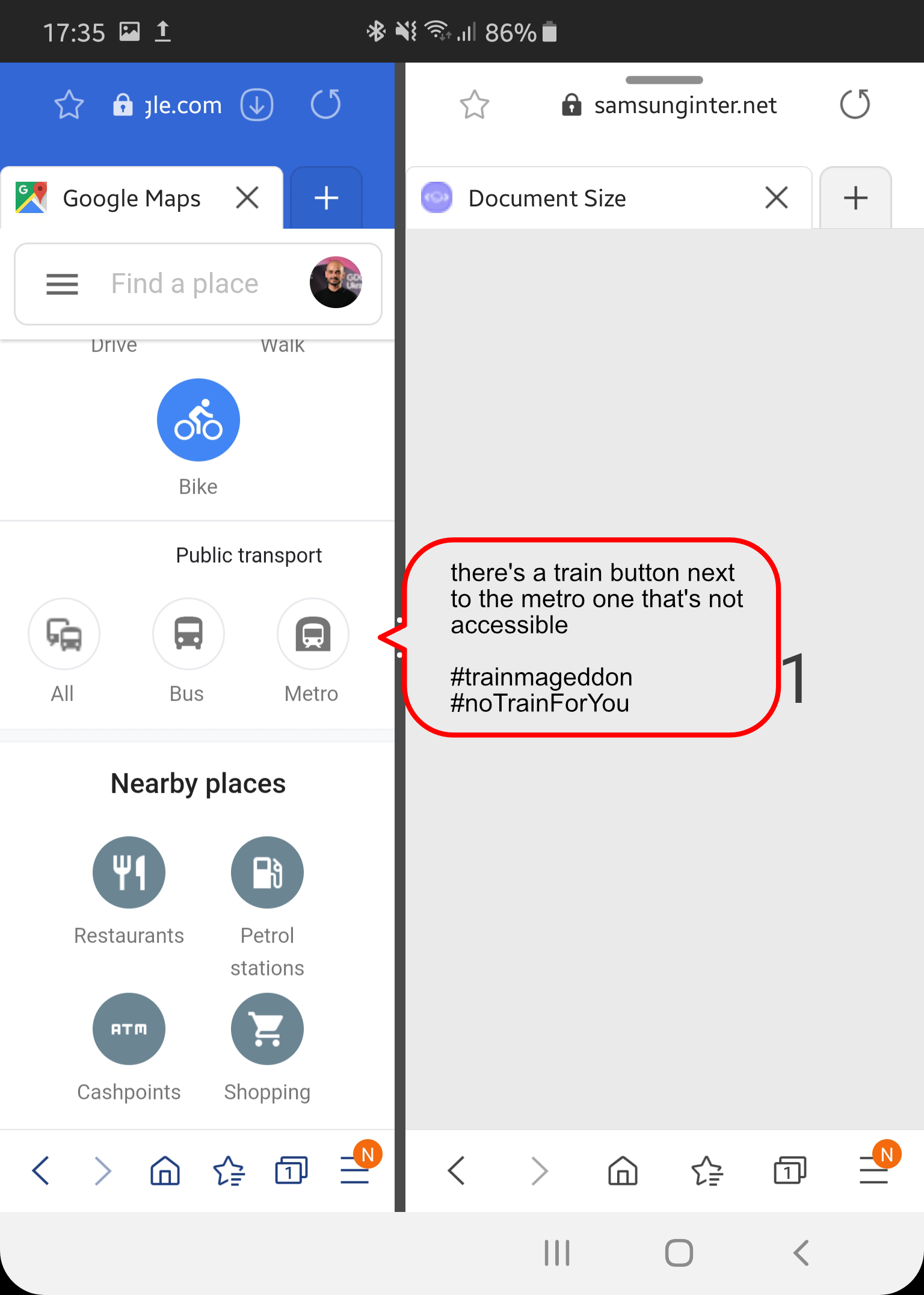 |
| * Fig 1: The banner is displaying incorrectly in here (although considering it’s a banner to download the app from the store I think it might be a feature instead of a bug). | Fig 2: Parts of the UI are not accessible on this width. A general solution is scrollable items or stacking the items differently like the “Nearby places” menu does. |
The simple solution
Now, let’s be very clear, the solution to all this, in a TL;DR way is responsive design, making proper use of the built-in layout system that CSS offers through CSS Grid and Flexbox (and here’s a great post my friend Jo about how to implement some common responsive layouts).
Common Responsive Layouts with CSS Grid (and some without!) - Samsung Internet Dev Hub - Resources
The tips
-
First and foremost, be sure to test accordingly. Samsung Internet holds ~6.5% of all mobile browsing in the world (as of 12/19), and there are at least 1 million devices out there that Fold. But its not only about this device, as almost 30% of mobile screen resolutions linger around the 300/400px width mark. Bottom line, be sure to test accordingly!
-
Make sure to provide ways to access all parts of sections that might get lost on narrow designs. There are several ways of doing this. The traditional use of hamburger icons to access menu items, and/or providing a way to scroll through the items horizontally. As an example, Amazon uses both approaches on their website.
-
As a rule of thumb, content on small/narrow screens is generally stacked in a single column. Some elements like menus or others can morph, be grouped or change their order in the design. The Verge does precisely this, it stacks all the content into one column. The twitter PWA is a good example as well of how the UI changes from being viewed in different resolutions. (see figure 3)
-
I don’t want to go by without providing useful tips, specially if they help you make your site work great. One extremely cool and useful way to identify where your content is overflowing is by checking your site with Firefox Dev tools, as Shi Ling Tai points out!
TIL The @FirefoxDevTools tells you which elements have scroll overflows!! I've spent countless hours debugging why I'm seeing two scrollbars in the past, this is a life saver!
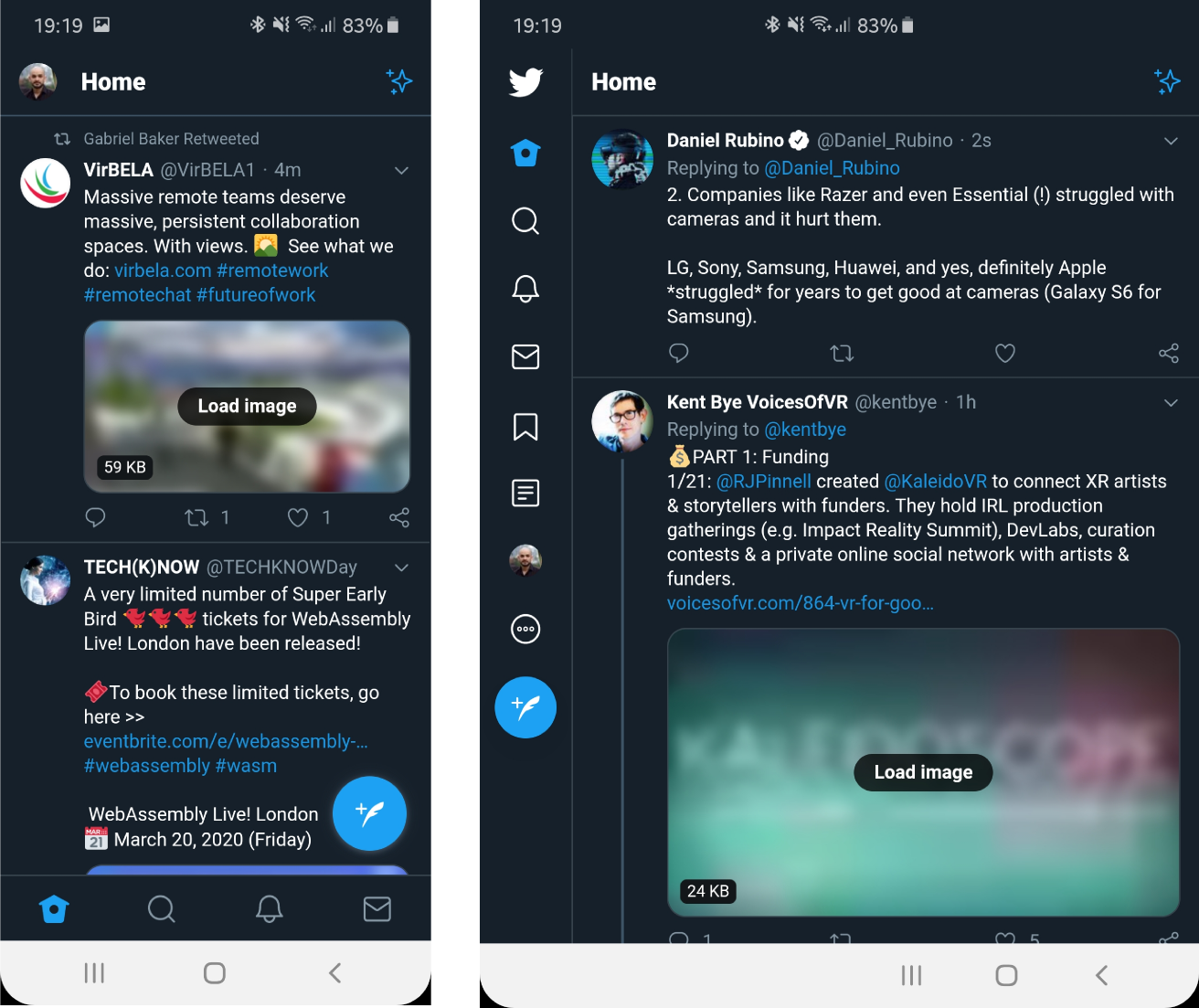 Fig 3: Twitter PWA on the front screen of the Galaxy Fold (left) and on the inside screen (right)
The hardware
The Samsung Galaxy Fold is an Android smartphone that opens to create a user experience that can be closer to a tablet. It has 2 displays: a 4.6" one on the outside and a 7.3" one on the inside. They won’t ever be on at the same time, and here’s a small graphic that shows where these screens are on the device.
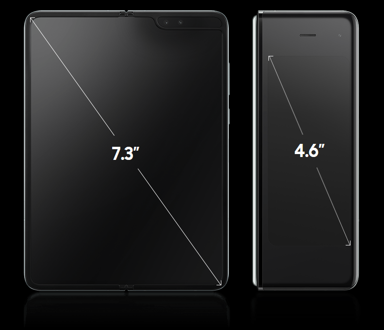 Fig 4: Two screens present in the Galaxy Fold
The aspect ratio for the internal 7.3 inch display is 4.2:3. The ratio on the external 4.6 inch display is 21:9.
The numbers
Out in the wild, while speaking with developers, the curiosity of testing their web properties on such device always arises. Sometimes minor quirks appear (like the ones in figures 1 & 2), prompting questions regarding the available space and aspect ratio. After all, it generally doesn’t look good that your website doesn’t display correctly in the latest shiny hardware!
So, to ensure proper testing, I want to make the following information available about the device’s (and browser’s) reported viewport sizes. I also want to inform about this data to make a point about the importance of responsive design, since you’ll quickly see that there are plenty of possible variations of space for an app (browser in our case) .
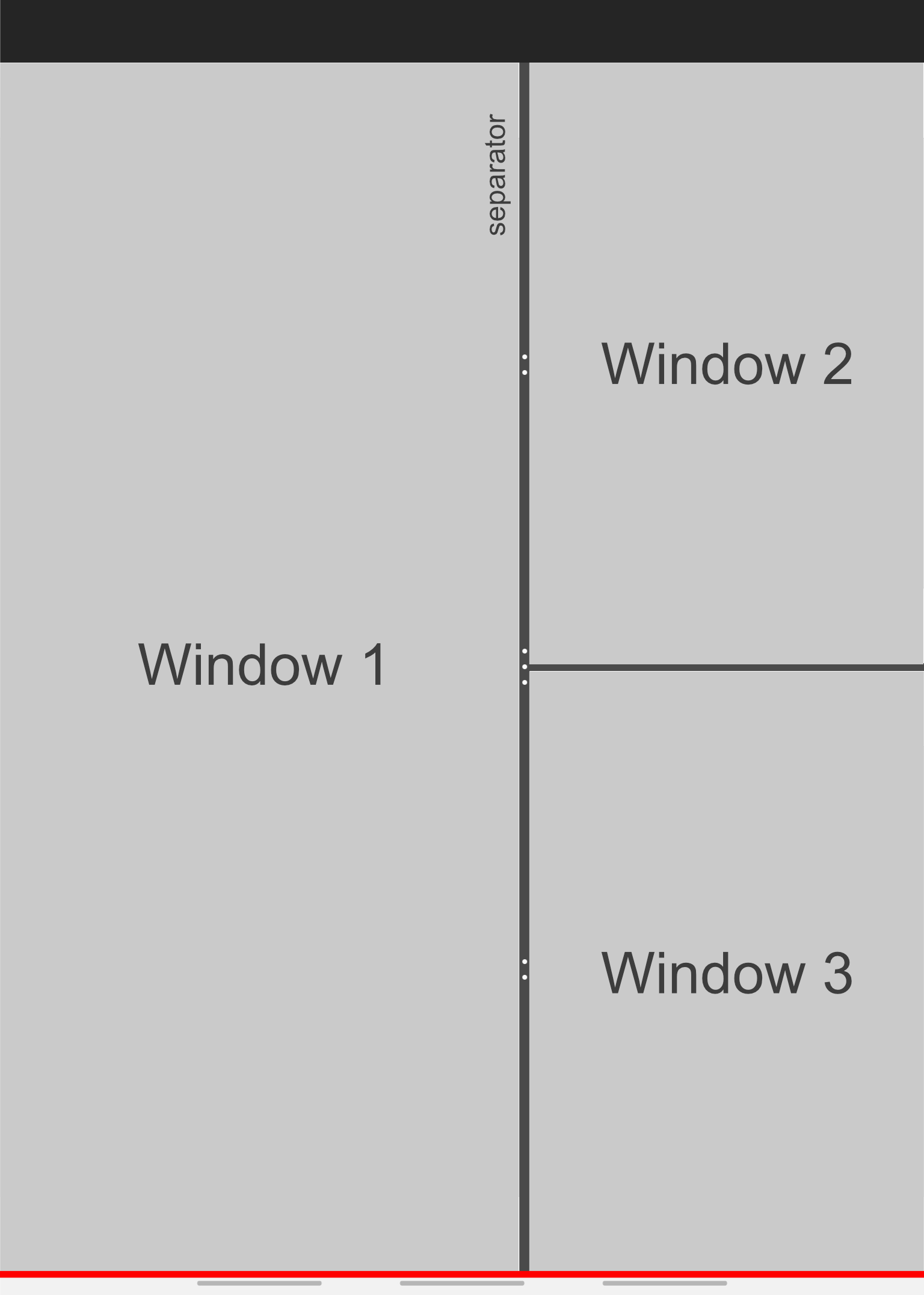
The Galaxy Fold can run up to 3 apps at the same time (See figure 5 below). Additionally, these factors also change the available viewport size:
-
the position of the middle app separator to one of three predefined positions (~60–40, 50–50,~40–60).
-
orientation (portrait/landscape).
-
presence of icons on the navigation bar, or swipe gesture indicators (see figure 5 below the red line) or no visuals at all.
-
the OS screen zoom setting (see figure 6).
-
Presence of tabs in the browser (recent new feature in Samsung Internet).
 |
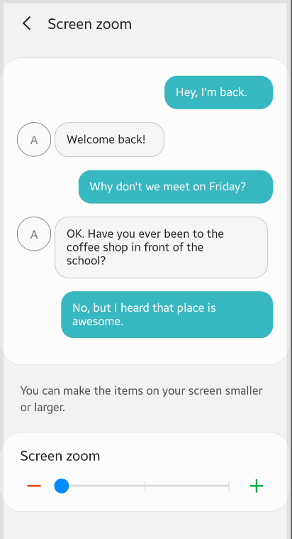 |
| Fig 5: Three app multitasking’s default ~60-40 layout on the Fold | Fig 6: OS Screen Zoom setting |
And until now I am only referring to the factors that might affect the layout of applications in the internal screen (for reference, the external screen does not switch to landscape and there is no possibility to split the screen in any way, due to space constraints).
As you can start to realize, the number of possible combinations grows exponentially, making responsive design the only way to properly tackle this. But I did promise numbers, which can be specially useful to test if your website is displaying properly on the Fold.
For simplicity’s sake, the following screenshots show the worst case viewport size scenario. They consist of having the screen zoom set to ‘Large’, tabs enabled in the browser, buttons on the Navigation bar and 3 apps running on the internal screen. This should portray the minimum available space for your content.
Much cramped?!
Front Screen
For the front screen, even in its worst case scenario, it has a healthy size that shouldn’t provide many challenges to existing web properties. To my recollection, there still hasn’t been any mayor issue I have encountered in it’s 320x519 resolution.
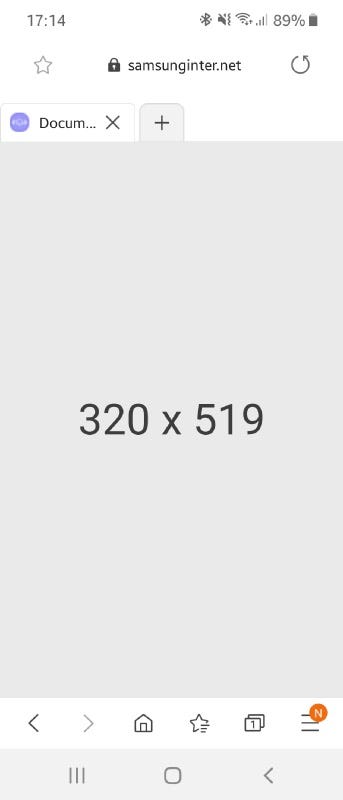 Fig 7: Viewport size on the front screen of the Galaxy Fold
Internal Screen
Regarding the internal screen, we must take into consideration the two ways a person can use the device. Let’s see how the 3 apps would behave in portrait mode in each of the 3 predefined positions for the middle separator.
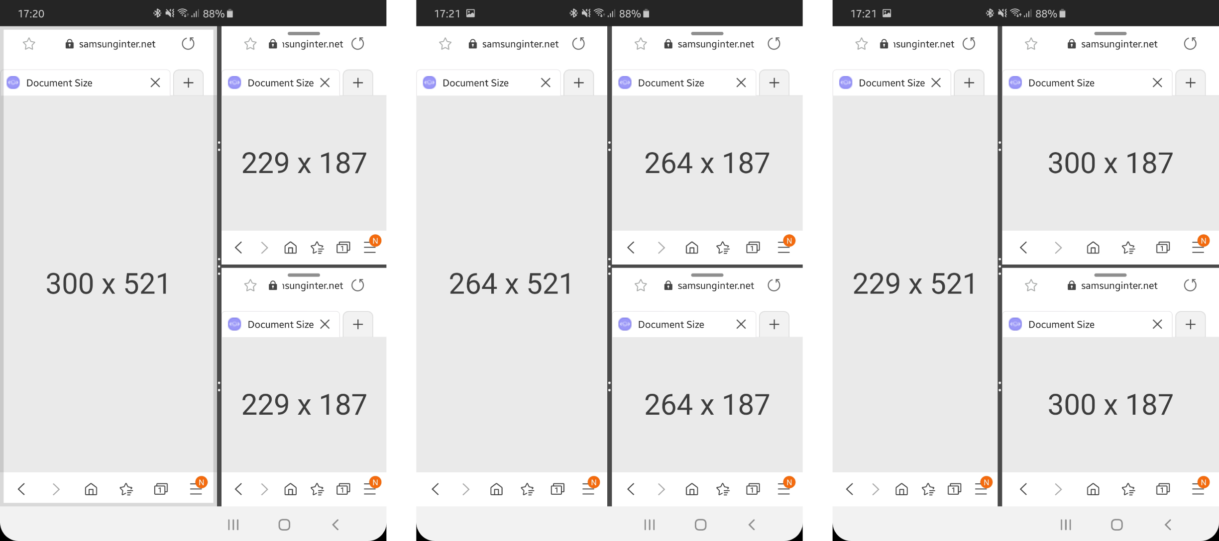 Fig 8: Worst case portrait viewport sizes on Galaxy Fold
Let’s now see possibly the extreme case you’d need to check for the Galaxy Fold device, landscape mode in one of the 2 small windows on the right (at least we can make sure the logo on our site fits in 85px!). Notice that there is a black bar on the right that is there the ‘L-cut’ (notch how I like to call it) is placed. This can also be on the left, if you hold the phone in the opposite direction, but for the user interface there is no real difference.
 Fig 9: Worst case landscape viewport sizes on Galaxy Fold
These resolutions are for Samsung Internet, so height will most likely be different for Edge, Firefox and Chrome, although height is generally not an issue since pages normally scroll vertically.
The future
There’s discussion at the moment in W3C for CSS primitives for foldable devices and JS APIs that will allow to define Window Segments led by Microsoft that will enhance the Web for dual (adjacent) screen devices, and we ourselves at Samsung are already mind-mapping which new APIs should come to the web to enrich foldable web experiences. I am personally engaged into these discussions and would really like to hear what you as developers want and expect from the browser in terms of capabilities and from the Web in terms of experiences. Do let me know what you think either in the comments or through Twitter!
The closing remarks
As you can read, the answer lies in responsive design and proper testing. Even if several browsers are built on top of the same engine, when it comes to optimizing for challenging (small or big) spaces, different GUI items, bars, and configurations can play a role in making part of your experience inaccessible or unusable.
The Galaxy Fold is an interesting device that enables a new paradigm of UX, and while I do not recommend designing specifically for a device, I hope this information sheds some light to make more informed decisions for layouts in your web properties, and again, prompt you into making sure you are testing with at least the most used browsers out there.
More resources
If you want to read about 6 assumptions that can break your website (some apply to websites on the Fold as well!) take a look at what my co-worker Ada wrote about some myths surrounding the topic of responsive design.
Six assumptions which could break your website
*A mistake consistently made by some of the biggest websites shows they are thinking about responsive web design…*medium.com