Folding the Web: Enabling Real Responsive Design on Foldable Devices
Diego González
Web Developer Advocate
Foldable devices
Although new to the industry, the concept of folding devices already has plenty of iterations. Samsung and other OEMs have presented devices with folding capabilities, that allow them to expand into small tablets, compress into smaller footprints, or enable more productive multi-tasking.
Consensus is now, that a “foldable” is a device that folds. While this might seem trivial, the details of how many screens, where/how they fold, and what size and shape the device should be, etc, were all up for discussion. Let’s agree for now that indeed, a foldable is a device that folds. Independent of whether it’s a vertical or horizontal fold, or if it is one big flexible screen or two adjacent ones, how many logical regions the folding translates to, or if it is the size of a phone or a laptop.
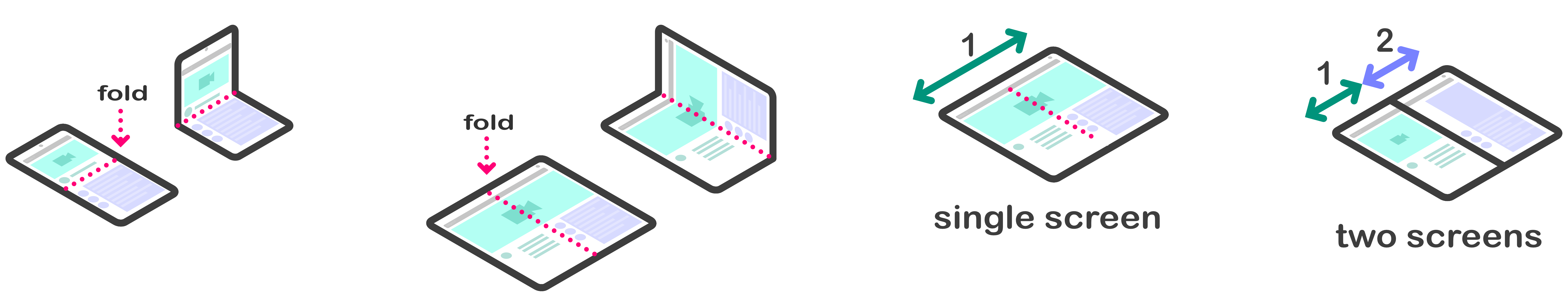
different types of “foldables”
a foldable is a device that folds
Some time ago I wrote about how to make sure websites looked good on the original Samsung Galaxy Fold. All that information, which summarizes into “make your websites responsive”, is very valid and I’d assume already a common practice. This was a good initial approach at making sure that the Web would continue to flow into different screen sizes, but these new devices were more than just expanded screen real estate. Treating them as just more space for Web content was against the intrinsic nature of the hardware itself, and against the full capabilities that could be enabled for the developer and end user. I knew that in the future I would be sharing information regarding more organic layouts for these types of devices.
We realized it made sense to embrace the physicality of the state of the device to provide a seamless (pun intended) experience for the user, by giving the developer access to more information regarding this aforementioned physicality.
Foldable Related APIs
Several lines of work started in parallel to address these challenges at Samsung, Microsoft and Intel. The CSS spanning media query and Window Segments Enum API allow developers to detect where the fold occurs, so that they can avoid positioning content on it. This is very handy especially in scenarios where you have dual screen devices with a physical separation between the screens. Microsoft have written an excellent post about these APIs. With the CSS spanning media query it is possible to know the layout of the foldable device and make sure there’s no content cut in half.
I want to introduce the work that we’ve been doing to address other use cases related to foldable devices here at Samsung with collaboration of our lovely friends at Intel.
Screen Fold API
Screen Fold API logo
We envision the need to adapt content to the physical way a device is being used. I mentioned earlier that foldables are more than just extra on-screen space for content. To embrace them we need to take into account the angle in which the screen(s) is folded. We can abstract this into a concept called the “posture” of the device. Considering posture, we can immediately see the benefits of making our content react to these changes. This is the basic concept behind the Screen Fold API.
Disclaimer: All the things I’m writing about at the moment are drafts that are subject to change, evolution or may never even see the light of day, nonetheless I believe it can be exciting to get an early glimpse into the future of Web design and to hear feedback from anyone interested.
The Screen Fold API is an extension to the Screen interface that exposes an angle value, a posture attribute and a change event. It allows developers to identify which posture a device is in and rearrange content accordingly. Working in conjunction with the CSS spanning media queries, one could achieve very interesting layouts. The API identifies a set of predefined postures for common use cases as seen in the image below. (Do note that names or states are not final and we are already considering adding a ‘peek’ state and changing the ‘laptop’ moniker that doesn’t bode well for phones for example.)
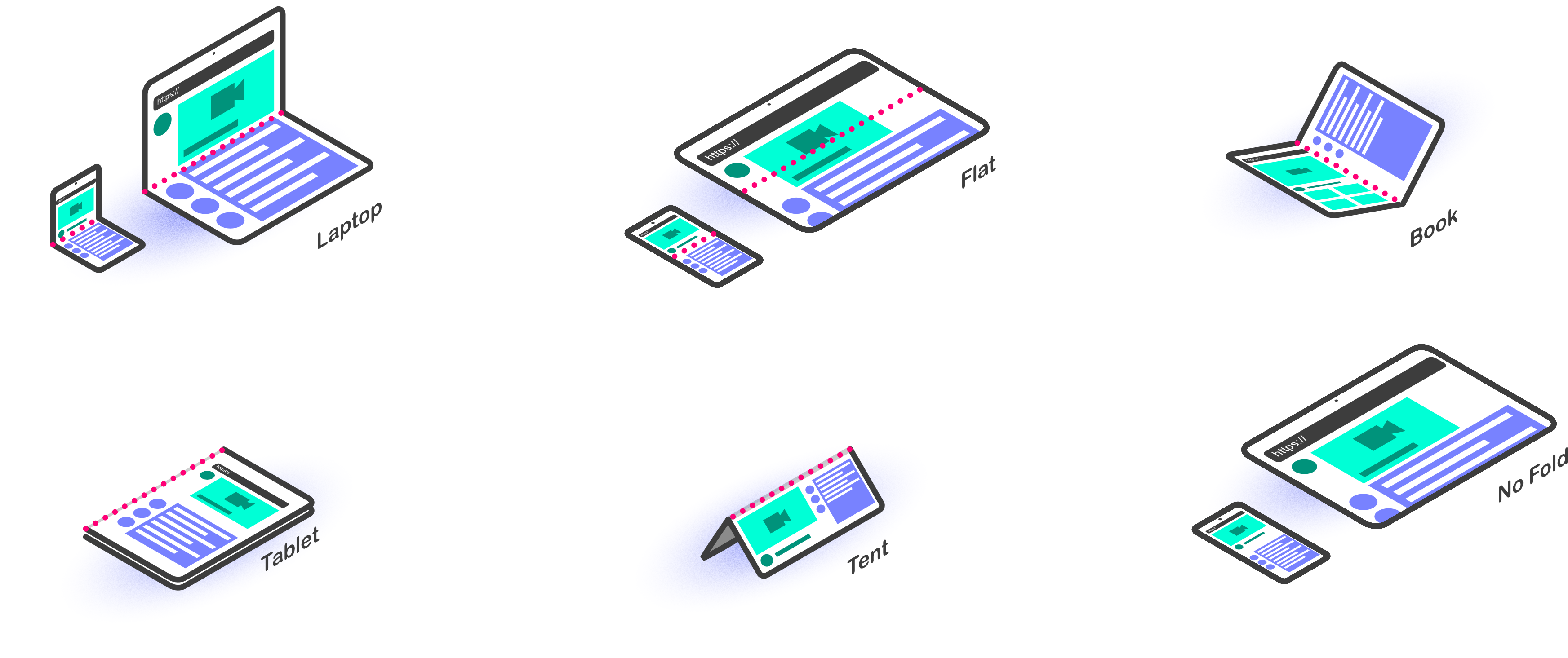
diagram of the postures available in the Screen Fold API (laptop, flat, book, tablet, tent, no fold)
Use Cases
These postures respond to different use cases, as detailed in the explainer linked below, you might recognize some of this functionality already shipped in some native apps under the names of ‘flex mode’.
These postures are not always what a developer might need so the API also allows us to directly query the angle values. The image below shows the proposed mapping between postures and angles.
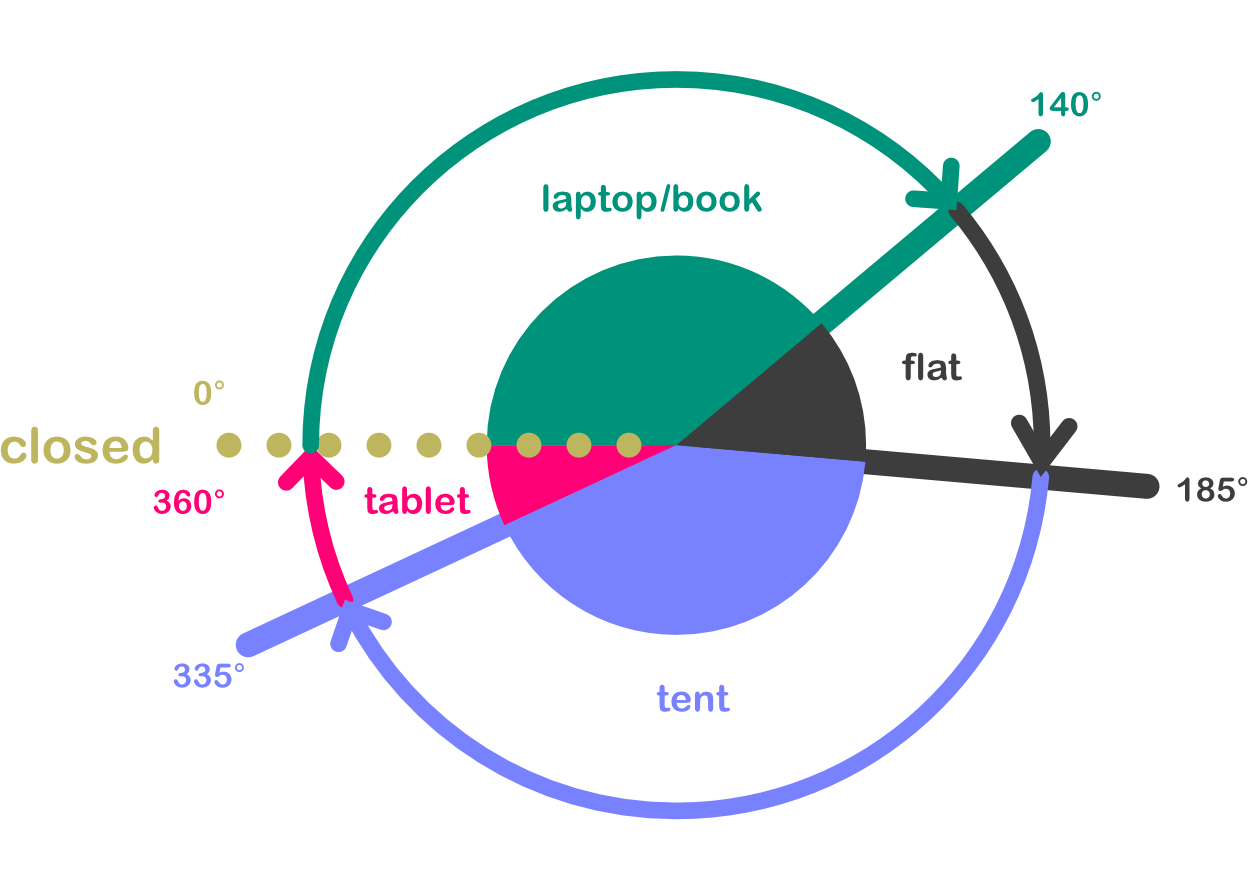
Mapping between postures and angles
Examples
There is a way to query these attributes both from JS and CSS. The former is through the screen object, the latter through handy CSS media queries. You can refer to an example below.
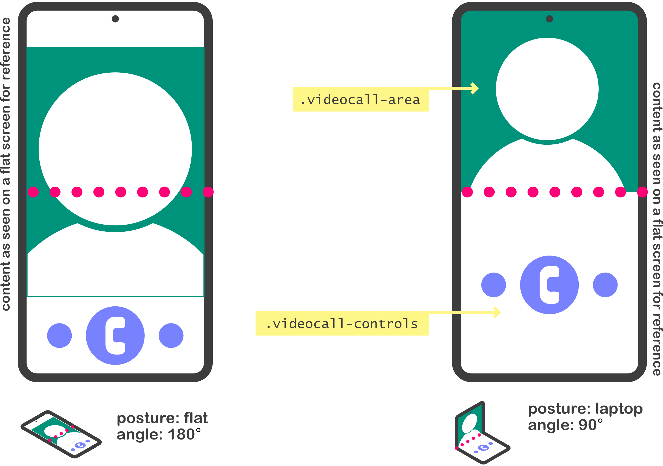
@media (screen-fold-posture: laptop) and (spanning: single-fold-horizontal){
   body {
     display: flex;
     flex-flow: column nowrap;
   }

   .videocall-area, .videocall-controls {
     flex: 1 1 env(fold-bottom);
   }
}
State of the API
If you’ve read up to here, it is very likely you find this interesting and are wondering what is the current state of the API? As I mentioned before, these are all early concepts. Fortunately, there is a specification draft and work under way at W3C. The Screen Fold API is expected to officially be a part of the Devices and Sensors Working Group and is already listed in the DAS WG roadmap.
Devices and Sensors Working Group

Samsung Internet Beta
Furthermore, at Samsung we have been experimenting internally with implementations for the Screen Fold API. We are committed to the Screen Fold API and hope to share an update and more news in the future. This is how a basic example for the Screen Fold API looks running on a Galaxy Z Fold2 device on a custom Samsung Internet build.
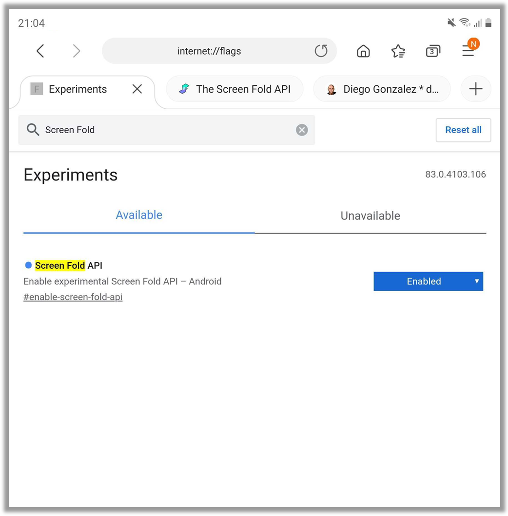
Screen Fold API behind a flag in Samsung Internet custom build
html {
    background-color: blue;
}

@media (max-screen-fold-angle: 120deg) {
    html {
        background-color: red;
    }
}
Finally, to enable you to jump into the fun and experimentation with the Screen Fold API, we have a very early version of a Polyfill and a settings widget for browsers that don’t support the specification draft or that do not fold.
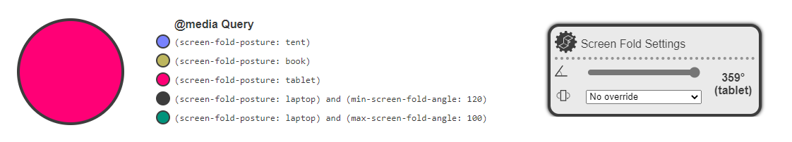
Screen Fold Settings widget
Yes, I am aware there are compatibility issues in the settings widget at the moment in some browsers and I’m more than happy to welcome help 😉.
The Road Ahead
The journey to properly supporting the Web on foldable devices is just getting started. There are various efforts from different fronts and discussions in standards groups and among the community are under way. At Samsung, we are committed to continue the conversation and advance the implementation. We are looking into ways to bring experimental support for the API in the future and we are in talks with other vendors to make sure we have more implementations.
As technical co-editor of the specification, I am very interested in knowing what you think of the Screen Fold API and if you have any considerations of things we might have left out. Feel free to contact myself (@diekus) or Daniel Appelquist for any questions.
In the meantime, play with the polyfill and let us know your thoughts and designs, as they will help us better shape the folding future of the Web.
Acknowledgements
I’d like to finish this post with a huge thank you to Jo Franchetti. She has lent her support and her CSS expertize from the beginning with every weird idea that comes into my head. Additionally, even though in it’s infancy, this work is possible due to the great advice from my co-editor, Kenneth, and to the internal support from Daniel Appelquist, Heejin Chung and the amazing engineering team in Suwon, Baul and Kangil. ✨