Let’s create a web camera app ready for foldable devices.
Laura Morinigo
Web Developer Advocate
Foldable devices are here! These smartphones allow different form factors with just one device, which can lead to new opportunities for innovation. As developers should be able to detect what is the current posture of the device, the physical position in which a device holds, Samsung is putting an effort within the W3C on making a new web standard called Device Posture API. This API allows web applications to request and be notified of changes in the device posture. Web apps can take advantage of the new form factors and improve users’ experience. We’ve created this codelab to show you how you can take advantage of this new feature.
Before we start, if you would like to learn more about it in a different format, here is a video that we’ve created with more information about this API and foldables.
👉 Would you like to do this codelab with mentors and in person?
If you are in London we will have a first meetup to try this with real foldable devices, feel free to register here! (ed. This event has already occurred, but we're leaving the link intact.)
What is the W3C and why you should care
In the meantime, as I’ve mentioned before, there is a current proposal about how to take advantage of these foldable devices called ‘Device Posture API’. Its current state is ‘draft’, which means that is still open to changes and discussion and has been published for review by the community, including W3C Members, the public (you!), and other technical organizations. We’ve created a demo to show you how to use this API, hear your thoughts and teach you some capabilities of the web. At the end of this codelab you can send us your feedback here. Let’s start working…
🛠️ Hands on
1. Set up your environment
You will need the following:
-
Samsung Internet latest version
-
Samsung Galaxy Z Fold2, Z Fold3, Z Flip, or Z Flip3
If a physical device is not available for testing, use
Requirements:
-
Samsung account
-
Java Runtime Environment (JRE) 7 or later with Java Web Start
b) Device Posture API Polyfill
For testing using a non-foldable smartphone, just implement a polyfill to the project.
2. Start your project
-
Open a new browser tab, go to https://glitch.com, and log in
-
Click New Project, then select Import from GitHub
-
Enter the URL of this repository
3. Add HTML video markup
Note: Take a look and check the files of your project before starting to code.
In index.html, you will have two main sections, one is dedicated to the video camera and the other one to the camera controls. You can identify the video section as it contains the class video-container. Complete the HTML markup by adding the <video> element, width, height, and id attributes.
<div class="video-container">
  <video id="video" width="1280" height="200" >
    Video stream not available.
  </video>
</div>
Once the video markup is added, the HTML file is complete. Besides this, you can find:
-
A
<canvas>element into which the captured frames are stored and kept hidden since users don’t need to see it. -
An
<img>element where the pictures will be displayed.
4. Enable front and back cameras with facingMode
In index.js, you'll find a startUp() function, here is where you will be doing the following:
-
Initialize most values
-
Grab element references to use later
-
Set up the camera and image
Start by setting up the camera. You will have access to both front and back cameras by using facingMode, a DOMString that indicates which camera is being used to capture images. It's always a good practice to check if this function is available for use. Add the following lines of code in startUp():
`let supports = navigator.mediaDevices.getSupportedConstraints();
  if (supports["facingMode"] === true) {
    flip_button.disabled = false;
  }`
5. Link the media stream to the video element
If you are able to use facingMode, the camera web app will use this option in the capture function to detect which is the current camera used and later send it to the flip button. Now, the camera should be activated, insert this block of code after retrieving defaultOpts.video value using facingMode:
`navigator.mediaDevices
      .getUserMedia(defaultsOpts)
      .then(_stream => {
        stream = _stream;
        video.srcObject = stream;
        video.play();
      })
      .catch(error => console.error(error));`
In order to get the media stream, you call navigator.mediaDevices.getUserMedia() and request a video stream that returns a promise. The success callback receives a stream object as input. It is the <video> element's source to the new stream. Once the stream is linked to the <video> element, start it playing by calling video.play(). It's always a good practice to include the error callback too, just in case the camera is not available or the permissions are denied.
6. Take a look at the implementations in index.js
At this point, the functionality of the web app is complete. Before moving to the next step, let’s review the rest of the JavaScript code:
-
There is an event listener video for the
canplayevent that will check when the video playback begins. If it's the first time running, it will set upvideoattributes likewidthandheight. -
For the snip button, there is an event listener for
clickthat will capture the picture. -
The flip button will be waiting for a click event to assign the flag about which camera is being used, front or back camera, within the variable
shouldFaceUser, and initialize the camera again. -
clearPicture()creates an image and converts it to a format that will be displayed in the<img>element. -
Finally,
takePicture()captures the currently displayed video frame, converts it into a PNG file, and displays it in the captured frame box.
7. Use the Device Posture API
At this point, you should have a working prototype of a camera web app. The video camera should be displayed and a picture may be taken using the snip button. In addition, it will show a preview of the picture taken through the small preview display. The flip button allows you also to switch between front and back cameras.
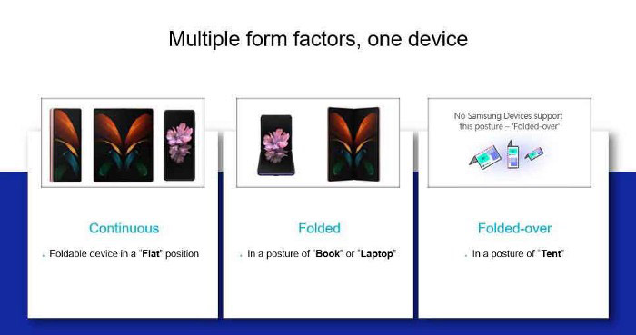
Now, it’s time to play around with the layout of the web app and take advantage of the features available on a foldable device. In order to do that, you will implement the Device Posture API that allows developers to detect what is the current posture of the phone. In order to change the layout when the device is partially folded, the device posture that you will look for is in a form of a book or laptop.
In style.css, apply the following media query:
@media (device-posture: folded) {

 body {
   display: flex;
   flex-flow: column nowrap;
 }
 .video-container .camera-controls {
   flex: 1 1 env(fold-bottom);
 }
.msg {
  display:block;
  margin: 5em;
}
Using modern CSS features like display:flex and grid, you can change the layout of the body element and the elements with the class video-container and camera-controls when the phone is flipped.
8. Test your app
Whether you test on a real foldable phone or on a remote test lab device, you need to enable the Device Posture API in the latest version of Samsung Internet. To do this, open the browser and type internet://flags in the URL bar and search for either Device Posture API or Screen Fold API, then select Enable.
- Test in a real device
If you have a real physical device, you can test it directly on Samsung Internet using the URL that glitch provides you by clicking on Show in a new window menu. Just partially fold your phone and you will see how the layout changes and even discover a hidden message!
- Use Remote Test Lab
The other option, if you don’t have a physical device, is by using Remote Test Lab. You can choose any Galaxy foldable devices from the list and follow the same instructions as you would with a real device. Just make sure to enable the Device Posture API and have the latest version of Samsung Internet. Use the buttons provided by Remote Test Lab to partially fold your remote Galaxy device.
- Implement polyfill
Polyfill allows you to emulate behavior on devices that do not have folding capabilities. It helps you visualize how the content responds to the different angle and posture configurations. Just include sfold-polyfill.js directly into your code and use the polyfill settings (screenfold-settings.js) of the web component that will emulate the angle of the device and therefore, it will change its posture.
Moreover, add the following code in index.html
<head>
  …
    <script type='module' defer src="screenfold-settings.js"></script>
    <script src="sfold-polyfill.js"></script>
  …
</head>
<body>
  <section>
     <screenfold-settings></screenfold-settings>
  </section>
  …
</body>
🥳 You did it! You’ve created a web app that detects when a foldable device change its posture. Please let us know how it went here, we would like to hear your thoughts around this API, future codelabs and more! This feedback will go directly to the W3C Devices and Sensors Group, so you will be part of the conversation around this draft too!
Thanks a lot for reading.