Watch Face Studio: Theme Color Implementation Basics
Most Fowziya Akther Houya
Engineer, Samsung Developer Program
Samsung Galaxy Watches run on Wear OS Powered by Samsung and have many features, including custom watch faces that you can create with Watch Face Studio (WFS). WFS provides a "Theme" feature that allows you to implement multi-color theme palettes to watch face components. Theme colors enhance your watch faces by making them more expressive and attractive, and give users customization options.
This article introduces the basic concepts of creating color themes for watch faces:
- Defining theme color palettes
- Applying theme colors to components
- Using theme colors on different backgrounds
To follow along with the demonstrations in this article, install Watch Face Studio and download the sample project.
Defining theme color palettes
To apply theme colors to watch face components, you must define a theme color palette. WFS enables you to add up to 30 theme colors to a project.
To create a theme color palette:
- In your WFS project, select the “Style” tab.
- Click the “+” (plus sign) button next to “Theme color palette.”
- Use the color picker to define the color you want.
- Click "OK" to set the chosen color.
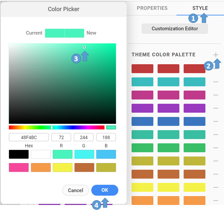 Figure 1: Adding theme colors
Each row in the “Theme color palette” section represents a separate theme color palette. A theme color palette is initially created with a single color, but a palette supports up to three colors. The additional colors can be different shades of the main color or contrasting colors.
To implement additional colors for a palette:
- In the “Theme color palette” section, select the theme color you want to change.
- Use the color picker to define the color you want. You can also check how the selected color compares to the original color.
- Click "OK" to set the chosen color.
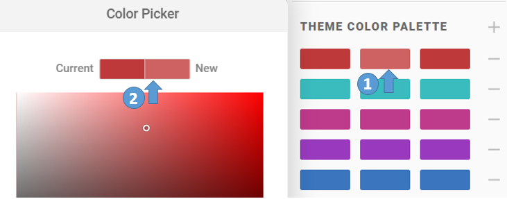 Figure 2: Adding theme colors to a palette
The following figure shows several multi-color theme palettes defined for the project.
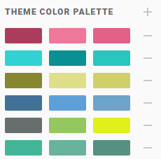 Figure 3: Multi-color theme palettes
Applying theme colors to components
When you have defined one or more theme color palettes, you can apply the colors to the watch face components.
To apply a theme color to a watch face component:
- Select the component and go to the “Properties” tab.
- Unfold the “Color” section.
- Fill the “Apply Theme Color” checkbox.
- From the dropdown menu, select whether to apply the first,second, or third theme color from the palette.
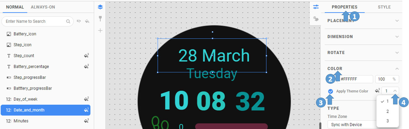 Figure 4: Applying theme color to a component
To quickly apply the theme color to components:
- Select the components you want to apply the theme color to.
- In the “Layer” tab, click the “Apply Theme Color” icon to cycle through the first, second, and third theme color.
The following figure shows the theme colors applied to the components in the sample project. The theme color is not applied to the step icon, battery icon, and progress bars.
 Figure 5: Theme colors applied to multiple components
Now that you have applied theme colors to the watch face components, you can preview the result on the "RUN" tab or the Run window. You can use the selected theme color from the "RUN" tab of WFS and see the output in the preview window.

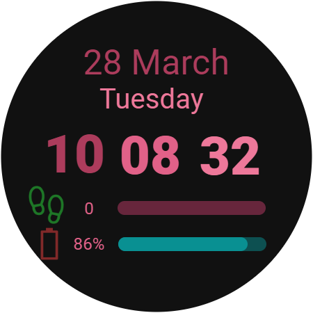
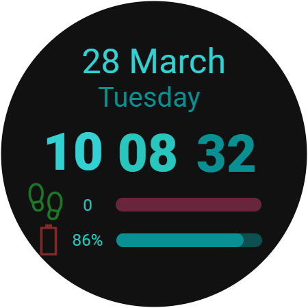
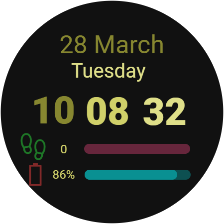
Figure 6: Theme color preview
Note: Icons and images on complications are converted to grayscale after theme colors are applied. Consequently, theme colors can appear differently on them. For information about applying theme colors to complications, see Design Complications Using Watch Face Studio.
Using theme colors on different backgrounds
To expand the customization options of your watch face, you can implement multiple backgrounds to complement the theme color palettes. Users can combine their choice of theme color palette and background to suit their preference.
To add a background to the watch face:
- Add an image component and define the image as the background.
- If you want to add more background images, select the background component. In the “Style” tab, click the “+” (plus sign) button and select the images to be implemented as backgrounds.
You can use the Customization Editor to preview any combination of theme color palette and background:
- To open the Customization Editor, in the “Style” tab, click the “Customization Editor” button.
- Use the side menu to switch between the colors and backgrounds you want to preview.
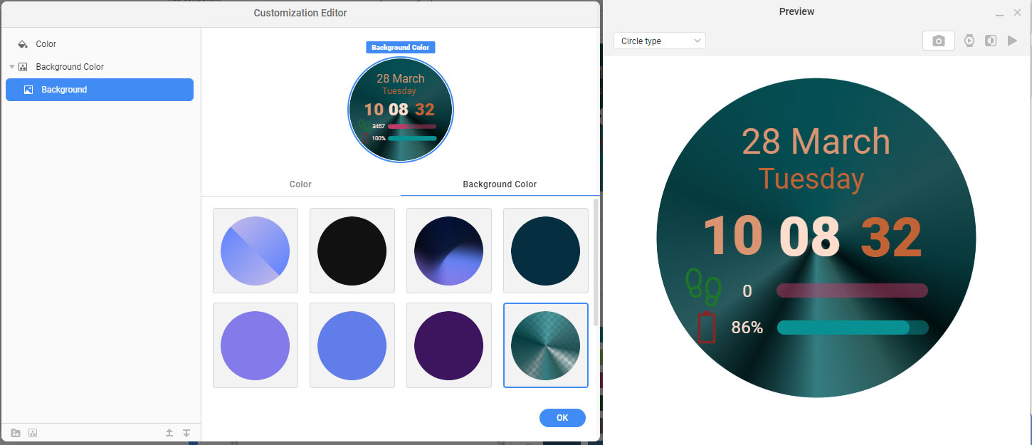 Figure 7: Customization Editor
You can also preview the theme colors from the “RUN” tab.
The following examples demonstrate how the same theme colors can provide a different look and feel depending on the background.
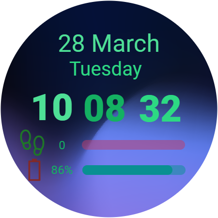
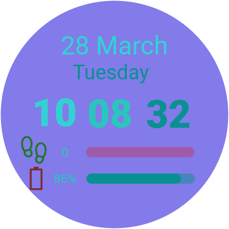
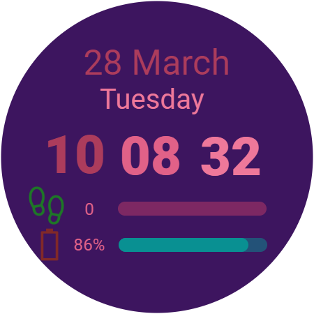
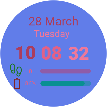
Figure 8: Theme colors against varying backgrounds
Finally, test your watch face on an actual watch or emulator.
With up to 10 backgrounds and 30 theme colors, up to 300 background and color combinations are possible.
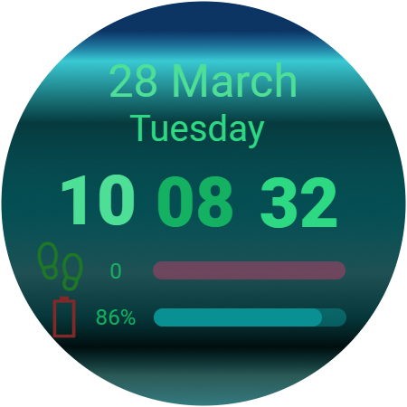
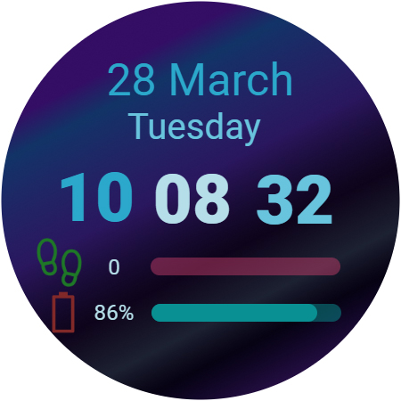
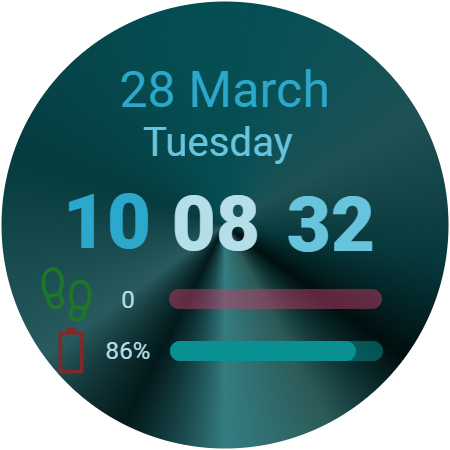
Figure 9: Examples of sample project output
Additional resources
For more information on designing watch faces with Watch Face Studio, see Create a watch face with Watch Face Studio on the Android Developers site.
Discuss ideas with other expert developers at Samsung Developers Forum and get tips, help, and answers to your development questions.
Learn more about Watch Face Studio and other Samsung SDKs and tools from the Samsung Developers Blog.