Design Complications Using Watch Face Studio
Most Fowziya Akther Houya
Engineer, Samsung Developer Program
Watch Face Studio is a graphic authoring tool that helps you to design watch faces for the Wear OS smartwatch ecosystem, including Galaxy Watch4 and Galaxy Watch5. It is an intuitive graphic tool which allows you to design watch faces without coding.
Watch Face Studio includes a notable feature known as a complication. Using complications, the user can get a glanceable unit of information for their selected application on their watch face. The complications can display data, such as text, title, image, or icon, which is collected from the applications that provide such information.
Today, I discuss some complication features in this blog. I design a simple watch face to demonstrate these. For simplicity I add a digital time and a digital date. For complications, I add one short text complication and one ranged value complication. At the end, two different theme colors are applied. You can download this sample design from here and throughout this blog you can follow me.
After deploying the watch face on a watch and customizing the complication, the watch face on the real device looks the same as Figure 1.
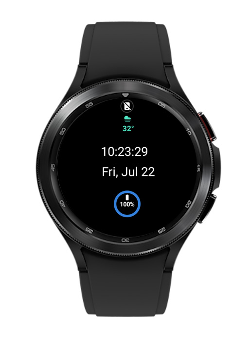 Figure 1: The watch face demonstrated in this blog
Getting started
To view and deploy the sample design from my blog, Watch Face Studio must be installed on your PC.
Now , I create a new project and then add basic components for simplicity. I add time and date from digital clock and place them in the center.
Adding complications
As I have said earlier, I use two different complications in this design. To add complications, go to the add component menu on the top middle. From the dropdown menu, add the "Short Text" complication. For more information about complications, visit this complication document.
Short text complication
First, I add a short text complication. For design purposes, I adjust the complication placement as (X and Y) 170 and 45. I leave the dimension and color as it is. However, you can resize the dimension and change the color of the components of the selected complication.
Now I set the properties of complication settings as follows:
-
Complication Type: I set it as "Editable" so that anyone can customize the complication from their watch. If the type is set as "Fixed," then the complication cannot be customized from the watch and it remains the same as what is provided in the design.
For example, I choose "Sunrise sunset" from the default provider > dropdown menu (see Figure 2a). If the default provider is set as > "Empty," no complication is displayed in the Run window.
Note :If the default provider is set as "Empty," customization from the watch is still possible.
- Complication Layout: The layout for this complication is set to the default ("Icon + Text + Title"), but the layout also can be changed to the designer's preference. In Figure 2b, the other layout options for the short text complication are displayed.
You can find more details about the complication layout from my Things to Consider when Designing Complication Layouts blog.

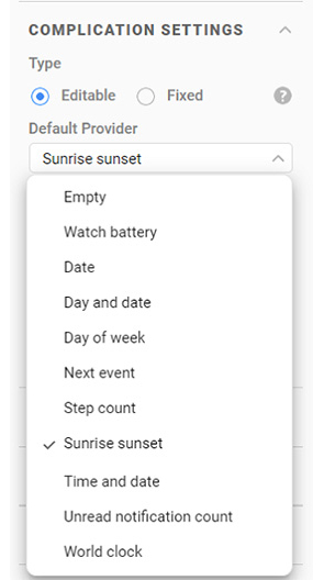
(a) Default provider options
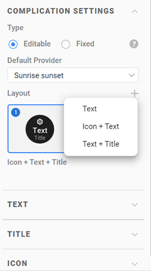
(b) Layout options
Figure 2: Complication settings
Ranged value complication
Now, I add a ranged value complication and adjust the properties as displayed in Figure 3. I select the default provider as "Watch battery" for this complication. I set the complication type to "Fixed" so that the customization from the watch is not possible.
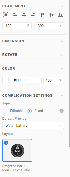 Figure 3: Ranged value properties, "Watch battery" is fixed and cannot be changed on the watch for this complication
-
Watch Face Studio gives the opportunity to change the properties for every component of the complication. Now, I modify the properties of the progress bar component of the ranged value complication. So, at first, I expand the ranged value complication. An example of this is displayed in Figure 4.
 Figure 4: Expand the ranged value complication
 -
To change the properties, I click on the progress bar under the ranged value complication to display its properties. I change the color of the progress bar by following the steps below:
a. Click the color box in the Color menu.
b. Select a color from the Color Picker pop-up window.
c. Click OK in the Color Picker pop-up window.
 Figure 5: Ranged value progress bar color change
 Figure 6: Ranged value complication added
I have added two complications in two different positions on the watch face. Keep in mind that currently, only one complication can be set in one spot. So only one complication must be set in the same area regardless of Normal or Always-on-Display (AOD).
For example, I add two same or different complications in the same position. I set one complication for Normal mode and another complication for AOD mode. Now, I can set two different complication providers and test them on the Run window for the Normal and AOD modes. But it is not possible to customize both the complications on the watch as the complications overlap each other.
Therefore, it is better not to use two complications in one spot.
Adding a theme color to a complication
Now, I add two theme colors and apply one of them to the short text complication. The steps to add and apply a color are given below:
a. Go to the Style tab. The tab contains the Theme Color Palette menu to choose the theme color**.**
b. Add a color by clicking the "+" icon.
c. The Color Picker pop-up window opens. Select a color from the available options.
d. Click OK for confirmation.
You can add as many colors as required by repeating steps a to d.
e. Now set the theme color for the short text complication. A "fill with color" icon is present for every selected component. Click the fill with color icon for the short text complication title, text, and the icon.
f. On the Run window, the Theme Color menu is displayed which contains all the selected theme colors from the Style tab. Choose any color by selecting the checkbox and view the output in the Run preview.
g. For the short text complication, the theme color is set and the color for the title, text, and icon is changed.
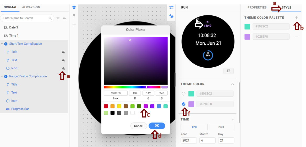 Figure 7: Add theme color for short text complication
The theme color can be customized from the watch.
Theme color on a watch
On the watch, I can choose a theme color from the available colors that I had added in the project earlier. The theme color is set on every component of the short text complication. However, in the case of the icon and image of the complication, the theme color is applied after converting the original color to grayscale. This is because we do not know the color that is provided by the complication provider. That is why it is converted into grayscale first, before applying the theme color. So be careful about setting the theme color while designing your watch face, as the icon and image colors may interfere with the theme color.
For example, from the watch, if I set a short text complication as "Sunrise sunset," the icon color of this complication is orange (for sunset). On the other hand, if I set the complication as "Weather," the icon color is white.
See Figure 8 for better understanding. In Figure 8a, the icon color for "Sunrise sunset" is orange and this color is provided by the provider. Therefore, if I apply the theme color on this icon, the icon color is not the exact same theme color as displayed in Figure 8b.
In another scenario, the provided icon color is white which is as displayed in Figure 8c. In this case, if the theme color is applied on the icon, the color is perfectly changed as the theme color. In Figure 8d, this case is displayed.
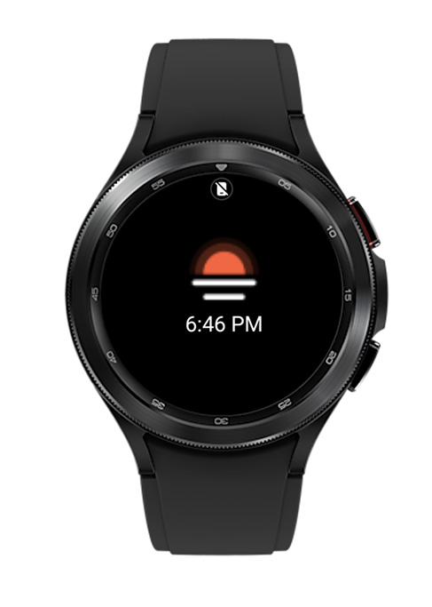
(a) "Sunrise sunset" complication icon without theme color
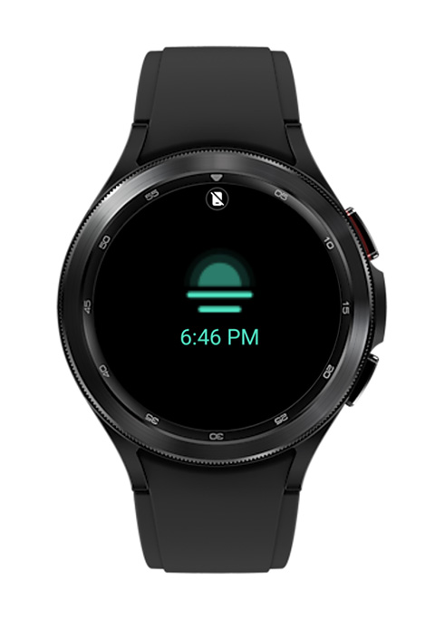
(b) "Sunrise sunset" complication icon after applying theme color
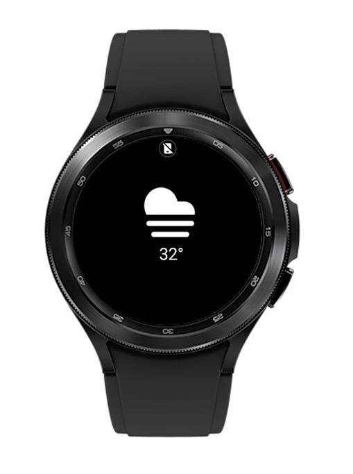
(c) "Weather" complication icon without theme color
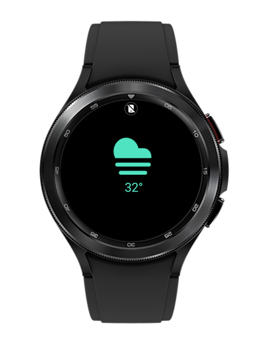
(d) "Weather" complication icon after applying theme color
Figure 8: The icon color interference with the theme color
Deploying the design and customizing complications as your own
Our target components are added. To view the watch face featured in this blog, download this file and deploy it to your watch by following these steps:
-
Connect your watch to Watch Face Studio. For information about connecting, see Connection guideline.
-
Deploy the design on your watch using Run on Device. For more details on connection, visit this test guideline.
As per FAQ 12, "Debug over Bluetooth" is not yet supported in Galaxy Watches with Galaxy Wearable.
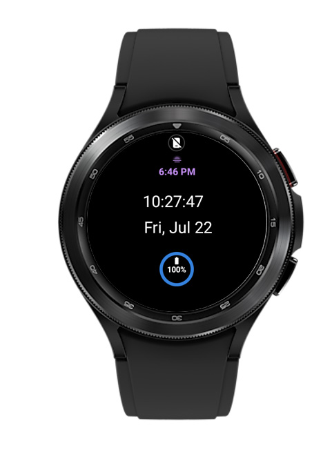
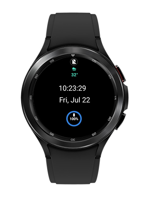
Figure 9: Designed watch face on a watch
Figure 9 displays the customized complications. To learn more about complications, visit Watch Face Complications.
Conclusion
As you can see, using complications, you can get detailed information for the selected application on your watch. Personalization is a key feature of Galaxy Watch. You can continue to enjoy customizing the look of your watch style as you develop your collection of watch faces.
Resources
In the Samsung Developer Forum, you can ask and get help for any issue. This is a very active and friendly community where developers discuss their issues.
There are many blogs on different topics, including Watch Face Studio, on the Samsung Developers site. Please visit these Galaxy Watch tutorials to expand your knowledge about Samsung Galaxy Watch and their special features.
If you want to develop watch faces programmatically, you can use Android Studio. You can do more complex operations using the Complication API.