Craft Adaptable UI for Android Applications Using Jetpack Compose
Samiul Hossain
Engineer, Samsung Developer Program
In the dynamic landscape of mobile technology, the introduction of the Jetpack Compose toolkit has opened a lot of opportunities for developers to create beautiful, seamless applications using declarative UI. Using this new model of UI development, developers can create adaptable applications targeting a wide range of mobile devices.
In this post, we learn how to integrate Android's new adaptive library into a pre-built compose application and leverage its APIs to create a dynamic user interface.
Overview of the application

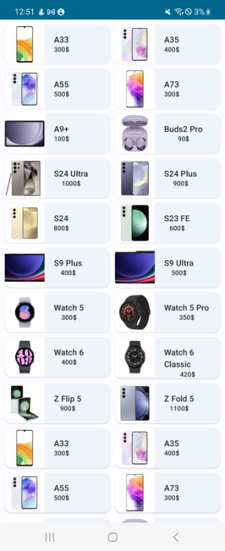
Figure 1: Application UI on the Galaxy Z Flip5
The example application is a simple list of mobile devices for sale. It is built using an ElevatedCard composable that is displayed by a LazyVerticalGrid composable. Each card is modeled after a data class named Mobile. Let’s take a look at the data class and composable functions below:
/// Data class to hold Mobile data
data class Mobile(
    @StringRes val name: Int,
    @DrawableRes val photoId: Int,
    val price: String
)
/// MainActivity.kt

class MainActivity : ComponentActivity() {
    override fun onCreate(savedInstanceState: Bundle?) {
        super.onCreate(savedInstanceState)
        setContent {
            ComposeAppTheme {
                MyApp()
            }
        }
    }
}

@Composable
fun MyApp(){
    Surface(
        modifier = Modifier
            .fillMaxSize()
            .statusBarsPadding(),
        color = MaterialTheme.colorScheme.background
    ) {
        MobileGrid(
            modifier = Modifier.padding(
                start = 8.dp,
                top = 8.dp,
                end = 8.dp,
            )
        )
    }
}

@Composable
fun MobileGrid(modifier: Modifier = Modifier){
    LazyVerticalGrid(
        columns = GridCells.Fixed(2),
        verticalArrangement = Arrangement.spacedBy(8.dp),
        horizontalArrangement = Arrangement.spacedBy(8.dp),
        modifier = modifier
    ) {
        items(MobileDataSource.mobiles) { mobile ->
            MobileCard(mobile)
        }
    }
}

@Composable
fun MobileCard(mobile: Mobile, modifier: Modifier=Modifier){
    ElevatedCard() {
        Row {
            Image(
                painter = painterResource(id = mobile.photoId),
                contentDescription = null,
                modifier = modifier
                    .size(width = 68.dp, height = 68.dp),
                contentScale = ContentScale.Crop
            )
            Column(
                horizontalAlignment = Alignment.CenterHorizontally,
                verticalArrangement = Arrangement.Center
            ) {
                Text(
                    text = stringResource(id = mobile.name),
                    modifier = Modifier.padding(
                        start = 16.dp,
                        top = 16.dp,
                        end = 16.dp,
                    ),
                    style = MaterialTheme.typography.labelLarge,
                )
                Text(
                    text = mobile.price,
                    style = MaterialTheme.typography.labelSmall,
                )
            }
        }
    }
}
As we’ve seen, the application UI looks good on the Samsung Galaxy Z Flip5. But how does it look on the Galaxy Z Fold5?
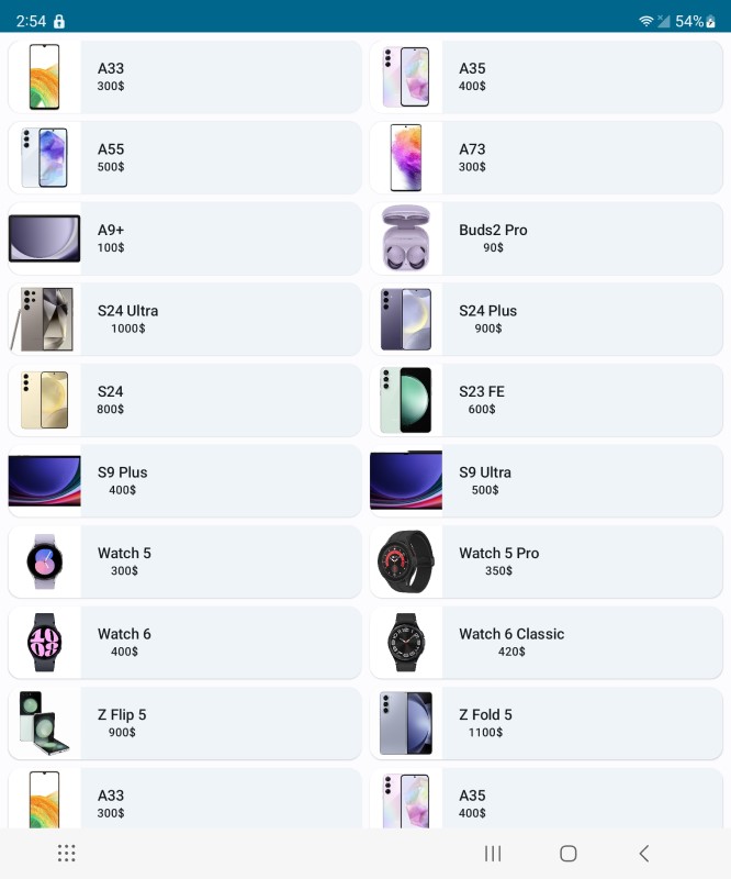
Figure 2: Application UI on the Galaxy Z Fold5
On the Galaxy Z Fold5, the cards are now very stretched and contain a lot of blank space. The unfolded state of foldable devices has a larger screen size and it is important to keep large screens in mind when developing your application. Otherwise, the application may look great on conventional mobile devices, but very off putting on larger devices such as tablets, foldables, and so on.
Create an adaptive layout for your application
The material-3 adaptive library provides some top-level functions that we can leverage to adapt our applications to different form factors. We will use the currentWindowAdaptiveInfo() function to retrieve the WindowSizeClass. The WindowSizeClass allows us to catch breakpoints in the viewport and change the application UI for different form factors. Follow the steps below to change the application's appearance depending on the screen size.
- Add the following dependencies to the app-level build.grade file
 ...
 implementation "androidx.compose.material3.adaptive:adaptive:1.0.0-beta04"
 ...
- Create a variable called windowSizeClass to store the
WindowSizeClassfromcurrentWindowAdaptiveInfo()in theMobileGrid()composable. It contains a member variable namedwidthSizeClassthat is a type ofWindowWidthSizeClass. The possible values of this class are Compact, Medium, and Expanded. We will use this value to change the layout of the application. Create a new variable named numberOfColumns to dynamically set the number of grid columns in theMobileGrid()composable depending on the width of the screen.fun MobileGrid(modifier: Modifier = Modifier){ val windowSizeClass = currentWindowAdaptiveInfo().windowSizeClass val numberOfColumns: Int = when(windowSizeClass.windowWidthSizeClass) { WindowWidthSizeClass.COMPACT -> 2 WindowWidthSizeClass.MEDIUM -> 3 else -> 4 } LazyVerticalGrid( modifier = modifier, columns = GridCells.Fixed(numberOfColumns), verticalArrangement = Arrangement.spacedBy(8.dp), horizontalArrangement = Arrangement.spacedBy(8.dp) ) { items(MobileDataSource.mobiles) { mobile -> MobileCard(mobile) } } }NoteTo learn more about the viewport breakpoints of WindowSizeClass, check out the official documentation by Android.
That's all! Your application now has a seamless, responsive UI that changes based on the size of the screen it is being displayed on. Let's see what it looks like now on the Galaxy Z Fold5.
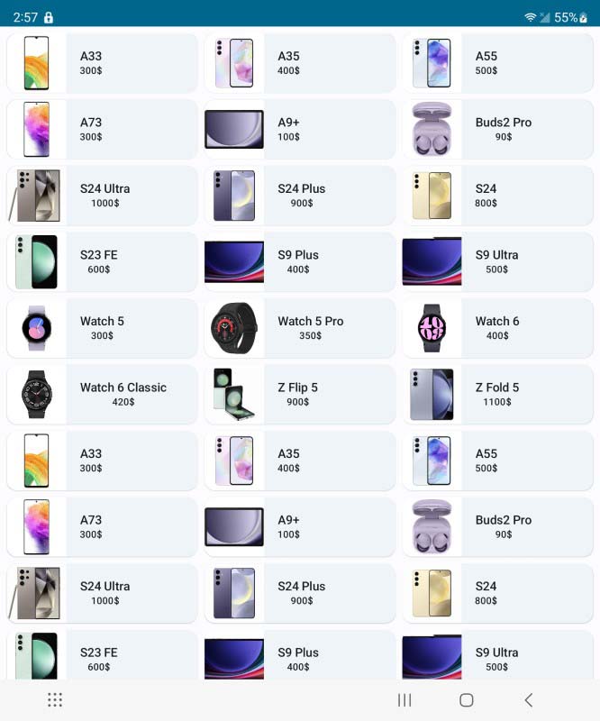
Figure 3: Updated UI on the Galaxy Z Fold5
Add support for pop-up view
Android enables users to improve their efficiency by leveraging its multi-tasking features. More than half of foldable users use the split-screen, multi window, or pop-up modes daily, so it is imperative that modern applications integrate support for these viewing modes. Let's have a look at the UI in pop-up mode.
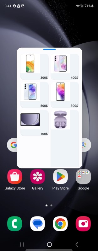
Figure 4: UI on the Galaxy Z Fold5 - pop-up mode
As you can see, the UI is completely broken in pop-up mode. The mode has a much smaller viewport width and height, so it'd be better to display just 1 column of tiles. We can do this by using the currentWindowSize() function from the adaptive library that uses the WindowMetrics class to calculate the width and height of the viewport. Create a variable named currentWindowWidthSize and retrieve the window width size using the function. If the viewport width is too low, less than 800 pixels in the example below, we can set the numberOfColumns variable to 1.
@Composable
    fun MobileGrid(modifier: Modifier = Modifier){
        val windowSizeClass = currentWindowAdaptiveInfo().windowSizeClass
        val currentWindowWidthSize = currentWindowSize().width
        val numberOfColumns: Int = when(windowSizeClass.windowWidthSizeClass) {
            WindowWidthSizeClass.COMPACT -> {
                if(currentWindowWidthSize < 800) 1 else 2
            }
            WindowWidthSizeClass.MEDIUM -> 3
            else -> 4
        }

        LazyVerticalGrid(
            modifier = modifier,
            columns = GridCells.Fixed(numberOfColumns),
            verticalArrangement = Arrangement.spacedBy(8.dp),
            horizontalArrangement = Arrangement.spacedBy(8.dp)
        ) {
            items(MobileDataSource.mobiles) { mobile ->
                MobileCard(mobile)
            }
        }
    }
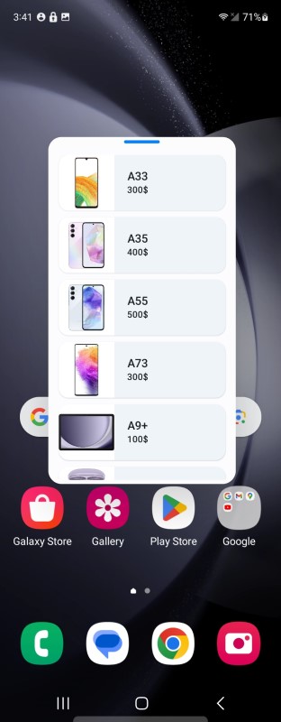
Figure 5: Updated UI on the Galaxy Z Fold5 - pop-up mode
Conclusion
You have now successfully used the new material-3 adaptive library to change the layout of your application to support foldables and large screen devices in portrait, landscape, split-screen or pop-up modes. By leveraging Jetpack Compose and Android APIs, you can create a consistent and optimized user experience across various screen sizes and device types. If you are interested in developing adaptive applications in XML, check out the links in the section below.