Users can control their Samsung Smart TVs with the Samsung Smart Remote or a standard remote control. Also, note that some models support touch, and external devices like a mouse or touchpad can be used.
Samsung Smart Remote
All applications must be designed so that using only the Smart Remote will give access to all of their features.
NoteBecause the Smart Remote is constantly evolving, buttons and features other than the basic buttons are subject to change. Hence, in order to make applications that are not restricted by a locale or the TV model, only use the basic buttons described in Basic Controls.
Basic Controls
The SELECT button is located inside the four navigation buttons and used to select an item or to confirm the selection. Table 1 illustrates the basic buttons.
Input
Basic TV Controls
Four-directional Control
Movement Control (Movement accelerates when it is held down)
SELECT
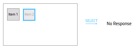
Execute the assigned function. If the function is currently unavailable, it appears translucent but can still receive focus and be selected. In this case, the action can be handled in one of two ways: it may remain unresponsive to the user's input, or if clear instructions are required, a message can be displayed to guide the user on how to enable the function.
RETURN
[On the application’s Home screen] Close the application. [In other situations] Return to the previous screen based on the hierarchical relationships between the application’s screens.
Channel Control
[When watching broadcast on full screen or on PIP] Change the channel [In other situations] Not available. A system message shows that the button is currently unavailable.
Volume Control
Display TV Volume OSD and volume control
Playback Control
[When playing media] Control the playback. Refer to [Controlling Video Playback with the Smart Remote].(/smarttv/design/media-player.html#controlling-video-playback-with-the-smart-remote) [In other situations] No response. No notification given.
POWER
Turn the TV power off.
Table 1: Basic TV controls
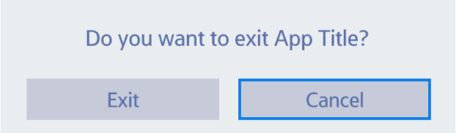
It is recommended that the application should provide an Exit popup window when users close the application.
On-Screen Number Pad
The on-screen number pad should appear when users press the 123 button on the Smart Remote. However, to allow users to input numbers intuitively, it is recommended to design the UI so that input is possible using only the basic remote buttons described in Table 1.
Basic Navigation
All Samsung Smart TV screens must be controllable using the Left/Right/Up/Down and Select buttons.
Moving Focus in a List
When focus is not on either end of the list of items shown on the current screen, moving focus only moves focus in the pressed direction and does not move the content.
When focus is on either end of the list of items shown on the current screen, moving focus moves focus in the pressed direction and moves the content in the opposite direction.
Focus does not loop in a list. Thus, focus stops moving when it reaches the first or last item in a list, even though the appropriate directional button is still pressed.
Figure 2: Example of focus movement in a horizontal list
Figure 3: Example of focus movement in a vertical list
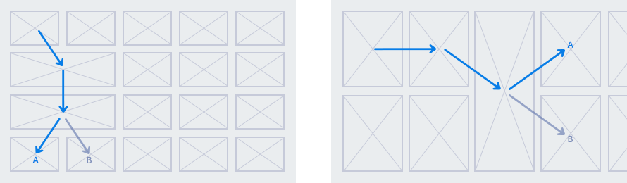
2-Directional Grid-type Items
In a list of items with various sizes, the focus's movement route may diverge at some places where the previous item borders two or more adjacent items. To keep navigation consistent, follow the guidelines below:
Focus should move to the nearest item in the movement direction.
The distance between two items should be determined by the distance from the middle of the two items.
The start point should be memorized and affects the movement route.
Figure 4 illustrates how focus moves through items in a grid layout. Based on the guidelines described above, focus moves along the route and reaches item A.
When focus moves between two different areas, the focus's movement route should also follow these guidelines. However, if the two areas have different hierarchy levels, refer to the Tab UI section.
Tab UI
As an efficient navigation method for users to view multiple groups of items on the same screen, tab UI consists of tabs and related pages (or content lists). Tabs are a list of categories and allow users to easily switch between different content lists. There are two interaction types depending on when the system displays the related content list of the focused category.
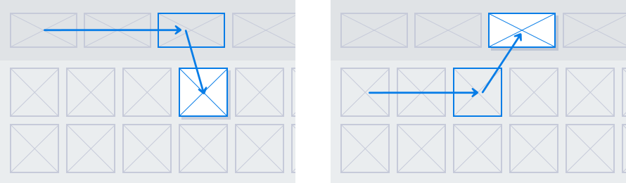
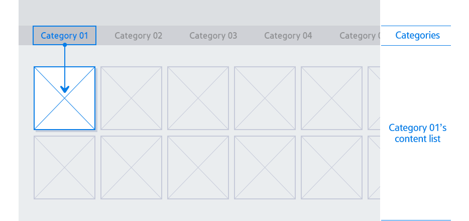
Content List Immediately Displayed When a Category is in Focus
The first item in a content list should be in focus when focus moves from the category area to the content list.
The current category should be in focus when focus moves from the content list to the category area. Then, when focus moves from the category area back to the content list without any focus movement in the category area, the previously focused item in the content list should be in focus again.
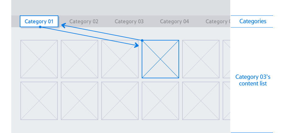
Content List Displayed When a Category is Selected
The previously focused item in the content list should be in focus when focus moves from the category area to the content list after users moved focus in the category area but did not select another category.
Figure 8: Example of focus movement between the category area and content list without a category change
The first item in a content list should be in focus when focus moves from the category area to the content list after users selected another category in the category area.
Figure 9: Example of focus movement from the category area to the content list after changing the category
Touch and Mouse
Applications can provide a more versatile user experience by supporting touch and mouse interactions. While the Smart Remote is the primary input method, the following interactions should be implemented to ensure consistent usability across the various input.
Basic Interaction
The following table defines the interaction types for touch and mouse inputs and their respective fuctions.
Interaction
Definition
Description/Function
Touch
Mouse
Tap
Click
Briefly touch/press and release once.
Selects and item or activates a function.
Double Tap
Double Click
Two quick successive taps or clicks.
Zooms in/out or opens a file/folder.
Hold
Hold
Keeping contact or pressing for a set duration.
Enters edit mode or displays context menus or previews.
—
Right Click
Pressing the secondary mouse button.
Displays context menus or previews.
—
Hover
Positioning the pointer over an element without clicking.
Displays tooltips help text, or preview states.
Move
Move
Changing the location of the point of contact or cursor.
TOUCH: Scrolls or pans the view or a list. MOUSE: Moves the cursor.
Drag & Drop
Drag & Drop
Moving an item while maintaining contact.
Reorders items or moves objects between locations.
Flick
—
A quick, light brushing motion.
Rapidly scrolls through long lists or switches pages.
Pinch In/Out
—
Moving two fingers together or apart.
Zooms in/out.
3 Fingers Tap
—
Tapping with three fingers at once.
Goes back to the previous screen
Edge Swipe
—
Swiping from the edge of the screen toward the center.
Triggers system-level features.
—
Wheel Scroll
Rotating the mouse wheel up or down.
Navigates vertically or horizontally through content.
Table 2: Basic interaction types
Return and Exit
Users must be able to return to the previous screen or exit the application using touch or mouse interactions on all screens.
Navigation UI Components
You must provide explicit Return and Exit button UIs on the screen to ensure navigation is possible without a remote control.
Dismissing Partial UIs (such as Popups, Context Menus)
Tapping or clicking outside the boundaries of a partial UI (overlay) should dismiss it.
Data Persistence:
If the partial UI includes an explicit Cancel button, any changes made should not be saved upon dismissal.
If no Cancel button is provided, changes should be automatically saved upon dismissal.
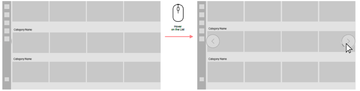
List Navigation Arrow for Mouse
For horizontal lists, provide navigation arrow buttons to ensure content accessibility via mouse.
Display Logic
Arrow buttons must be provided at the sides of a list when there are items that are not currently displayed on the screen.
Arrows should be shown for both directions if the list is scrollable. If no further items are available in a certain direction, the corresponding arrow button must be displayed in a disabled (dimmed) state.
Interaction and Behavior
The buttons are interactive using mouse clicks only.
Clicking an arrow button triggers page-wise navigation (scrolling by one full set of visible items).
Scope
This policy applies exclusively to horizontal lists. Navigation arrow buttons are not required for vertical lists, as they can be navigated using the mouse wheel.
Manage Your Cookies
We use cookies to improve your experience on our website and to show you relevant
advertising. Manage you settings for our cookies below.
Essential Cookies
These cookies are essential as they enable you to move around the website. This
category cannot be disabled.
Company
Domain
Samsung Electronics
developer.samsung.com, .samsung.com
Analytical/Performance Cookies
These cookies collect information about how you use our website. for example which
pages you visit most often. All information these cookies collect is used to improve
how the website works.
Company
Domain
Samsung Electronics
.samsung.com
Functionality Cookies
These cookies allow our website to remember choices you make (such as your user name, language or the region your are in) and
tailor the website to provide enhanced features and content for you.
Company
Domain
Samsung Electronics
developer.samsung.com, google.account.samsung.com
Preferences Submitted
You have successfully updated your cookie preferences.