Samsung Smart TV provides a user experience that differs completely from that of other familiar devices, such as mobile devices and desktop computers. Users will experience something new while using their TVs.
The following key factors must be taken into account when designing a user experience suitable for TV Applications.
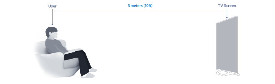
1. The average distance between a TV and its viewers is 3 meters (10 ft).
Traditionally people lean back and relax while watching TV. They are not used to complex screen layouts and controls.
TV screens are generally larger than mobile devices and desktop computer monitors, but are viewed from a greater distance. Legibility must be considered for this distance. The size of text and other elements must be adjusted accordingly.
2. Four-directional navigation is the fundamental TV control.
Navigation must be possible using only the following controls: Four-direction navigation, focus selection, return, and exit application.
Since the application is used at a distance, the control feedback must be instant and distinct.
When applying a pointer navigation system, the pointer must be large enough on the screen for the user to easily see it. Complex and detailed navigation must be avoided. The areas that can be pointed at must be large and clearly identifiable.
3. TV is used by more than one person.
Situations when more than one person is using the device must be taken into account.
For applications that may show personal information, precautionary privacy measures must be provided.
For applications that require a sign-in, it must be clear who the signed-in user is.
When necessary, it must be easy for signed-out users to sign back in.
Application Design Principles
Smart TV applications should adhere to the following design principles:
Simplicity
A more complicated application is not necessarily a better application. The layout should be user-friendly with clear, easy to access features that are arranged in a convenient way.
The layout should be simple. Unnecessary screen levels must be removed. Going into different levels and getting out again must be easy and obvious.
Applications should not require a separate guide or a manual.
Clarity
The most crucial factor when designing a TV application is to include clear and accurate navigation for user operations.
If navigation is ambiguous, users will feel confused and insecure. They are likely to close the application, and may never use it again.
In short, users should always know exactly where they are within an application. Move, Return, Enter, and other basic navigation functions must be clear. The users should be able to use the operations they want with these actions.
User Control
The control method must account for the control device, and an intuitive layout must be provided accordingly. In order to achieve this, the button names and icons on the remote control must match the actions that occur on the screen.
The movements that occur on the screen must be in the direction expected by the user. Overall, there must be a consistency in movement specifications.
Consistency
Consistency is closely related to improvements in usability and learnability. When using a new application, experience with a similar application will ensure fast learning.
It's not always possible to use the same UI for every application, because each application has unique traits. Ensuring the consistency of the components detailed below, however, enables users to become familiar with common controls, and to use applications more easily.
Consistency of Controls
There are no major restrictions on button, voice control, and motion assignments. But following the function guidelines helps users to quickly and easily learn how to operate an application.
Consistency of Screen Layout
The screen should be laid out to effectively provide information in each application. Maintain the screen layout recommended in the Guidelines for the content type and application characteristics to ensure a familiar user experience.
Consistency of Navigation
The application must be consistent overall with all of the necessary basic navigation features such as four-direction navigation, going into levels, or returning to the previous screen on the content list.
Feedback
When displaying items that can be selected using the focus, the status of the items must be displayed in a manner that allows the users to easily identify the difference between an item that is focused on, or one that has been selected by a remote control operation, such as pressing the SELECT button.
When the time required to open an application or load data exceeds certain period, a loading animation must be displayed to provide visual confirmation that the screen will soon change according to user's request.
Aesthetic Considerations
Aesthetically pleasing design makes applications look simple to use, while also increasing the chances of them being used again. Also it's effective in helping users have a positive experience.
Applications designed specifically for use on a TV must pay particular attention to the associated TV-specific design factors such as color, resolution, and screen composition, which are different from those applied to desktop computers and mobile device environments.
Better User Experience
For a better user experience, note the following considerations:
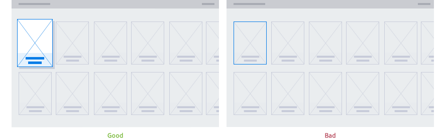
Focus
The Focus is the element that highlights a selectable component and signifies the user’s current on-screen location. The form in which the Focus is displayed may vary, depending on the component. However, consistency within the application is required.
A clear and highly visible Focus helps the user to quickly recognize their current on-screen location, and eases navigation.
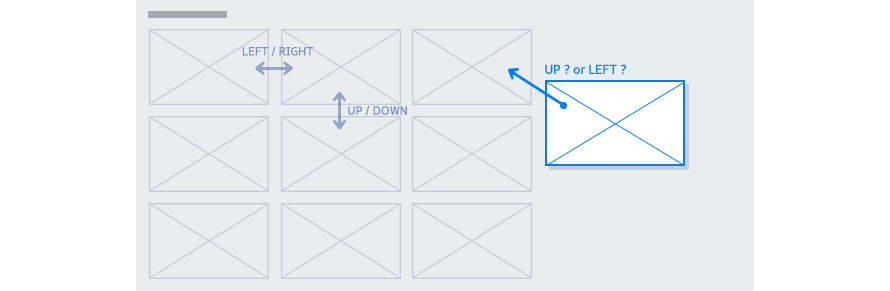
Navigation
Navigational movements must be predictable.
The layout of the components that are selectable by the Focus is especially important. In a TV control environment, where the most basic control is a four-directional control, using a grid is the best way to minimize confusion. If the layout has diagonal placements such as in Figure 1-3, then the user will be confused as to where their button presses will navigate next.
Manage Your Cookies
We use cookies to improve your experience on our website and to show you relevant
advertising. Manage you settings for our cookies below.
Essential Cookies
These cookies are essential as they enable you to move around the website. This
category cannot be disabled.
Company
Domain
Samsung Electronics
developer.samsung.com, .samsung.com
Analytical/Performance Cookies
These cookies collect information about how you use our website. for example which
pages you visit most often. All information these cookies collect is used to improve
how the website works.
Company
Domain
Samsung Electronics
.samsung.com
Functionality Cookies
These cookies allow our website to remember choices you make (such as your user name, language or the region your are in) and
tailor the website to provide enhanced features and content for you.
Company
Domain
Samsung Electronics
developer.samsung.com, google.account.samsung.com
Preferences Submitted
You have successfully updated your cookie preferences.