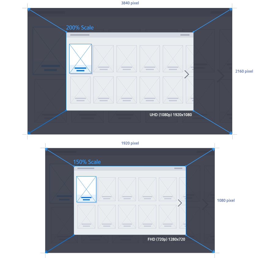
The resolution of an application affects the clarity of scale, text, and images of its components on the TV screen. For details, refer to Figure 4-1.
A higher resolution results in higher picture quality on the TV screen. The required resolution for the Samsung Smart TV application is 1920x1080 pixels for UHD, and 1280x720 pixels for FHD.
When using image file with a resolution other than the default App resolution, it may cause image quality deterioration.
It's recommended to use a resolution image of default size (e.g. 1920x1080 pixels)
Using a high resolution may affect the application size and performance. It is recommended that you test run your application on a TV and check for performance.
Typography
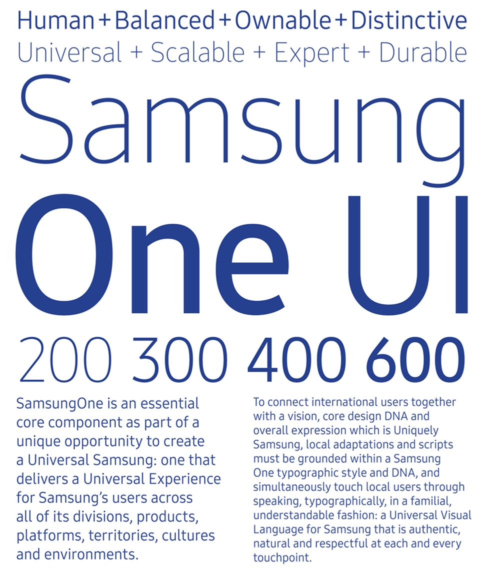
Samsung One UI
Samsung One UI is a new font for Samsung Smart TVs.
It is also the default font used by all Samsung Tizen operating systems.
Weights
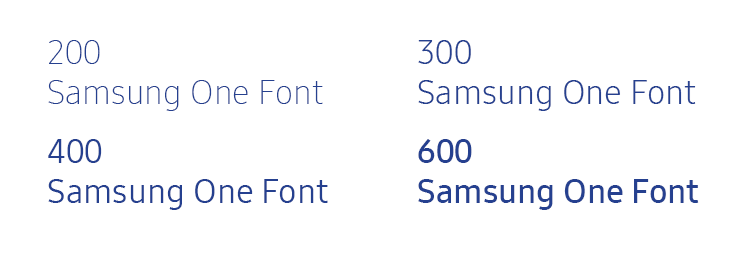
Different weights are necessary to present text for various purposes. Samsung One UI has four weights so that you can make your application more aesthetically pleasing by using these four weights consistently.
Each weight is assigned a number instead of being given a name, such as medium. This is to allow other weights to be easily added to the current group in the future.
Samsung One UI has four weights: 200, 300, 400, and 600
Language Coverage
Samsung One UI currently supports 86 languages. Additional languages may be available later.
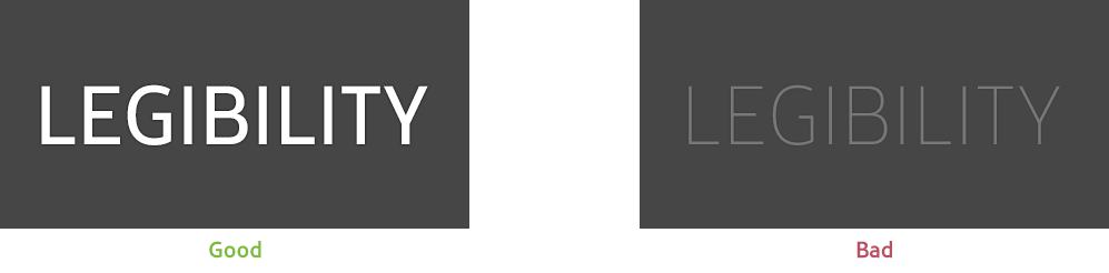
Legibility
Legibility is the most important factor in typography. Text should be legible on all screens.
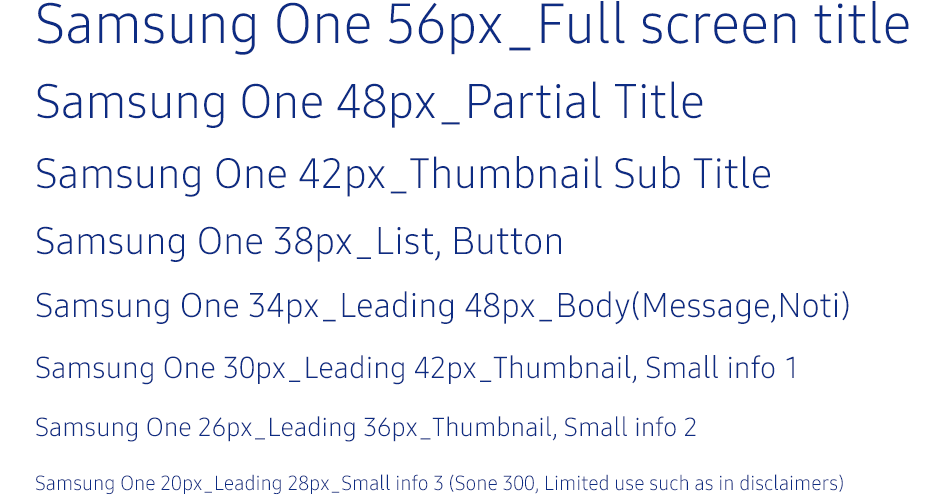
Sizes
We recommend that you use the set of font sizes illustrated below. On a special screen that is not related to any other screens, you can use font sizes other than the ones listed below. However, they should not be smaller than the smallest font size shown below.
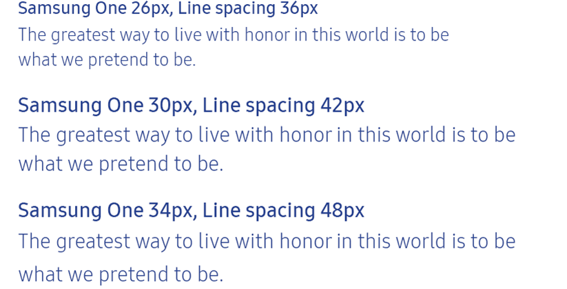
Leading
We recommend that you keep line spacing at 1.2 or 1.4 times larger than the font size being used. We also recommend that you keep the line spacing specified in Figure 4-6 when you use the provided font sizes.
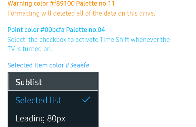
Colors
We recommend that you use the font colors shown below for warning messages, highlighted text, and selected items.
Categories and Layouts
Apps can be designed into a few levels of information to effectively explain their details and features. Depending on the application’s characteristics, categories can be displayed horizontally in the top right-hand corner of the screen, or vertically at the left-hand side of the screen.
Horizontal Style
This is the method most generally used on the TV.
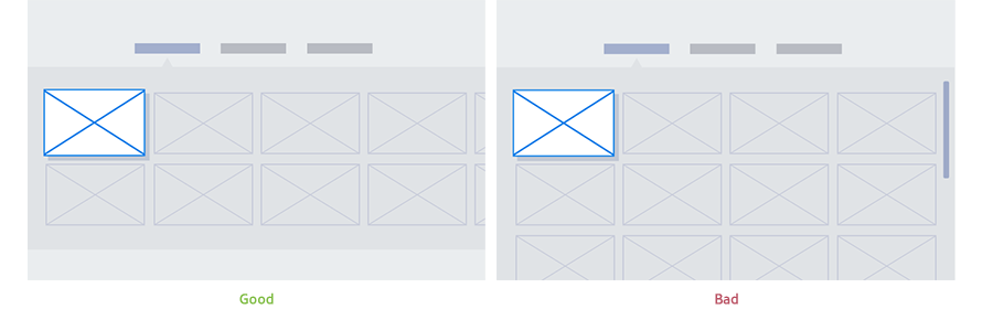
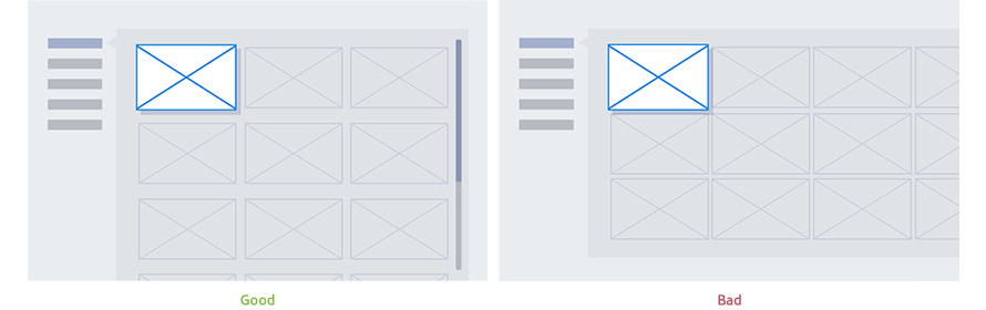
Figure 4-8 (Left) shows that the items are listed horizontally at the top of the screen. This content list will employ horizontal navigation and the content will be arranged from left to right.
Figure 4-8 (Right) shows what happens when there are too many rows in the content list to use a horizontal layout. The use of four-directional focus movement may be difficult, impeding movement between the list of content and the categories. For this reason, we do not recommend this type of layout.
Vertical Style
For applications with several or variable number of categories, the vertical style format may be more useful.
Figure 4-9 (Left) shows that the categories are displayed vertically at the left-hand side of the screen. You may freely use up-down scrolling on categories or a list of content.
Figure 4-9 (Right) shows what happens when there are too many columns in the content list to use a vertical layout.
The use of four-directional focus movement may be difficult, impeding movement between the list of content and the categories. For this reason, we do not recommend this type of layout.
Content List Configuration
Content lists can be designed freely, using thumbnails, text, etc. The following two methods are, however, the most commonly used.
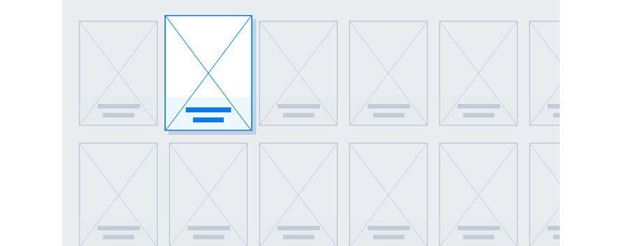
Grid Style
This style is ideal for contents to which thumbnail information such as pictures and videos are crucial. The grid style typically contains thumbnails and content names.
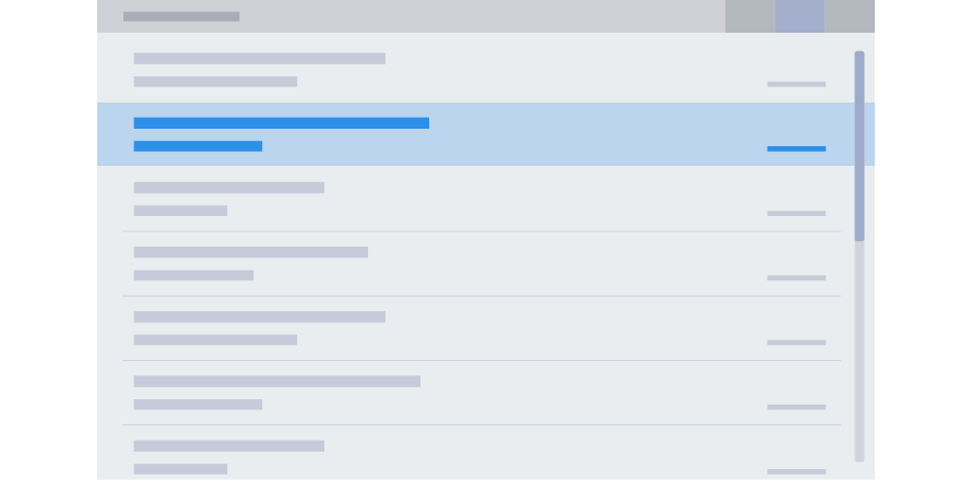
List Style
The ideal format for simple text content. It typically contains content titles and related textual information.
Content List Navigation
Navigation of the content list is divided into moving focus and fixed focus methods.
Moving Focus
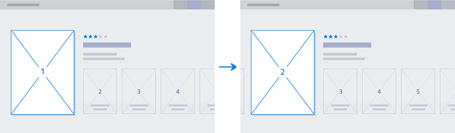
The list is fixed on the screen. The focus moves from one content item to the next.
Fixed Focus
The focus is fixed on the screen. The list moves, similar to a scrolling action.
Table 4-1 lists the benefits of each navigation type.
Moving Focus
Fixed Focus
Characteristics
Easily corresponds with various input devices, such as the Smart Remote, Motion Control, and mouse.
The visual effects required are not as complex as for the Fixed Focus method.
Useful when displaying additional information for the item currently focused on.
The entire content list moves during navigation, which gives a grander visual effect.
Table 4-1. Characteristics of Moving Focus and Fixed Focus
Position Indicators
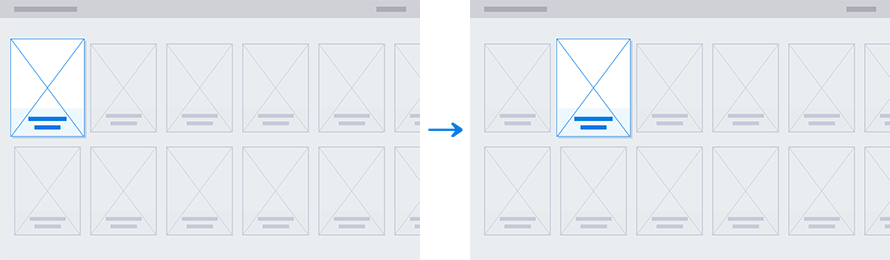
When it is necessary to scroll through a long list, a scroll bar will appear to show the current position in the list.
The length of a scroll bar is determined by the number of scrollable objects.
A scroll bar cannot appear on restricted user interface areas.
When users enter a page where scrollable objects exist, an scroll bar appears for 2 second. For pages that includes two or more auto rollover areas, when the page opens, all scroll bars appear simultaneously for 1 second.
Figure 4-14. Scroll bar shown when a page is open
A scroll bar only appears on the right or at the bottom of a list being scrolled currently. The scroll bar appears while the list is being scrolled and disappears 1 seconds after scrolling stops.
Figure 4-15. Scroll bar shown when a list is being scrolled
A scroll bar should always appear next to the text lists or body text when they are scrollable.
Progress Indicators
When opening an application or loading data takes a long time (100 ms or longer), users must be clearly informed that their request is being processed. There must be visual confirmation that the screen is going to change soon. Once it is displayed, it must not disappear until the task is complete.
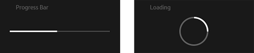
The notification needs to include an image and a message. The message should be accurate and detailed about the current task. If possible, it is useful to show an animation such as a progress bar, as shown in Figure 4-17, to show how much of the process has been completed and how much is left to go. When it is not feasible to show the progress or ETA, use a loading indicator as shown in Figure 4-18.
Figure 4-17. Progress bar
Figure 4-18. Loading Indicator
If the animation for the progress bar or the indicator slows down the process, using a text-based message to explain that the task is in progress is an acceptable substitute.
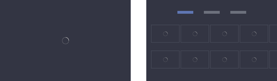
The notification is generally shown in the center of the screen, as shown in Figure 4-19 But to show that only a part of the screen is progressing, the notification can be shown at the center of the item that is loading, as shown in Figure 4-20. However, keep in mind that multiple notifications on a single screen will look cluttered and can confuse the users.
Figure 4-19. Guide to the overall screen
Figure 4-20. Guide to a portion of the screen
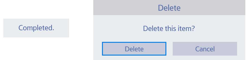
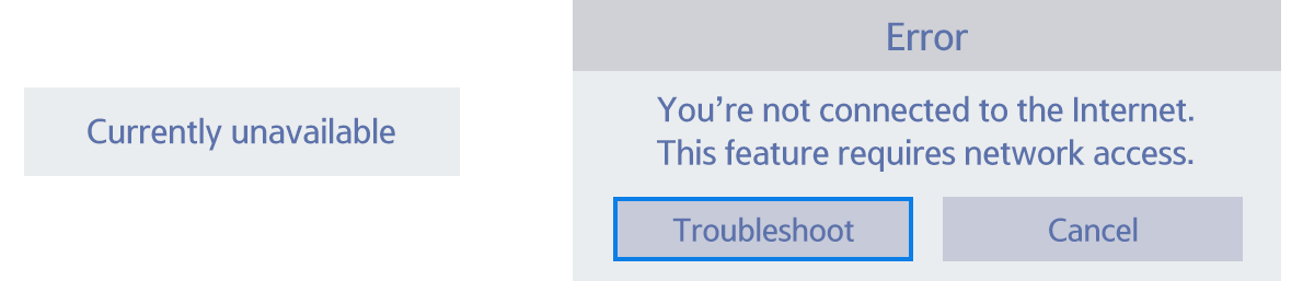
Pop-up Window
A pop-up window is used to let users perform actions related to the current task or notify them of the current system status.
A pop-window always appears on top of other content as it uses a separate UI.
When a pop-up window is displayed, all areas outside the pop-up window become unavailable and appear dimmed. Thus, any actions from user controls do not affect the area outside the current pop-up window.
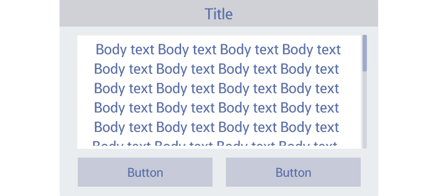
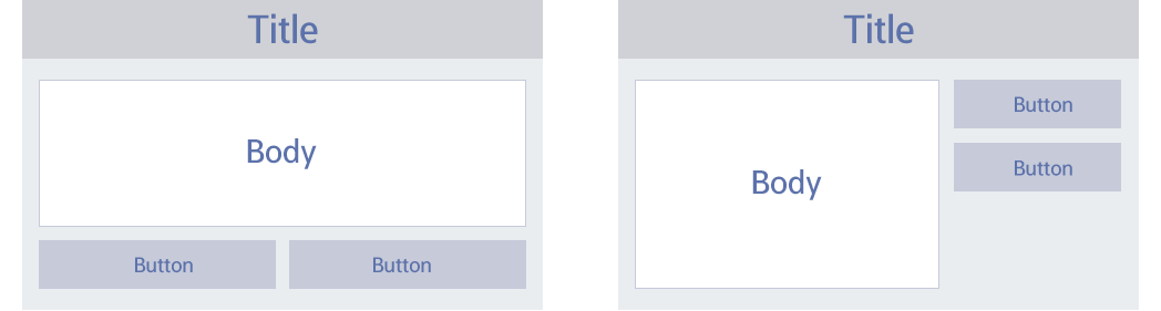
A pop-up window generally consists of components, such as the title, body, and buttons, as shown in Figure 4-21.
The purposes of pop-up windows are classified as follows:
Message
Action
Toast
By default, a pop-up window automatically disappears when the user is inactive for a certain period. For the recommended duration of pop-up windows, refer to Table 4-2.
Pop-up Type
Duration
Message, Action
60 seconds
Toast
3 seconds
PIN, Unusual information
Do not disappear automatically
Table 4-2. Screen duration for each pop-up type
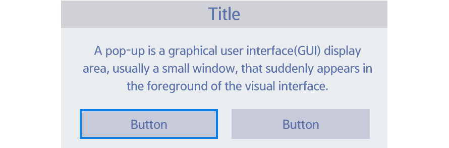
Message
A message pop-up window is used to display error messages, status information, and the result of users’ actions, or to ask for confirmation. With this pop-up window, users can also proceed to the next step.
A button to close the pop-up window should be included and it should be the final button in the button list (rightmost in a horizontal layout and bottommost in a vertical layout).
Action
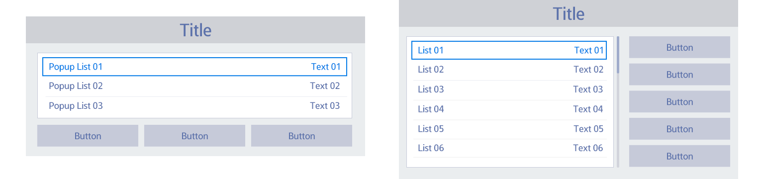
An action pop-up window is used to allow users to change values or customize various settings.
In general situations, users can continue the ongoing task without being taken to other screens.
The body area can be composed of a combination of various components, such as a list, buttons, and check boxes, that allow the user to adjust values.
When an action pop-up window is displayed, the first item in the body area is in focus.
Generally, buttons are located at the bottom of the pop-up window. However, if the pop-up window contains a long list of vertical items, buttons may be located on the right of the pop-up window.
A button to close the pop-up window should be included and it should be the final button in the button list (rightmost in a horizontal layout and bottommost in a vertical layout).
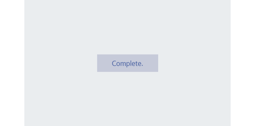
Toast
A toast pop-up window is used to display simple messages or the results of the user's actions that do not require further user actions or confirmations.
Toast pop-up windows should appear around the component where the user’s last action occurred. This helps users easily find and check information without having to look for it. However, if the screen that the user’s last action occurred on is already closed or the toast message is not related to the user’s last action, toast pop-up windows should appear in the center of the screen.
Unlike other pop-up windows, a toast pop-up window only consists of the body area and it does not make other components unavailable, meaning they are still controllable while the toast pop-up window is displayed on the top.
Feedback to Users’ Actions and Error Alerts
Users should be provided with the results of the most recent action to prevent them from making mistakes and to be informed of the current status of the system. A message or toast pop-up window can be used depending on whether the operation can be restored, and unnecessary or repeated alerts should be avoided.
When users encounter an error while using their TVs, they should be given information about why the error occurred and how to solve it. If users can fix the error on their TVs, a button should be provided to take them to the right place.
Manage Your Cookies
We use cookies to improve your experience on our website and to show you relevant
advertising. Manage you settings for our cookies below.
Essential Cookies
These cookies are essential as they enable you to move around the website. This
category cannot be disabled.
Company
Domain
Samsung Electronics
.samsungdeveloperconference.com
Analytical/Performance Cookies
These cookies collect information about how you use our website. for example which
pages you visit most often. All information these cookies collect is used to improve
how the website works.
Company
Domain
LinkedIn
.linkedin.com
Meta (formerly Facebook)
.samsungdeveloperconference.com
Google Inc.
.samsungdeveloperconference.com
Functionality Cookies
These cookies allow our website to remember choices you make (such as your user name, language or the region your are in) and
tailor the website to provide enhanced features and content for you.
Company
Domain
LinkedIn
.ads.linkedin.com, .linkedin.com
Advertising Cookies
These cookies gather information about your browser habits. They remember that
you've visited our website and share this information with other organizations such
as advertisers.
Company
Domain
LinkedIn
.linkedin.com
Meta (formerly Facebook)
.samsungdeveloperconference.com
Google Inc.
.samsungdeveloperconference.com
Preferences Submitted
You have successfully updated your cookie preferences.