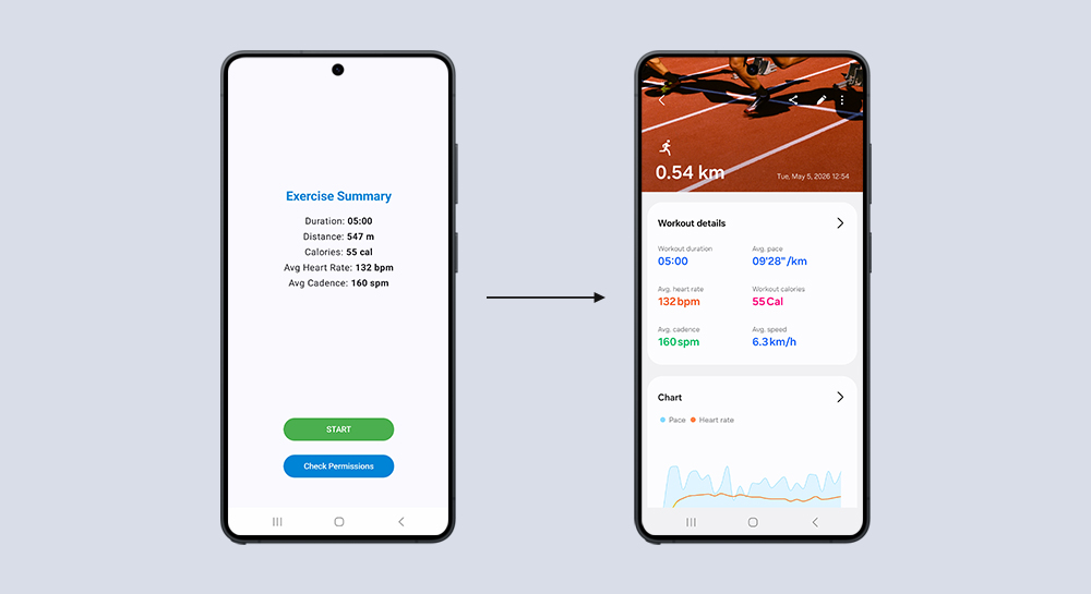
Health
Write exercise data to Samsung Health
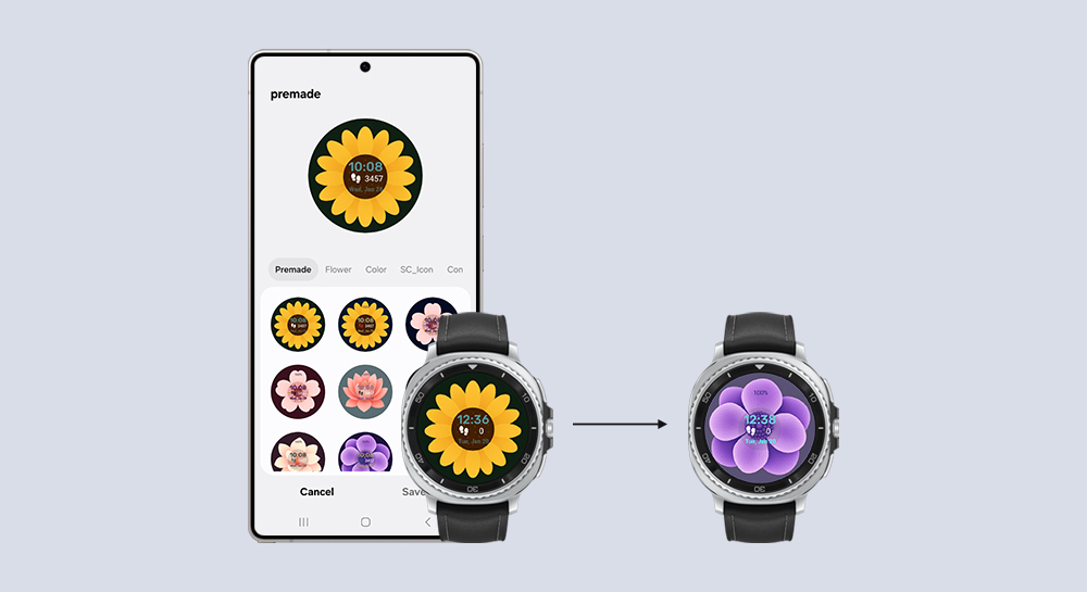
Watch Face Studio
Create multiple premade watch face designs in a single project
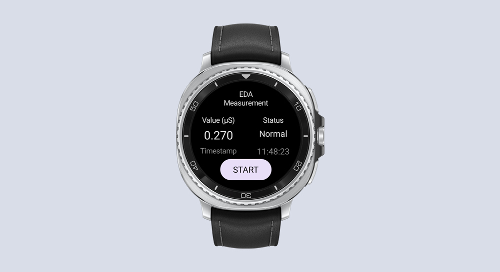
Health
Measure electrodermal activity on Galaxy Watch
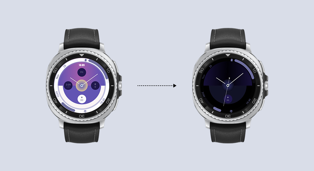
Watch Face Studio
Optimize your watch face design
Watch Face Studio
Apply motion graphics to your watch face using tag expressions and gyro effects
In-App Purchase
Implement in-app subscriptions using Samsung IAP
Watch Face Studio
Design a watch face with customizable edge complication slots and digital clock
In-App Purchase
Add Samsung In-App Purchase service to your app
Watch Face Studio
Get creative with weather data in Watch Face Studio
SDC24
Health
Build a health app with steps from Samsung Health and its connected wearables
SDC24
Health
Access rich sleep data from Samsung Health measured by Galaxy wearables
SDC24
SmartThings
Create a SmartThings Edge Driver for an IoT bulb
SDC24
SmartThings
Develop a SmartThings Find-compatible device
SDC24
SmartThings
Test Edge Drivers using SmartThings Test Suite
SDC24
Health Research Stack
Establish a health research system using Samsung Health Research Stack
SDC24
Samsung Pay
Samsung Wallet
Integrate Samsung Pay Web Checkout with merchant sites
SDC24
Samsung Pay
Samsung Wallet
Integrate Samsung Pay SDK Flutter Plugin into merchant apps for in-app payment
SDC24
Samsung Wallet
Utilize Add to Samsung Wallet service for digital cards
SDC24
Samsung Wallet
Verify your ID with Samsung Wallet
SDC24
Automotive
Create an Android Automotive Operating System (AAOS) app with payments via Samsung Checkout
Watch Face Studio
Apply gyro effects to a watch face using Watch Face Studio
SmartThings
Matter: Create a virtual device and make an open source contribution
SmartThings
Matter: Build a Matter IoT app with SmartThings Home API
Galaxy Z
Develop a widget for Flex Window
Samsung Pay
Samsung Wallet
Integrate In-App payment into merchant apps using Samsung Pay SDK
GameDev
Optimize game performance with Adaptive Performance in Unity
GameDev
Galaxy Z
Implement Flex Mode into a Unity game
Watch Face Studio
Customize styles of a watch face with Watch Face Studio
Watch Face Studio
Galaxy Z
Customize Flex Window using Good Lock plugin on Watch Face Studio
Health
Measure skin temperature on Galaxy Watch
Health
Transfer heart rate data from Galaxy Watch to a mobile device
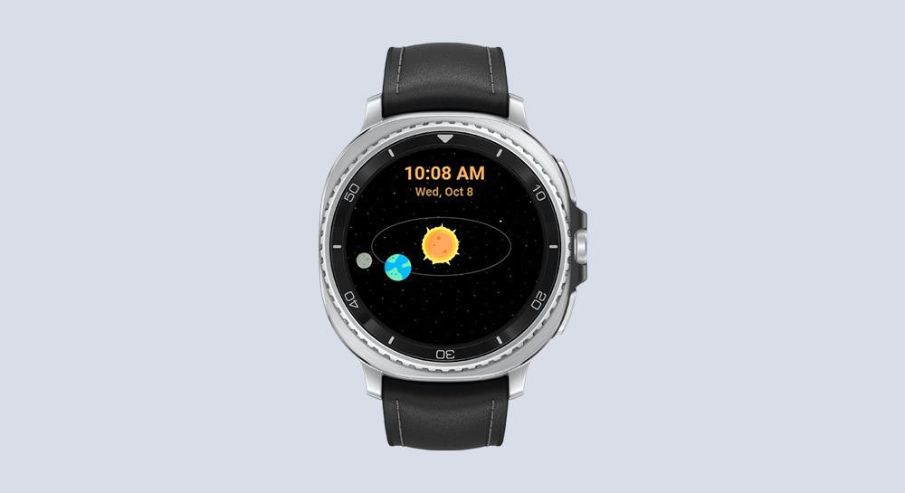
Watch Face Studio
Design a Watch Face using Mask and Moon Phase Tags
Bixby
SmartThings
Control a Smart Bulb
Watch Face Studio
Apply Conditional Lines on Watch Faces
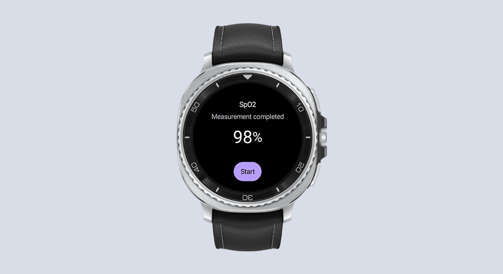
Health
Measure blood oxygen on Galaxy Watch
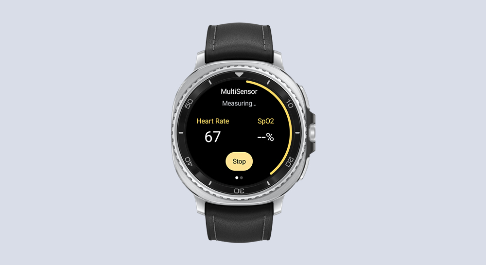
Health
Measure blood oxygen and heart rate on Galaxy Watch
Galaxy Z
Implement Multi-Window Picture-in-Picture on a Video Player
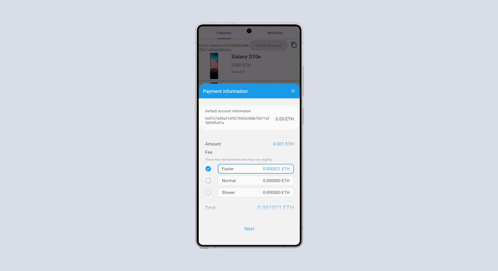
Samsung Blockchain
Transfer ERC20 Token with Blockchain App
Galaxy AR Emoji
GameDev
Use AR Emoji on Games and 3D Apps
GameDev
Galaxy Z
Implement Flex Mode on an Unreal Engine Game
SmartThings
Integrate IoT Devices into the SmartThings Ecosystem
Watch Face Studio
Create a Watch Face Using Tag Expressions
Galaxy Z
Implement Flex Mode on a Video Player
Galaxy Z
Implement App Continuity and Optimize Large Screen UI of a Gallery App
Galaxy Z
Configure an App to Enable Copy and Paste in Multi-Window
Galaxy Z
Configure an App to Enable Drag and Drop in Multi-Window
Samsung Blockchain
Develop a Blockchain Shopping App