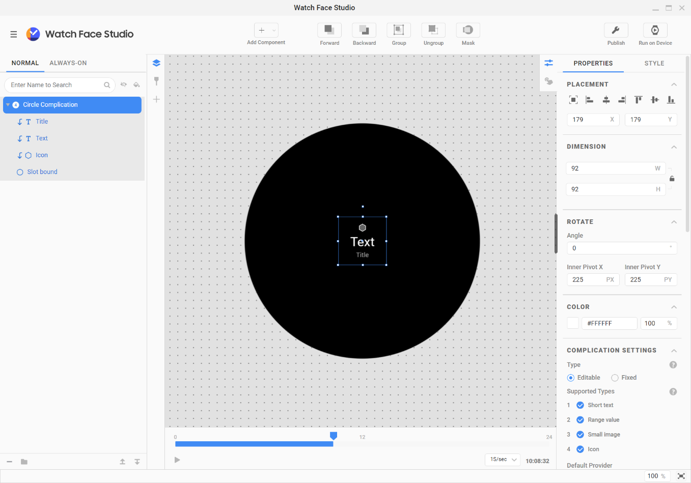
This guide describes the main tools and UI in Watch Face Studio (WFS).
Figure 1. Watch Face Studio UI
Tools
The WFS interface has a button bar that contains various tools.
Figure 2. WFS button bar
Add Component: Open a dropdown list of components you can add to your watch face.
Forward: Move the selected component to the front of the canvas.
Backward: Move the selected component to the back of the canvas.
Group: Group multiple components together so they can be controlled as one component.
Ungroup: Ungroup a group of components.
Mask: Cover all or part of a group of layers based on the shape outline of the bottom-most layer in the group.
Diagnosis: The Diagnosis dialog box opens, allowing you to see the minimum SDK version and memory usage of the current watch face project.
Publish: Open the publication dialog to prepare your watch face files for uploading to the Play Store.
Run on Device: Scan for and connect to an actual watch device connected to the same WiFi network as your computer, and preview the watch face on it.
Components
Add as many different components as you want to your watch face. You can also use a customized design source for your components. For example, you can display heart rate or step count data with a text component or add a custom image to launch an application.
Watch face canvas
The canvas is the bottom layer of the watch face. You can set its background color.
The canvas is cropped to a circle by default. To use a rectangular canvas, uncheck the Apply circular crop option in the Properties tab. In this case, the watch face shape is determined by the device on which it is installed.
Figure 3. Canvas with circular crop Figure 4. Canvas without circular crop
Component types
The following components are available for watch faces.
Text
Text fields hold normal text by default. Normal text is static and does not change. In the Properties tab for your text field, you can change the text field from normal text to data text. Data text changes and is populated based on tags.
To create text that curves with the watch face, select the Apply Curved-Text option.
Figure 5. Creating curved text
Determine the curve of your text by setting the Width (W) and Height (H). Changing W and H automatically changes the dimension of your text component. To determine the position of your text, select a range preset. You can also define a custom range by specifying the Start point and Angular distance. Set the direction of your text to either clockwise (CW) or counter-clockwise (CCW).
Image
Import custom images.
Shape
Add various shapes, including rectangles, rounded rectangles and ellipses. You can specify a shape's inner color and opacity, and its border’s thickness, color, and opacity.
Progress bar
Add a progress bar to your watch face to track various activities. You can select from a linear or circular progress bar. To determine the position of your progress bar, select a range preset. You can also define a custom range by specifying the Start point and Angular distance. Set the direction of the progress bar to either clockwise or counter-clockwise.
Animation
To create an animation on your watch face using a sequence of images:
Create an animation sequence with a design program, such as Adobe Flash or Adobe Premiere.
In WFS, select Add Component > Animation.
Select the animation sequence images from the file browser, then select Open.
Edit the animation by changing the order of the images, removing images, or adding images.
Figure 6. Editing an animation
To define when you want your animation to play, configure the trigger value.
To start the animation as soon as the watch face is shown, set the trigger value to WatchFace on. You can also choose from other options, such as Tap, Every Sec, Every Min, and Every Hour. You can also delay the start by a specific number of seconds.
Figure 7. Defining the animation trigger
You can also configure various additional animation options:
Auto replay immediately repeats the animation upon completion until an interruption occurs, such as turning the screen off.
Repeat delay sets a delay between iterations of the repeated animation.
Resume Playback determines whether to resume the animation or start from the beginning when play is stopped because of an interruption, such as receiving a notification or a phone call.
Hide before playing determines whether to hide the animation until play is triggered.
Hide after finished determines whether to hide the animation when play is completed.
Multimedia
To add an animated image file, such as an AGIF or WebP image:
In WFS, select Add Component > Multimedia.
Select the file from your file browser, then select Open.
To define when you want your animation to play, configure the trigger value.
Keep in mind that the file size, image resolution, and number of frames in the multimedia image can affect device performance and battery consumption. Multimedia images are loaded asynchronously during operation and can be delayed when playing, depending on the capabilities of the user’s watch and various characteristics of the image.
Analog watch
An analog watch provides 6 hands: hour, minute, and second hands, and additional hands for special effects, such as shadows.
Figure 8. Analog watch
All clock hands are supplied with an image that you can change using the Swap image menu. Other components cannot be added inside an analog watch combination, but you can group the analog watch and other components together. Each clock hand's style is shown as merged in the Customization Editor.
To optimize battery use, keep these components to a minimum.
Digital clock
You can select from various digital clock shapes. Digital clock components work based on fixed sync and cannot be edited. You can add hours, minutes, and seconds expressions individually, or in predefined combinations.
Figure 9. Digital clock
Each of these 5 digital clock expressions is considered a single component with a single layer.
HH, MM, and SS represent the hour, minute, and second, respectively. You can also enable the Leading Zero option to display a “0” in front of single-digit values. HH can optionally sync to the watch's 12-hour or 24-hour display setting. SS is not displayed on devices in Always-on mode.
For the combinations HH:MM and HH:MM:SS, only the HH part has the Leading Zero option. It can also optionally sync to the watch's 12-hour or 24-hour display setting. SS is not displayed on devices in Always-on mode. For HH:MM, you can optionally use a blinking colon to represent ticking seconds.
To optimize battery use, use HH, MM, and HH:MM only as needed.
Figure 10. Digital clock
The time expressions by individual digit, (H)(H), (M)(M), and (S)(S), are single components consisting of 2 layers each. Properties such as the location and font for each digit can be configured separately for more customization. (H)(H) offers the Leading Zero option, and can optionally sync to the watch's 12-hour or 24-hour display setting. (S)(S) is not displayed on devices set to Always-on mode. You can optionally use a blinking colon to represent ticking seconds.
ICU Date and Time
Figure 11. ICU Date and Time
WFS uses the ICU date format and offers frequently used date combinations to support date expressions suitable for your locale.
Index
Figure 12. Index
You can automatically create as many indexes as you want with your own images and place them anywhere.
View more
Figure 13. View more
Analog hands
Open the file browser to select an image file to import for each hand.
Analog clock hands have a Rotation property, which has various options:
Sync with
Time Zone
Rotate
Value
Movement Effect
To define the time interval or condition for the analog hand movement, configure the Sync With option:
Hour in Day
Minute in Hour
Second in Minute
Day of Month
Month of Year
Day of Week
Day of Year
Conditions: Moon Phase Position, Moon Phase Type
When the hand is set to sync with Second in Minute (in other words, it is a second hand), the Sweep movement effect is available.
Clock
This is a clock expression that uses a tag expression in a text component. The default display for digital time is HOUR_1_12_Z:MIN_Z:SEC_Z.
Date
This is a date expression that uses a tag expression in a text component. The default display format for dates is DAY_WEEK_S, MON_S DAY_1_31_Z.
Component management
Manage your components using the WFS tools. You can add, group, ungroup, and order components on your watch face.
Add components
Add a supported component using the Add component (+) button.
Figure 14. Adding components
When you add a component, it is placed in a default position on the canvas. The component is automatically selected so you can easily modify it.
Group or ungroup components
A group is a combination of one or more components. All components can be grouped. Groups can be ungrouped.
Figure 15. Grouping components
Mask or unmask components
When you use a mask group, the shape of the bottom-most layer determines the visible area of the mask group. The layers above it appear only through the shape outline of the bottom layer.
For example, if you place a square image in the bottom layer and an image and an animation in the layers above it, the image and animation appear only through the square outline of the bottom layer.
Figure 16. Creating a mask
To create a mask group:
Select the layers you want to group.
Select Mask from the button bar or right-click the layers and select Mask.
To unmask (release) the mask group:
Select the mask group.
Select Unmask from the button bar or right-click the layers and select Unmask.
Note:When the bottom-most layer of the mask group is deleted, the mask group is automatically released.
Diagnosis
You can see the minimum SDK version and memory usage of your watch face project.
Checking Memory Usage
Install the Memory Usage Plugin on Watch Face Studio to view the watch face's memory usage.
See Memory Usage Plugin for more information.
Minimum SDK Version Information
You can see the minimum SDK version (Android API level) of your watch face project. The minimum SDK version is automatically determined based on the features or components used. If your watch face uses new features supported by the latest version of Watch Face Format, a list of those new features is provided along with the minimum SDK version information.
See the Watch Face Format Guide for more information about the features added to Watch Face Format version 2.
Watch Face Format (WFF) version
WFS version
Minimum SDK version
Version 1
1.4.13 and higher
30
Version 2
1.7 and higher
34
Table 1. Watch Face Format version and minimum SDK version
Note:
The following features of WFF version 2 are supported in WFS 1.7 and higher.
Weather
ICU Date and Time component: Last Updated (Weather), and Hour and Day added to Time Source
Analog watch component: Sync to Device added under Update Frequency, and Sweep added under Movement Effect in Second Hands Settings
Ranged Value complication that supports color ramp
Preview area
The preview area is your main working area when designing your watch face.
Add all watch face elements to the canvas in the preview area. On the canvas, drag elements into position and resize, arrange, and rotate them.
Figure 17. Preview area
Layer list
The layer list displays the components and groups shown in the preview area. Each component has its own layer by default.
Figure 18. Layer list
Within the layer list, you can:
Search: Search for a layer by name.
Show or Hide: Show or hide layers, toggling their visibility in the preview area.
Theme color: Toggle the theme colors.
Rename: Rename a layer by double-clicking the layer name.
Note:By default, when you add a new component, a new layer is placed at the top of the list. Layers added within a group are placed at the top of the group.
By right-clicking a layer, you can:
Lock or Unlock: Lock the layer to its position on the canvas or unlock it so it can be moved.
Group or Ungroup: Group multiple components together so they can be controlled as one component or ungroups a group of components.
Mask or Unmask: Cover all or part of the other layers based on the shape outline of the bottom layer or remove the layer from a mask group.
Swap image: Move the image file from one layer to another. Only shown for images.
Layer color: Define a color label for the layer to differentiate between layers in the layer list.
Conditional lines
Conditional lines let you show and hide components on a watch face and control the components' behavior. Use conditional lines to change the appearance of your watch face in response to certain conditions, such as time, step count, battery, or event.
When you add a component, the time condition is set by default. To adjust these conditions, click the condition icon on the desired layer. To set your conditional to repeat, right-click the frame area and select Loop.
Figure 19. Adding conditional lines
Keep in mind that layers that are not displayed do not reduce performance or affect battery life.
You can set your watch face to respond to the time, step count, battery status, event or weather, as described in the following sections.
Note:Each layer responds to only one type of condition. For example, if a layer is set to change according to step count, any existing monitoring of other conditions stops.
Time
Your watch face can change dynamically based on time intervals. For example, your watch face can be bright during the day then gradually darken after a set time. You can set the time to be measured in hours, minutes, or seconds.
To add a time condition:
Create the layers to be displayed conditionally.
In the timeline, for each layer, set the time periods to control when each layer is displayed. Click and drag the start and end handles to define a time range. To create another time range for the same layer, double-click and drag from the start time to the end time.
To preview your changes, use the Run panel and the time control slider.
To display different watch faces for a 12-hour setting and a 24-hour setting based on the chosen setting on the user’s phone:
Add two digital clock components, the first component for the 12-hour version and the second for the 24-hour version.
Place them in the same position.
Add 12-hour and 24-hour conditions to the components' conditional lines.
Set time periods to show the first digital clock component for the 12-hour layer in the 12-hour format and to show the other layer in the 24-hour format.
Time control
The time control slider lets you see your watch face in action. Use this to preview how your watch face changes throughout the day. Drag the slider to specific times or view your watch face animations by using the play and fast-forward buttons.
Figure 20. Time control and preview
Step count
You can design your watch face to change dynamically according to the user's step count. For example, you can create a watch face that changes based on the percentage of the daily step goal that has been achieved.
Battery
You can design your watch face to change dynamically according to the watch's available percentage of battery life.
Event
You can design your watch face to change dynamically according to the device state, such as low battery or unread notifications. To do so, select the desired event and the image or animation you want to display during that event.
Figure 21. Event condition
Weather
You can design your watch face to dynamically change according to weather conditions. For example, you can set your watch face to lighten on a sunny day and dim on a cloudy day.
Figure 22. Weather condition
Properties tab
Each component has a range of modifiable properties. For example, you can change the color of the numbers on a digital clock or choose whether the watch hands measure hours, minutes, or seconds.
Figure 23. Properties tab
Action options
The Action options within the Properties tab enable interaction with your watch face. For example, you can let the user tap a component to change images or open other applications.
Figure 24.Action options
Color
Apply a specific color to your component or save a theme color for the watch face. For complications, the initial color theme is grayscale.
Colors can be specified as either Solid or Gradient type (Linear, Radial, Sweep). Singular components, such as the Progress bar, can also be expressed in Gradient type or different colors.
Table 1. Components and Gradient type options
Image appearance
Modify an image's appearance using the following controls:
Hue controls the tone of the color.
Saturate makes the image color more or less vivid.
Lightness causes the image colors to be lighter or darker.
Note:Because these functions replace the pixels of the added image, they are processed before the other color functions, such as Apply theme color.
Text appearance
Use the Text appearance options to define the text alignment and font style. To decorate the text, in the project settings, select Add Bitmap Font. If you want to use the default font size among the bitmap fonts added to the project, select Apply Default Font Size.
Figure 25. Modifying text appearance
Style tab
Use the Style tab to modify the style of the selected layer. You can define image styles and theme color palettes that the user can choose from to customize their watch.
Figure 26. Style tab
Image style
Styles can be added for image-based layers, such as image, multimedia image, index, and hand component layers. The watch face supports up to 10 image styles.
To add an image style to the selected layer, in the Style section, add a file of the same type as the existing image in the layer.
Theme color palette
Theme color palettes can be defined in the Style tab. Each palette can have up to 3 colors. The watch face supports up to 30 theme colors.
You can assign the theme color for the selected layer in different ways:
From the Layer list, cycle through the 3 theme colors with the “Apply Theme Color” icon.
Figure 27. Assigning theme color from Layer list
From the Properties tab, select “Apply Theme Color” and define which of the 3 colors to apply from the theme color palette.
Figure 28. Assigning theme color from Properties tab
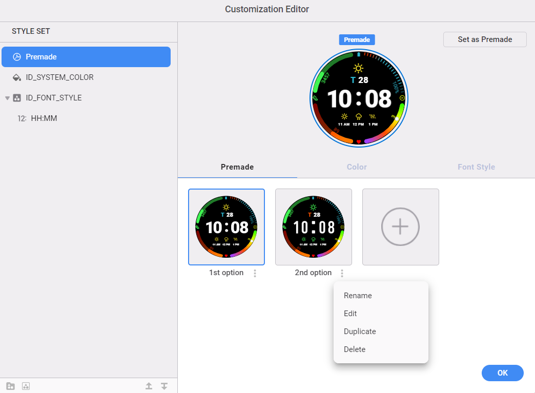
Customization Editor
The Customization Editor in WFS enables you to refine, organize, name, and preview the styles you have defined for the watch:
You can combine components so that they change styles at the same time and define the order in which the styles appear on the device.
Figure 29. Customization Editor
Left area
Allows you to create and manage style sets. You can create a style set by merging styles and other components, and add and remove style set elements.
You can drag and drop to change the order of merged style sets and their display options.
You can define the names of merged style sets and their options using text IDs.
Right area
Allows you to preview the merged style defined in the left area. You can see how the device customization looks when applied.
You can modify the thumbnail images to be shown on the device for the display options of merged components. You can also drag and drop to change the order of the display options.
Figure 30. Customization Editor
You can select the text ID for the style name to be displayed on the watch. You can also create a new text ID and select it. A style set with this text ID supports localized text according to the device's language settings in the customization screen. You can create and modify text IDs directly from the Customization Editor. Text IDs can also be edited from the text ID management menu.
Figure 31. Defining a style name
You can test your style combinations, style display order, and style name in the Customization Editor preview.
Font Style
You can add a font style to the digital clock component. Select a font type for the selected layer and add a style.
Figure 32. Add Font Style
You can set font style options in Customization Editor and adjust the font style options in the run panel to run the watch face.
Figure 33. Setting Font Style
Run
To preview how your watch face looks along a timeline, use the Run panel in WFS. You can select a device shape and adjust the time, date, device battery level, user step count, user heart rate, and gyro values to test how your watch face looks in different circumstances. Styles such as unread notifications count, tag expression, and conditional lines, which are configured in the Customization Editor, can be adjusted. Additionally, various conditions related to hourly and daily weather forecasts, including temperature unit, temperature, weather condition, chance of rain, and UV index, can also be adjusted. The Run preview can be set to show the active or always-on (ambient) mode.
Figure 34. Run panel and settings
When previewing the always-on mode, WFS displays the current on-pixel ratio and provides an analysis tool that enables you to analyze each screen along a timeline.
To open the Run preview in a separate window, select the “Preview Watch Face” button.
Figure 35. Always-on mode preview
For information on testing your watch face on an actual device, see Test your watch face.
Photo slot
Shows single or multiple photos, set using the companion app. Introduced in Wear OS 6.
You can select when to change photo in the Properties tab:
When watch face is tapped (Default on)
When watch wakes (Default off)
Premade
A Premade specifies a set of configuration values, grouped as a preset.
Combine styles and components to create premades in the Customization Editor. Premades are activated when you create at least one in addition to the default watch face. Typically, the user can choose from these Premades in the companion app.
Figure 36. Premade
You can manage premades in the Premade tab of Customization Editor. The default watch face has been added on the premade. If you don't add more premades, only default watch face is provided and no premade available for this watch face.
Premade Menu:
Duplicate: The premade name is automatically generated with "copy" after the original watch face name.
Add: When you add premade, the premade is automaticallly duplicated with the default watch face and add from that.
Set as premade: Set this preview as premade.
Edit, Delete, Rename
Manage Your Cookies
We use cookies to improve your experience on our website and to show you relevant
advertising. Manage you settings for our cookies below.
Essential Cookies
These cookies are essential as they enable you to move around the website. This
category cannot be disabled.
Company
Domain
Samsung Electronics
developer.samsung.com, .samsung.com
Analytical/Performance Cookies
These cookies collect information about how you use our website. for example which
pages you visit most often. All information these cookies collect is used to improve
how the website works.
Company
Domain
Samsung Electronics
.samsung.com
Functionality Cookies
These cookies allow our website to remember choices you make (such as your user name, language or the region your are in) and
tailor the website to provide enhanced features and content for you.
Company
Domain
Samsung Electronics
developer.samsung.com, google.account.samsung.com
Preferences Submitted
You have successfully updated your cookie preferences.