One UI relies on rich, solid colors to create a sleek modern look. The brightness and saturation of these colors all fall within particular ranges (below) to ensure users can identify and read the most important information on the screen at any given time.
The color palette used for One UI app icons continues into the apps to provide a cohesive experience. So, the green from the Phone app icon also appears on its call button, selected tab, scrollbar, and more. Of course, the brightness and saturation can be adjusted based on where the color appears and how important it is.
For full screens, a rich warm gradient helps add delight to the experience and makes it feel less abrupt. We don't want to make a blue screen of death.
Backgrounds in One UI use simple, calm colors that are visually comforting and help users focus on content.
Default mono tone
In focus blocks for settings, images, or other content, One UI uses monotone colors in both Light and Dark mode.
Default
Alternative : Filling focus blocks with full bleed images.
Alternative gradient
One UI gradients use either a detailed pattern or combination of analogous colors to achieve their distinctively simple, sophisticated color scheme.
Structure
Calm colors are used in large areas for visual comfort, while bright and distinctive colors are used for small areas to give an uplifting impression.
Attention flow
Color gradients intuitively show users what they need to tap next and what info they need to pay attention to.
Focus block color
Focus blocks should use subdued color tones so they don't distract. That said, you can still use colors in focus blocks to make content more meaningful or help users understand content more clearly. There are 3 types of focus block colors, and each has their own color standards.
Functional and practical, type 1 is the most frequently used color for focus blocks.
Use the gradation type (Type 3) with caution because it can make the screen more complex and distract users.
Type 1
Standard, simple monotone colors for function-driven content like message lists
Type 2
Light colors taken from the app's color scheme for on/off toggles (brightness adjusted for both Light and Dark modes)
Basic system color
Blue symbolizes trust, hope, and stability, and it's also a key part of Samsung's heritage and brand identity. We selected a bright, optimistic shade of blue for the main color applied to all One UI's major components. To ensure optimal readability in both Light mode and Dark mode, we adjust this shade of blue in 3 ways.
Primary dark
Light theme
Dark theme
#0072de
#3e91ff
The background colors of contained buttons for LIght theme and Dark theme
Sub text colors for Light theme and Dark theme
Primary
Light theme / Dark theme
#0381fe
Floating action buttons
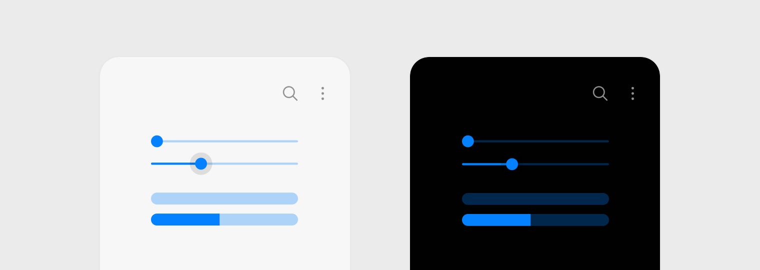
Sliders
Color control activated
Light theme / Dark theme
#3e91ff
Checkboxes
On/off toggles
Informative color
For One UI, we considered the meaning and connotations of the colors to make sure functional components are easy to recognize and intuitive to use. To keep make sure users can always accomplish tasks easily, we also made sure function components have the same color in both Light mode and Dark mode.
1
Notification
2
Accept
3
Reject
Manage Your Cookies
We use cookies to improve your experience on our website and to show you relevant
advertising. Manage you settings for our cookies below.
Essential Cookies
These cookies are essential as they enable you to move around the website. This
category cannot be disabled.
Company
Domain
Samsung Electronics
developer.samsung.com, .samsung.com
Analytical/Performance Cookies
These cookies collect information about how you use our website. for example which
pages you visit most often. All information these cookies collect is used to improve
how the website works.
Company
Domain
Samsung Electronics
.samsung.com
Functionality Cookies
These cookies allow our website to remember choices you make (such as your user name, language or the region your are in) and
tailor the website to provide enhanced features and content for you.
Company
Domain
Samsung Electronics
developer.samsung.com, google.account.samsung.com
Preferences Submitted
You have successfully updated your cookie preferences.