One UI uses blur, dim, and shadow effects to create a hierarchical structure that helps users focus on important information. These effects shouldn't be used excessively or distract from important content. High-priority information should be presented at the top.
When a new screen isn't related to the previous one, blur and dim effects are applied to the previous screen to keep users focused. However, if the new screen is closely related to the previous one, then only the shadow effect is applied to the previous screen so that the two screens appear connected.
Depth type and attributes
Blur
The blur effect helps emphasize the current information while maintaining a connection with what was shown previously. Using the blur effect in combination with the white dim effect in basic light mode delivers a clean, bright, and lively impression.
The blur effect should be applied evenly throughout the background and combined with the light dim or dark dim effect depending on the current theme. This allows users to consistently and clearly distinguish different types of information.
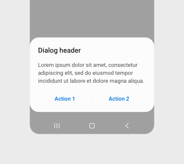
Light theme
Dark theme
Appropriate use of the blur effect creates a soft, comfortable impression and enhances readability. Distinguishing information becomes less effective if the blur effect is too weak and the hierarchical structure becomes less clear if the blur effect is too strong. Instead of using blur alone, use it together with the dim effect to enhance readability.
Dim
The dim effect helps clarify the individual levels of the hierarchical structure, while focusing attention on the element located at the highest level. This effect should be evenly applied across multiple screens so that switching between screens feels natural.
The dim effect should only be used to help users easily distinguish different types of information. To ensure a clear information structure, don't expose multiple levels of structure on a single screen.
Shadow
One UI provides simple structure and style. A soft shadow effect can be used to show connections between information while maintaining the hierarchy. Shadow should not be seen as having 3D depth because this would create excessive length or contrast.
Strong contrast between the shadow and background makes the shadow stand out too much, interfering with focus on information. The shadow effect should be applied lightly and cleanly to focus attention on the layered information.
Repeated and combined use of the shadow and dim effects can increase visual fatigue and bring down the overall impression of the screen. Avoid applying the dim effect and shadow effect at the same time.
Manage Your Cookies
We use cookies to improve your experience on our website and to show you relevant
advertising. Manage you settings for our cookies below.
Essential Cookies
These cookies are essential as they enable you to move around the website. This
category cannot be disabled.
Company
Domain
Samsung Electronics
developer.samsung.com, .samsung.com
Analytical/Performance Cookies
These cookies collect information about how you use our website. for example which
pages you visit most often. All information these cookies collect is used to improve
how the website works.
Company
Domain
Samsung Electronics
.samsung.com
Functionality Cookies
These cookies allow our website to remember choices you make (such as your user name, language or the region your are in) and
tailor the website to provide enhanced features and content for you.
Company
Domain
Samsung Electronics
developer.samsung.com, google.account.samsung.com
Preferences Submitted
You have successfully updated your cookie preferences.