This topic describes how you can optimize your application for the Samsung TV text-to-speech (TTS) voice guide feature. The TTS feature is helpful for users with visual limitations, since they can have difficulty using textual on-screen TV features.
Samsung TVs support the accessibility toolkit (ATK) as part of the Web engine. If the user has activated the voice guide feature, the text-to-speech (TTS) engine can read HTML elements on the application screen.
NoteNot all TV models support the voice guide feature.
To support the voice guide feature in your app:
You must set automatic focus to an HTML element when the app is launched.
To achieve this, set HTML’s autofocus attribute on one of the app’s elements.
NoteThis API must be used, otherwise, voice guide will behave unexpectedly when launching the web app.
To test the voice guide feature:
On the TV, select "TV Menu > System > Accessibility > Voice Guide > On".
Use the remote control to move focus to an application screen element. The voice guide reads the content inside the focused HTML element, including its child elements. For example:
In the following example, the voice guide says: "TTS Test".
<div id="test" tabindex="-1" >TTS Test</div>
document.getElementById("test").focus(); // javascript
// OR
$("#test").focus(); // jQuery
In the following example, the voice guide says: "TTS Test, Second Element".
<div id="test" tabindex="-1" >
  TTS Test
  <div> Second Element.</div>
</div>
By default, the voice guide reads content in the focused HTML element in the following order:
Name
The element name and description are calculated using the rules defined in Accessible Name and Description Computation, although older Web engines do not follow the specification completely.
Role
To inform the TTS engine that an HTML element has description information, define a role for the element using the ARIA role attributes. If an HTML element does not have a defined role attribute, the Web engine maps a role to it based on the W3C standard HTML Element Role Mappings.
Description
Additional information to be read by the voice guide can be implemented using ARIA states and properties.
Inferring Names for HTML Elements
If an HTML element does not have a defined name or label, the Web engine can calculate a name from the element content, if the defined role supports it. Only some roles support calculate a name from content
The following examples show how an HTML element can be assigned a name from its content:
In the following code, the outer div element does not have a role defined. The voice guide says: "Section".
In the following code, the "button" role is defined for the outer div element. Since the "button" role supports name from content, the voice guide says: "Featured button".
For compatibility with older TV Web engines that do not fully support the W3C specification, since Tizen 3.0, you can define an empty role attribute (role=""). The voice guide calculates the element name from the content, and does not say a role name. In the following code, the voice guide says: "Featured".
NoteIf you assign the value "-1" to the tabindex attribute, the element can only be focused using JavaScript, and not with the "Tab" key. If you want to implement sequential navigation with the "Tab" key, the tabindex attribute must have a positive value. Since there is no "Tab" key on a remote control, you must consider how to implement focus movement.
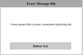
The following popup window uses the tabindex attribute to make the button focusable with JavaScript. When the button in the popup has focus, the voice guide says: "Error Message title, Lorem ipsum dolor sit amet, consectetur adipisicing elit, Button Text, select to close".
<div id="popup" class="popup">
  <div id="popupTitle" class="title">
    Error Message title </div>
  <div id="popupText" class="text">
    Lorem ipsum dolor sit amet, consectetur adipisicing elit.
  </div>
  <div id="popupButton" role="button" tabindex="-1" class="button">
    <div aria-labelledby="popupTitle popupText"></div>
    <div class="">Button Text</div>
    <div aria-label=", select to close."></div>
  </div>
</div>
In general, you do not need to implement additional code to handle enabling and disabling the voice guide in your application, since it is handled with the TV menu setting. However, you can check whether the voice guide is enabled.
To check whether the voice guide is enabled, use the getMenuValue() method with the TvInfoMenuKey.VOICE_GUIDE_KEY property:
// Returns "true" if voice guide is enabled
webapis.tvinfo.getMenuValue(webapis.tvinfo.TvInfoMenuKey.VOICE_GUIDE_KEY);
To be notified when the voice guide is switched on or off:
var listenerId = '';
var onChange = function() {
  // Gets true or false status
  webapis.tvinfo.getMenuValue(webapis.tvinfo.TvInfoMenuKey.VOICE_GUIDE_KEY);
};
try {
  listenerId = webapis.tvinfo.addCaptionChangeListener(webapis.tvinfo.TvInfoMenuKey.VOICE_GUIDE_KEY, onChange);
  console.log("listener id = " + listenerId);
} catch (error) {
  console.log(" error code = " , error);
}
ARIA Role Attribute Support
This section describes the support for various ARIA role attributes and their behavior, as implemented in NVDA for Windows® computers and on Tizen. The behavior descriptions are based on the example scenarios provided.
Move focus to the input field. NVDA says: "Guess a number between 1 and 10, editable, blank".
Tizen
Tizen 4.0:
Not supported. The voice guide says: "Guess a number between 1 and 10, entry, editable". Because there is no browsing mode, all standard input events go through to the Web application.
Tizen 3.0:
Same behavior as on Tizen 4.0.
Tizen 2.4:
Not supported. The voice guide says: "Guess a number between 1 and 10, entry, press OK button to edit". Because there is no browsing mode, all standard input events go through to the Web application.
NVDA says: "State combo box, autocomplete, editable, blank".
Press the "Down" arrow key.
The drop-down list appears, with the first descendant activated. NVDA reads the active descendant and the edit box value: "Alabama, 1 of 56. State combobox, autocomplete, editable, Alabama".
Tizen
Tizen 4.0:
When the "State" combo box has focus, the voice guide says: "State drop-down list, showing 0 item".
When the drop-down list appears, the first descendant is activated, and the voice guide reads: "Alabama". Since sequential navigation with the "Tab" key is not supported on TVs, navigate between list items with the "Up" and "Down" arrow keys.
To select an item from the list, click the remote control "Done" key, and use the "Left" or "Right" arrow key to move focus away from the combo box.
Tizen 3.0:
When the combo box has focus, the IME appears with focus. The voice guide reads the IME input.
Tizen 2.4:
When the "State" combo box has focus, the voice guide says: "State drop-down list, press OK button to open the menu". Instead of showing the drop-down list, clicking the remote control "OK" key opens the IME.
Clicking the "Down" arrow key navigates out of the combo box.
When focus is on the combo box open button, clicking "OK" shows the drop-down list and focus moves to the combo box. However, clicking any arrow key moves focus away from the combo box.
In "Example 1: Simple List of Links", move focus to the first grid item. NVDA says: "Related Documents, table with 1 row and 6 columns".
Tizen
Tizen 4.0:
When a grid item has focus, the voice guide only reads the grid item content.
To navigate within the grid, use the arrow keys. However, JavaScript consumes the arrow key events, so you must consider how to implement navigating away from the grid.
Within the Web browser, navigation between grid items can have unintended behavior, such as focus moving twice when the arrow key is clicked once.
Because grid is a composite UI element, and there is no "Tab" key on a remote control, you must consider how to implement focus movement to descendants.
Tizen 3.0:
Same behavior as on Tizen 4.0.
Tizen 2.4:
Not supported. When a grid item has focus, the voice guide only reads the grid item content.
Within the list box, when navigating or selecting items, aria-activedescendant changes to the currently-focused item, but DOM focus stays on the list box element.
Tizen
Tizen 4.0:
To navigate within the list box, use the arrow keys. However, JavaScript consumes the arrow key events, so you must consider how to implement navigating away from the list box.
In "Example 2: Multi-Select Listbox", clicking "OK" does not change the checkbox state.
Within the Web browser, navigation between list items can have unintended behavior, such as focus moving twice when the arrow key is clicked once.
Because listbox is a composite UI element, and there is no "Tab" key on a remote control, you must consider how to implement focus movement to descendants.
Tizen 3.0:
Same behavior as on Tizen 4.0.
Tizen 2.4:
Not supported. Focus moves only to the static text element.
Note: Focus cannot be moved away from the menu using the arrow keys.
Tizen
Tizen 4.0:
When "About" has focus, the voice guide reads: "About".
To unfold a menu, click "OK" or use the arrow keys.
JavaScript consumes the arrow key events, so you must consider how to implement navigating away from the menu.
Within the Web browser, navigation between menu items can have unintended behavior, such as focus moving twice when the arrow key is clicked once.
Because menu and menubar are composite UI elements, and there is no "Tab" key on a remote control, you must consider how to implement focus movement to descendants.
Tizen 3.0:
Same behavior as on Tizen 4.0.
Tizen 2.4:
When "About" has focus, the menu unfolds, and the voice guide says: "About menu".
When "Facts" has focus, the sub-menu unfolds, and the voice guide says: "Facts menu".
When focus is moved away from the menu using the arrow keys, the menu does not fold.
Table 16. "menu", "menubar, and "menuitem" attribute behavior
To navigate between the radio items, use the arrow keys.
When a radio item has focus, it is selected. When "Regular crust" is selected, NVDA says: "Pizza Crust group, Regular crust radio button, checked, 1 of 3".
Note: Focus cannot be moved away from the radio group using the arrow keys.
Tizen
Tizen 4.0:
To navigate between the radio items, use the arrow keys.
When a radio item has focus, it is selected. However, JavaScript consumes the arrow key events, so you must consider how to implement navigating away from the radio group.
When "Regular crust" is selected, the voice guide says: "Regular crust selected".
Within the Web browser, navigation between list items can have unintended behavior, such as focus moving twice when the arrow key is clicked once.
Because radiogroup is a composite UI element, and there is no "Tab" key on a remote control, you must consider how to implement focus movement to descendants.
Tizen 3.0:
Same behavior as on Tizen 4.0.
Tizen 2.4:
When "Regular crust" has focus, the voice guide says: "Regular crust not selected, radio button".
Moving focus to a radio item with the arrow keys does not select the item.
Focus can be moved away from the radio group using the arrow keys.
To navigate through the list box items, use the arrow keys.
The scrollbar moves as list items become visible.
Note: Focus cannot be moved away from the list box using the arrow keys.
Tizen
Tizen 4.0:
To navigate through the list box items, use the arrow keys.
The scrollbar moves as list items become visible.
Since there is no "Tab" key on the remote control, and JavaScript consumes the arrow key events, you must consider how to implement navigating away from the menu.
Within the Web browser, arrow key navigation can have unintended behavior, since JavaScript uses the key clicks to navigate the list, while the TV uses the key clicks to move focus.
Tizen 3.0:
Same behavior as on Tizen 4.0.
Tizen 2.4:
When "Neptunium" has focus, the focus is on the static text, and the voice guide says: "Neptunium".
To navigate through the list box items, use the arrow keys.
The scrollbar moves as list items become visible.
Focus can be moved away from the list box using the arrow keys.
When the slider is moved, the voice guide does not read the slider value or the aria-valuetext value.
Since there is no "Tab" key on the remote control, and JavaScript consumes the arrow key events, you must consider how to implement navigating away from the slider.
Within the Web browser, arrow key navigation can have unintended behavior, since JavaScript uses the key clicks to move the slider, while the TV uses the key clicks to move focus.
Tizen 3.0:
Same behavior as on Tizen 4.0.
Tizen 2.4:
The arrow keys do not move the slider.
The voice guide does not read the slider aria-valuetext value.
To change the spin button value, use the arrow keys.
NVDA reads the spin button value.
Note: Focus cannot be moved away from the spin button using the arrow keys.
Tizen
Tizen 4.0:
Not supported.
Since there is no "Tab" key on the remote control, and JavaScript consumes the arrow key events, you must consider how to implement navigating to and from the spin button.
When the spin button value is changed, the voice guide does not read the value.
Within the Web browser, arrow key navigation can have unintended behavior, since JavaScript uses the key clicks to change the spin button value, while the TV uses the key clicks to move focus.
Tizen 3.0:
Same behavior as on Tizen 4.0.
Tizen 2.4:
Not supported. Instead of changing the spin button value, the arrow keys move focus away from the spin button.
To move focus to the tab content, press the "Tab" key.
Tizen
Tizen 4.0:
When "Crust" has focus, the voice guide does not read the role. The voice guide says: "Crust".
Since there is no "Tab" key on the remote control, and JavaScript consumes the arrow key events, you must consider how to implement navigating away from the tab header.
Within the Web browser, arrow key navigation can have unintended behavior, such as focus moving twice when the arrow key is clicked once.
Tizen 3.0:
Same behavior as on Tizen 4.0.
Tizen 2.4:
Arrow key navigation can have unintended behavior, such as focus moving twice when the arrow key is clicked once.
Table 27. "tab", "tablist", and "tabpanel" attribute behavior
To navigate between visible tree items, use the "Up" and "Down" arrow keys.
NVDA says the item name, its state (expanded or collapsed, if applicable), and its position in the tree (for example, "1 of 6").
To navigate between tree levels:
To expand the currently-selected parent node, press the "Right" arrow key.
Focus moves to the first child item.
To collapse the currently-selected parent node, press the "Left" arrow key.
Focus moves to the previous parent node, if possible.
To expand or collapse the currently-selected parent node, press "Enter".
NVDA says the node state (expanded or collapsed).
To select the root parent node in the tree, press "Home".
To select the last visible node in the tree, press "End".
To navigate away from the tree, press the "Tab" key.
Tizen
Tizen 4.0:
The voice guide reads the node state, but when the node state changes, the voice guide does not read the updated state.
The voice guide does not read the item position.
Since there is no "Tab" key on the remote control, and JavaScript consumes the arrow key events, you must consider how to implement navigating away from the menu.
Within the Web browser, arrow key navigation can have unintended behavior, since JavaScript uses the key clicks to navigate the list, while the TV uses the key clicks to move focus.
Tizen 3.0:
Same behavior as on Tizen 4.0.
Tizen 2.4:
Not supported. Because the arrow keys move focus to the static text, tree nodes cannot be expanded or collapsed.
The voice guide does not read the node state or item position.
Table 32. "tree", "treegrid", and "treeitem" attribute behavior
ARIA State and Property Attribute Support
This section describes the support for various ARIA state and property attributes and their behavior, as implemented in JAWS for Windows® computers and on Tizen. The behavior descriptions are based on the example scenarios provided.
To move focus to the radio group, press the "Tab" key.
If no item is selected and the focus moves to the group, the first item receives focus. If an item is already selected and the focus moves to the group, the selected item receives focus, and pressing the "Tab" key again moves focus to the first item in the group.
When the "Deep dish" item has focus, JAWS says: "Pizza Crust, Deep dish radio button checked" (or "not checked").
Tizen
Tizen 4.0:
Same behavior as the reference implementation, but since there is no "Tab" key on a remote control, you must consider how to implement focus movement.
When the "Deep dish" item has focus, the voice guide says: "Deep dish selected" (or "not selected").
<script>
var isBusy = 1;
function update1() {
  if (isBusy == 1) {
    isBusy = 0;
    document.getElementById("test").setAttribute("aria-busy","false");
    document.getElementById("updateBusyButton").innerHTML="Update aria-busy tag, current is false";
  } else {
    isBusy = 1;
    document.getElementById("test").setAttribute("aria-busy","true");
    document.getElementById("updateBusyButton").innerHTML="Update aria-busy tag, current is true";
  }
}

var numFlag = 1;
function update2() {
  numFlag = numFlag + 1;
  document.getElementById("num").innerHTML=numFlag;
}
</script>

<div id="test" tabindex="0" aria-busy="true" role="" aria-live="polite">
  Test aria-busy, if aria-busy is true, content changes are not read
  <div id="num"> 1 </div>
</div>

<button id="updateBusyButton" onclick="update1();">Update aria-busy tag, current is true</button>
<button id="updateContentButton" onclick="update2();">Update test target content</button>
Implementation
Behavior
Reference
JAWS in Google Chrome™:
When the example page is loaded, aria-busy is true by default. Click "Update test target content". When the content changes, JAWS does not read the updated content.
Switch aria-busy to false by clicking "Update aria-busy tag, current is true".
Click "Update test target content". When the content changes, JAWS reads the updated content.
<h2>Input text field and textarea with the aria-readonly="true" attribute.</h2>
<div>
  <label for="textField3">First Name</label><br>
  <input type="text" id="textField3" value="Unknown" aria-readonly="true"></input>
</div>
JAWS says: "Fan, left-right slider, Off. To increase or decrease, use the yellow key".
aria-valuenow describes the slider value as a number, but aria-valuetext describes the slider value as text. If defined, the screen reader reads the aria-valuetext value.
Tizen
Tizen 4.0:
Not supported.
Tizen 3.0:
Not supported.
Tizen 2.4:
Not supported.
Table 64. "aria-valuenow" and "aria-valuetext" attribute behavior
Manage Your Cookies
We use cookies to improve your experience on our website and to show you relevant
advertising. Manage you settings for our cookies below.
Essential Cookies
These cookies are essential as they enable you to move around the website. This
category cannot be disabled.
Company
Domain
Samsung Electronics
developer.samsung.com, .samsung.com
Analytical/Performance Cookies
These cookies collect information about how you use our website. for example which
pages you visit most often. All information these cookies collect is used to improve
how the website works.
Company
Domain
Samsung Electronics
.samsung.com
Functionality Cookies
These cookies allow our website to remember choices you make (such as your user name, language or the region your are in) and
tailor the website to provide enhanced features and content for you.
Company
Domain
Samsung Electronics
developer.samsung.com, google.account.samsung.com
Preferences Submitted
You have successfully updated your cookie preferences.