DISTRIBUTION OF TIZEN-BASED WATCH APPS HAS BEEN DISCONTINUED
Touch
Touch is the watch’s basic interaction system, with taps and swipes used to navigate the interface. Ensure components have a sufficient touchable area, and that the space between components is large enough so that touchable areas do not overlap.
Interaction
Function
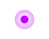
Tap
Action/select
Double tap
Zoom in or out
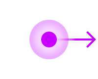
Swipe
Scroll left, right, up, or down
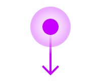
Bezel swipe down
Open Quick panel
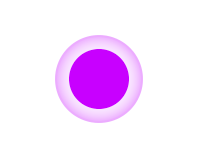
Touch and hold
Go to select mode
Tap
A tap is a light touch on the screen with a finger. Users tap to move between pages or to interact with a component on the screen. You can customize the tap gesture in your app and assign it to other functions.
Use tap to:
Move from one screen to another
Tap to move to a lower level in the hierarchy or to access a more detailed page.
Make a selection
Tap to select or deselect a confirm or cancel button, radio button, or checkbox.
Double tap
A double-tap is two light taps in rapid succession on the screen. Users double-tap to zoom in on the screen. You can also customize the double-tap gesture and assign it to other functions.
Zoom
Double-tap to temporarily increase the size of the font or of an image.
Swipe and drag
A swipe is the gesture where the user touches and moves a finger across the screen. It shifts or scrolls the screen according to the gesture’s velocity and direction. Users can swipe anywhere across the entire screen when the screen does not contain an on-screen target.
A drag is a gesture where the finger touches an on-screen target and moves it across the screen at a constant speed. It moves an on-screen target as much as the user’s finger indicates. A drag is sustained as long as the user maintains contact with the screen and ends when the finger is lifted.
A swipe is a less precise movement than a drag. You can customize the swipe gesture and assign it to various functions.
Move from one screen to another
Swipe to transition between pages or cards. Screens move in the same direction that the user swipes.
Scroll
Where content does not fit on one screen, swipe to scroll vertically or horizontally.
Refresh
Swipe down from the top of the screen to refresh content. This interaction is useful if your app deals with content in real-time. Show a loading indicator at the top of the screen when a screen is refreshing. See Update content for more details.
Tip :
When users swipe, show an indicator, circular scroll bar, or loading indicator as appropriate. These visual cues help users interact smoothly with the watch.
Watch top edge swipe-down
Swiping down from the watch’s top edge opens the quick panel. This gesture is not customizable. As a result, any other swipe-down navigation you add to your app may conflict with this gesture, causing users to open the quick panel by mistake.
Touch and hold (long press)
Users can touch and hold a list or an icon to begin selecting multiple items. You can also customize the touch and hold gesture to assign it to other functions.
Select multiple items
In select mode, users can select or deselect multiple items before deleting or sharing them.
Tip :
The number of selected items is displayed at the top of the screen. This visual cue gives users confidence that the system is responding to their input.
Palm touch
Covering your watch’s display with your fingers or the palm of your hand deactivates the screen. It can be activated again by pressing the Home or Back key. When a call comes in, a palm touch mutes the sound and deactivates the screen. It also snoozes and deactivates alerts.
Manage Your Cookies
We use cookies to improve your experience on our website and to show you relevant
advertising. Manage you settings for our cookies below.
Essential Cookies
These cookies are essential as they enable you to move around the website. This
category cannot be disabled.
Company
Domain
Samsung Electronics
developer.samsung.com, .samsung.com
Analytical/Performance Cookies
These cookies collect information about how you use our website. for example which
pages you visit most often. All information these cookies collect is used to improve
how the website works.
Company
Domain
Samsung Electronics
.samsung.com
Functionality Cookies
These cookies allow our website to remember choices you make (such as your user name, language or the region your are in) and
tailor the website to provide enhanced features and content for you.
Company
Domain
Samsung Electronics
developer.samsung.com, google.account.samsung.com
Preferences Submitted
You have successfully updated your cookie preferences.