DISTRIBUTION OF TIZEN-BASED WATCH APPS HAS BEEN DISCONTINUED
Notifications
Notifications deliver meaningful information from an app and smoothly connect users to the next required action.
Make your notifications glanceable
Notifications should deliver a clear message at a glance. Users should be able to check and understand information easily even while doing something else.
Connect users to the next step smoothly
Remember that users should be able to continue easily with any task suggested by a notification. For example, provide a link to the relevant app’s menu or allow user input on the notification itself.
Notification pop-up alerts
There are two types of alerts:
Full pop-ups appear when a notification arrives when the watch is turned off. Full pop-ups lead to corresponding notification cards, depending on user settings (that is Auto show details should be activated in the Galaxy Wearable -> Notifications -> Auto show details). Users can view details or perform a task on the notification card.
Small pop-ups appear at the top of the screen when the watch is active. These smaller pop-ups minimize interruptions to users’ workflow and take them to corresponding notification cards when tapped.
Notification board
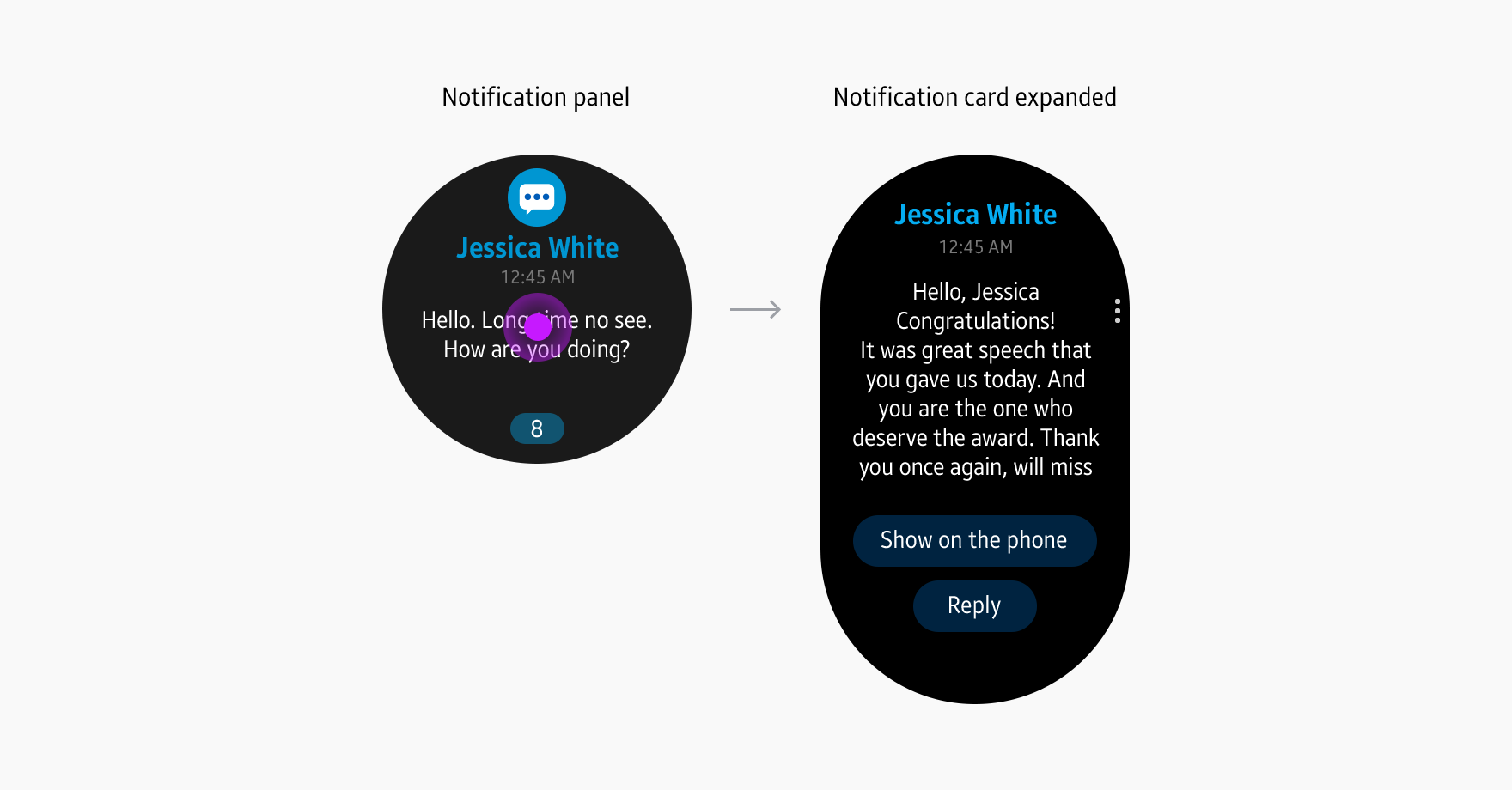
Notifications received on the watch appear on the notification board, located to the left of the watch face. Users can look through notification panels one by one, starting from the most recent. When they tap one of the panels, it expands into a notification card to show more details.
Notification panels
Notification panels display the title, part of the content, and the total number of notifications received from an app. The panels should provide appropriate information to help users decide whether or not to view notifications in full. Customize icons and other design elements of your app’s notification panels. Group notifications from the same app into a single panel, as the total number of notifications are shown at the bottom of the screen.
Notification cards
Each notification panel expands into a notification card that shows more details and body text. You can also include an action button that performs a related task and a More options button. More options include, by default Block(notification) and Clear and you can add more functions such as Share or Chooser.
Designing notifications
You can customize all elements of notifications to deliver information in the most effective way.
Design elements
Information is configured differently on notification pop-ups, notification panels, and notification cards.
App icons show the app to which the notification corresponds. You can design different icons for the notification board to brand your app. If you do not provide an icon design for the notification board, the original app icon appears at the top center of the notification panel.
Title
Use the most important word or phrase in the card as the title (for instance, the sender's name in a messaging app).
Body text
Body text forms the main content of a notification. You can choose to fill the body solely with text or include images or attached files.
Action buttons
Action buttons give access to related functions or tasks, such as sending a message or opening an app. Provide action buttons below the body text of a notification or in a More options menu.
Manage Your Cookies
We use cookies to improve your experience on our website and to show you relevant
advertising. Manage you settings for our cookies below.
Essential Cookies
These cookies are essential as they enable you to move around the website. This
category cannot be disabled.
Company
Domain
Samsung Electronics
developer.samsung.com, .samsung.com
Analytical/Performance Cookies
These cookies collect information about how you use our website. for example which
pages you visit most often. All information these cookies collect is used to improve
how the website works.
Company
Domain
Samsung Electronics
.samsung.com
Functionality Cookies
These cookies allow our website to remember choices you make (such as your user name, language or the region your are in) and
tailor the website to provide enhanced features and content for you.
Company
Domain
Samsung Electronics
developer.samsung.com, google.account.samsung.com
Preferences Submitted
You have successfully updated your cookie preferences.