DISTRIBUTION OF TIZEN-BASED WATCH APPS HAS BEEN DISCONTINUED
Widgets
Widgets provide easy access to frequently used tasks or content and are useful when users are engaged in other activities or unable to provide precise control of their watch. Users can access any app’s key features without launching the app.
Design widgets to fit on one page
Widgets occupy the whole screen. Design a widget to occupy a single page without scrolling.
Widgets only take a single tap
Tapping is the only gesture widgets use to perform a task or open an app.
One app can have multiple widgets for different purposes
Widgets refresh automatically
Permissions
User permission may be required to display widget information. Users can modify permission settings in Settings > Apps > Permissions. If a user does not agree to grant permission, you must provide an additional notification screen that states permission is required in order to view widget information. The screen needs to provide the app name, the widget name (if the app has two or more types of widgets), and a link to the Permission pop-up.
Tip :
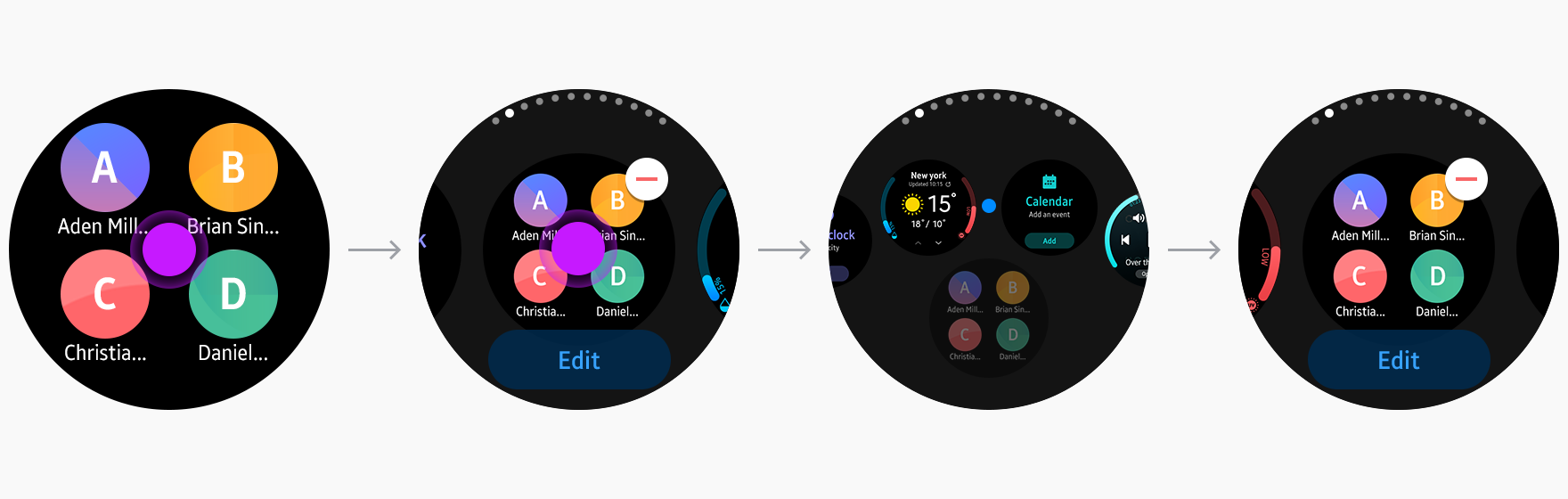
Users can add up to 15 favorite widgets on the Widget Board, located to the right of the watch face.
Users can manage widgets by touching and holding on any widget screen. They can rearrange the order by dragging widgets to the desired position, and add or remove them by tapping the corresponding buttons.
You can provide a link to the widget’s Edit screen using the Edit button embedded in the screen. In this case, the Edit screen must be provided independently.
The edit function is currently only provided for native widgets. See Configuring the Application Manifest for more details on configuring the Edit screen.
If an app is uninstalled, all related widgets are also removed.
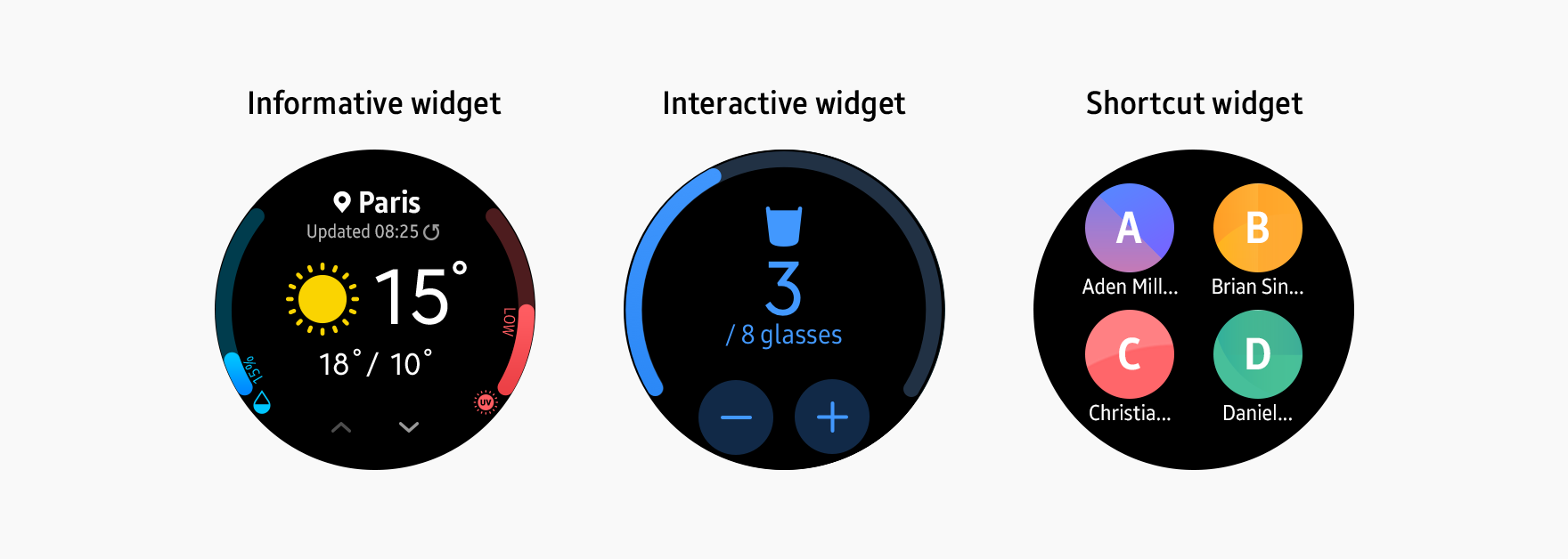
Types of widgets
Three widget types are available for the watch:
Informative widgets that deliver information from the parent app
Interactive widgets that deliver information and receive user input
Shortcut widgets that provide a link without exchanging any data with the app
Choose the right widget type for the content you want to offer.
Informative widgets
Informative widgets provide information in a scannable way. Design your widgets to display key information on a single screen without scrolling and provide users with a direct route to more detailed information within the related app. Providing an appropriate image can enhance readability.
Interactive widgets
Interactive widgets perform simple tasks that can be completed with one tap. Ensure that your components are designed intuitively so that users notice they are tappable. Widgets should immediately reflect any user input in real time and make it clear that user input has been recognized.
Shortcut widgets
Shortcut widgets provide quick access to frequently used menus or tasks. Shortcuts should use appropriate icons and text to communicate where they lead. When providing multiple shortcuts on one screen, ensure each one is visible and has a sufficient touchable area.
Types of actions
A single tap, the only gesture allowed for widgets, is used for two types of actions: links and direct actions. Links connect users to an app's menu and direct actions perform a task on the widget.
Link
Links can connect users directly to the first screen or a particular menu of an app. The link can make up the whole screen or be shown as a button.
Direct action
Direct actions perform simple tasks without opening the app. You can use direct actions for tasks such as measuring data or toggling an alarm.
Common use cases
Here are some common use cases that will help you design your widgets.
Filling empty widgets
Some widgets need to be filled with content by users. When creating widgets like these, include an “Add” button instead of leaving the screen empty.
Multiview widgets
Each widget should present just one piece of information on each screen, but you can break the information up across several views that users can browse through. In these cases, dim and turn off the browsing button when there are no more views in a particular direction.
Check your phone
Widgets can redirect users to another device, such as a phone. If your widgets support this feature, use a phrase like "Check your phone" to indicate this action.
Design your widgets
Keep the visual principles for color, layout, and typography in mind when you’re designing your widgets.
Make your widgets readable with a dark background
A dark background works best for widgets. It increases screen readability when outdoors and smoothly integrates the widget with the black bezel. We recommend using a transparent background, but if you are using a colorful image, add a tinted black layer on top (at least 60% opacity) to ensure the text is legible.
Maintain visual identity with an identity color
Applying the primary color of your app to the main text can communicate a strong visual identity. Consider readability when you choose your app identity color.
Use Breeze Sans.
Use the system font Breeze Sans to optimize readability on the watch and make your app consistent with others. Breeze Sans comes in condensed, regular, and medium fonts. Determine the weight of the font according to the relative level of importance of the text. See Visual design for more details on Breeze Sans.
Manage Your Cookies
We use cookies to improve your experience on our website and to show you relevant
advertising. Manage you settings for our cookies below.
Essential Cookies
These cookies are essential as they enable you to move around the website. This
category cannot be disabled.
Company
Domain
Samsung Electronics
developer.samsung.com, .samsung.com
Analytical/Performance Cookies
These cookies collect information about how you use our website. for example which
pages you visit most often. All information these cookies collect is used to improve
how the website works.
Company
Domain
Samsung Electronics
.samsung.com
Functionality Cookies
These cookies allow our website to remember choices you make (such as your user name, language or the region your are in) and
tailor the website to provide enhanced features and content for you.
Company
Domain
Samsung Electronics
developer.samsung.com, google.account.samsung.com
Preferences Submitted
You have successfully updated your cookie preferences.