DISTRIBUTION OF TIZEN-BASED WATCH APPS HAS BEEN DISCONTINUED
Layout patterns
Successful layouts suggest where users should look first and guide them from there. Considering the characteristics of the circular display can help design a better layout for the watch.
Layout types
Radial
Radial layouts divide the screen into pie-shaped areas. Content is placed along the edge of the circle to guide the viewer’s eye along a circular path. This type of layout is useful when your content has a flow or when your elements are at similar levels in the hierarchy. Because elements are evenly spaced along the edge, you can fully utilize the space of the circular screen while maintaining the balance of your design.
Grid
Grids divide the screen into vertical and horizontal zones. They are more commonly used on square and rectangle screens and are useful when you display multiple sets of content. Without the corners of a square screen, however, you can only place content in the grid within the boundaries of the circle. Considering this limitation, optimize the space as you place your text and images.
Center
A centered approach places the main piece of content in the middle of the screen. This is the most commonly used layout on the watch, because it maximizes readability. It delivers a simple message to users at a glance.
Hybrid
Different layout types can be used together in one screen. This hybrid layout is useful when you need to express two sets of content hierarchies on one screen. Consider which content to show in the central area and along the circular edge, and avoid providing too much content in the central area. See Anchored view type for more details.
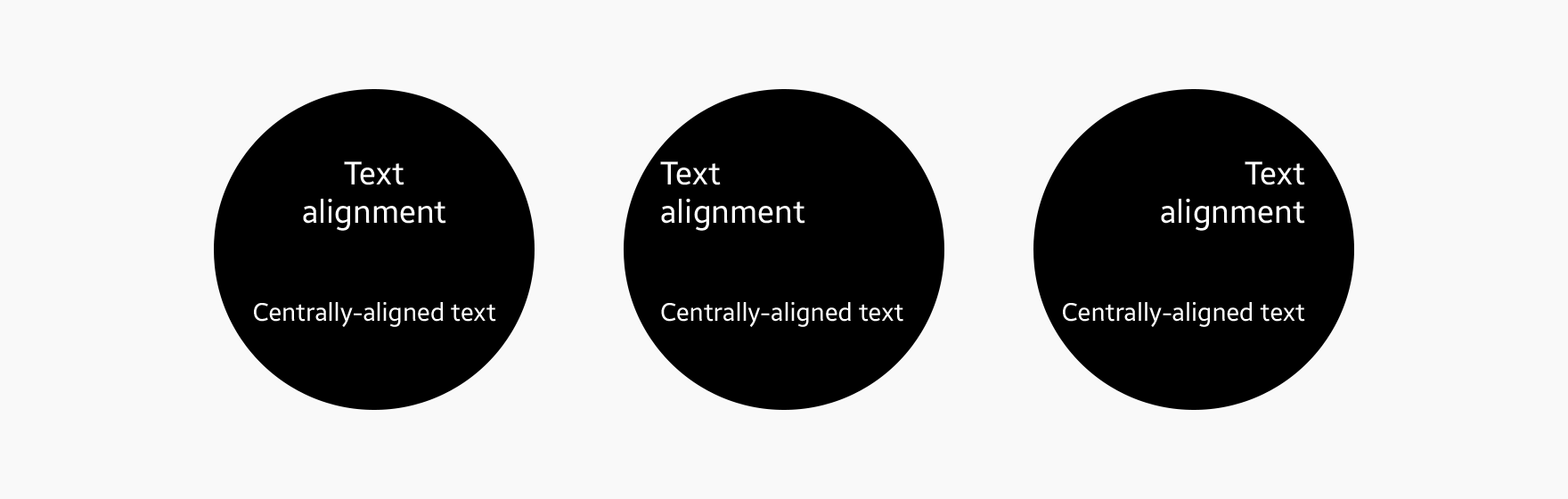
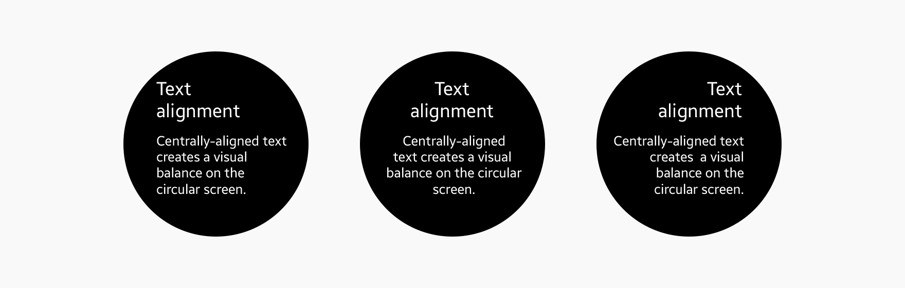
Text alignment
Centrally aligned text creates a visual balance on the circular screen. Text aligned to the left helps users read long texts like news or email by providing the same starting point for each line of text.
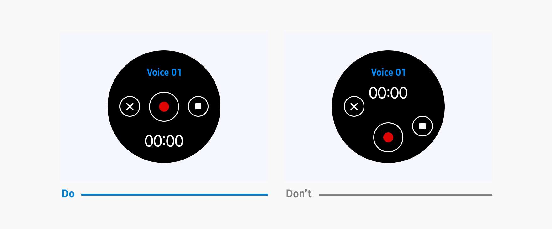
Touchable area
The touchable area is where users can touch components. A touchable area that is smaller than the component is difficult to select. Ensure that there is enough space between nearby components so the touchable areas don’t overlap.
Manage Your Cookies
We use cookies to improve your experience on our website and to show you relevant
advertising. Manage you settings for our cookies below.
Essential Cookies
These cookies are essential as they enable you to move around the website. This
category cannot be disabled.
Company
Domain
Samsung Electronics
developer.samsung.com, .samsung.com
Analytical/Performance Cookies
These cookies collect information about how you use our website. for example which
pages you visit most often. All information these cookies collect is used to improve
how the website works.
Company
Domain
Samsung Electronics
.samsung.com
Functionality Cookies
These cookies allow our website to remember choices you make (such as your user name, language or the region your are in) and
tailor the website to provide enhanced features and content for you.
Company
Domain
Samsung Electronics
developer.samsung.com, google.account.samsung.com
Preferences Submitted
You have successfully updated your cookie preferences.