DISTRIBUTION OF TIZEN-BASED WATCH APPS HAS BEEN DISCONTINUED
Screen Views
You can accommodate more information on the watch’s small display by choosing one of five view types that shows the content most effectively:
Vertical
Horizontal
Anchored
Freeform
Temporary
Vertically oriented screens
Horizontally oriented screens
Screens with stacked layers
Screens with large content
Screens with a temporary overlay
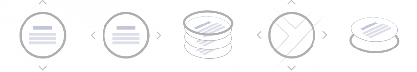
Vertical view
Horizontal view
Anchored view
Freeform view
Temporary view
Basic structures of five screen views
Vertical view
Vertical views are read from top to bottom, so use them for lists and longer pieces of text. They scroll up or down by swiping up or down or by rotating the bezel. A clockwise rotation scrolls down the screen, while a counterclockwise rotation scrolls back to the top.
Lists
As users scroll through a list of items in a vertical view, the item in focus is highlighted with a larger font. A circular scroll bar on the screen indicates where the user is in relation to the list as a whole.
Cards
Simple information can also be presented on a set of individual cards. As the user navigates up or down, the next or previous card snaps onto the screen. A circular scroll bar indicates which card in the whole series is currently being viewed.
Body text
Body text presents information in a long form format. A circular scroll bar on the screen indicates where the user is in relation to the body text as a whole.
Horizontal view
Users navigate the horizontal view by swiping to the right or left. Use horizontal views for a series of thumbnails or a series of screens that tell one continuous narrative. Screens scroll horizontally and move content to the right or left.
Like vertical views, horizontal views scroll by swiping left or right or by rotating the bezel. A clockwise rotation scrolls the screen right, while a counterclockwise rotation scrolls left.
Pages
Pages are ideal for providing a series of images or text across a number of screens. Page indicators at the top of the screen show which page is currently being viewed.
Continuous
Continuous screens are well suited for presenting information that has a time flow, such as a trend graph or a progress report. Users can scroll right or left to move forward or backward through the time flow. A circular scroll bar indicates which part of the content is currently being viewed.
Anchored view
Anchored views display content on screen layers, which users can navigate by swiping left or right or by rotating the bezel. These layers can contain varying depths of content. For example, an app using anchored views can consist of independent data and functions, such as a pedometer, heart rate monitor, and a workout tracker. This is a major difference from the horizontal and vertical views that contain only related content.
Dials
Dial screens are well suited for displaying information that cannot be arranged evenly. When users swipe left or right or rotate the bezel, the indicator moves around the screen, bringing items and information into focus. The index indicator selects and displays specific information in a simple and easy way.
Freeform view
Freeform displays content that can be panned or zoomed, such as a photo in the Gallery app. These views are panned by touch and zoomed by touch or with the bezel. Spreading your fingers or turning the bezel in a clockwise rotation zooms into an image. Pinching your fingers or turning the bezel in a counterclockwise rotation zooms out.
Temporary view
Temporary view windows interrupt the user’s workflow by appearing over the current screen, forcing users to close them before they can continue what they were doing. Use temporary views to ask the user to make a decision, get their confirmation, and provide more functionality.
Pop-up
Dialog pop-ups ask the user to make a decision about a task or inform them about the result of a task. They have buttons, such as Confirm or Cancel, but a scroll bar generally is not provided.
Toasts
Toast pop-ups inform the user about a task result or relay information, and disappears after a few seconds.
More options
More options provides access to functions that are related to an item in a list.
Pickers
Pickers allow users to set a value like a number, a date, or time.
Manage Your Cookies
We use cookies to improve your experience on our website and to show you relevant
advertising. Manage you settings for our cookies below.
Essential Cookies
These cookies are essential as they enable you to move around the website. This
category cannot be disabled.
Company
Domain
Samsung Electronics
developer.samsung.com, .samsung.com
Analytical/Performance Cookies
These cookies collect information about how you use our website. for example which
pages you visit most often. All information these cookies collect is used to improve
how the website works.
Company
Domain
Samsung Electronics
.samsung.com
Functionality Cookies
These cookies allow our website to remember choices you make (such as your user name, language or the region your are in) and
tailor the website to provide enhanced features and content for you.
Company
Domain
Samsung Electronics
developer.samsung.com, google.account.samsung.com
Preferences Submitted
You have successfully updated your cookie preferences.