DISTRIBUTION OF TIZEN-BASED WATCH APPS HAS BEEN DISCONTINUED
Create Your First Tizen Wearable .NET Application
The Tizen .NET framework allows you to easily and efficiently create
applications for Tizen. Study the following instructions to help
familiarize yourself with the Tizen .NET application development
process. With the instructions, you can create and run a basic .NET
application, which displays some text on the screen with no user
interaction.
Before you get started with developing Tizen applications, set up the development environment.
This step shows how you can enhance your application by creating a
UI and making small alterations to it to improve the usability of the application.
Creating a Project
The following example shows you how to create and configure a basic
Tizen .NET application project in Visual Studio. An application project
contains all the files that make up an application.
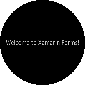
The following figure illustrates the output of application. The
application screen displays a message, Welcome to Xamarin Forms! and there is no user interaction.
Figure: Application running on the wearable emulator
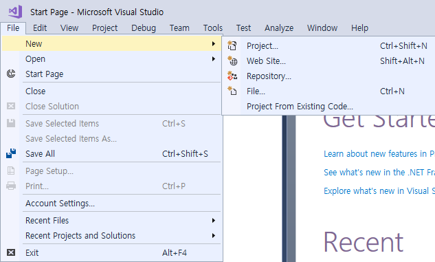
To create a new Tizen .NET project:
Launch Visual Studio.
In the Visual Studio menu, select File > New > Project.
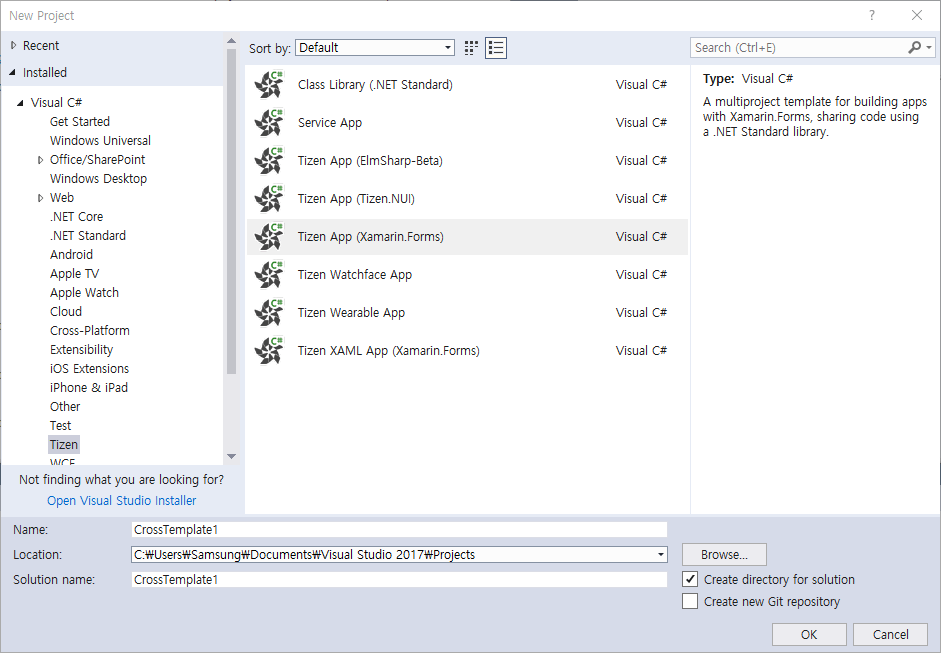
Define the project properties and click OK. You can enter the Name, Location, and Solution name.
The Tizen Project Wizard pop-up window appears.
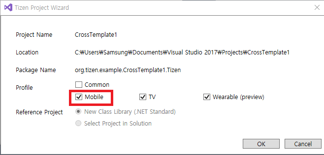
Select the profile, Wearable (preview). Click OK.
If you select the Common profile, you cannot select Mobile,
TV, or Wearable.
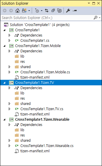
The following figure illustrates a solution with four projects created and displayed in the Solution Explorer view:
Figure: Project with mobile, TV, and wearable profiles
The <projectname> project contains the Xamarin.Forms code
shared across platforms.
If you select the common profile in the Tizen Project Wizard, a
common project titled <projectname>.Tizen is added. It
contains code to instantiate your common application within the
Tizen framework.
If you select the wearable profile in the Tizen Project Wizard, a
wearable project titled <projectname>.Tizen.Wearable
is added. It contains code to instantiate your wearable application
within the Tizen framework.
If you are already familiar with Xamarin.Forms, this project has the
same structure as a Xamarin.Forms portable application. The
<projectname> project is the portable class library and the
others are the platform-specific projects; however, in Tizen .NET, only
the Tizen platform-specific project is generated.
The .cs file in the portable project already contains simple
Xamarin.Forms code that makes a basic UI.
Building Your Application
After you have created the application project, you can implement the
required features. In this example, only the default features from the
project template are used, and no code changes are required.
When your application code is ready, build the application. The building
process performs a validation check and compiles your files. You must
sign the application package with an author certificate when building
the application. If you have not yet registered a Tizen certificate in
Visual Studio, see Certificate Manager.
There are 2 different ways to build the application:
In the Visual Studio menu, select Build > Build Solution.
In the Solution Explorer view, right-click the solution name and
select Build.
Tizen .NET applications are always deployed as installed packages. The
package files have the .tpk file extension, and the process of generating a package is controlled by the manifest
file. The Visual Studio
template generates the manifest file (tizen-manifest.xml) to the top
level of the <projectname>.Tizen project (if you create projects
with mobile, TV, or wearable profiles, a separate manifest file is
generated for each profile).
For this example application, the default manifest is sufficient. If you
want to make any changes in the application, such as changing the
application icon or installing resources that are used by the
application at runtime, see Packaging Your Application.
After you have built the application, deploy and run it.
Deploying and Running Your Application
To run the application, you must first deploy it to the target: either a
device or an emulator. Deploying means transferring the package file
(.tpk) to the target and invoking the Tizen package manager to install
it.
To deploy and run the application on the emulator:
In the Visual Studio menu, select Tools > Tizen > Tizen
Emulator Manager.
Alternatively, click Launch Tizen Emulator in the Visual Studio toolbar to launch the Tizen Emulator Manager.
In the Emulator Manager, select an emulator from the list and click
Launch.
If no applicable emulator instance exists, create
one.
Once you launch an emulator instance, you can deploy the application
by clicking the emulator instance in the Visual Studio toolbar.
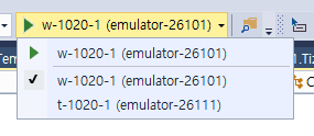
In the Visual Studio toolbar, you can select the target from the drop-down list to change the deployment target.
If deployment is successful, the application icon is visible on the
emulator or device screen. Click the icon to launch the application.
The following figure shows the launched application on the wearable emulator:
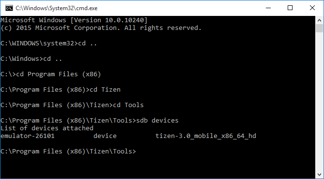
Visual Studio uses the Smart Development Bridge (SDB) to communicate
with the target device or emulator. If you encounter problems with
detecting the device in Visual Studio, you can check the SDB manually:
In the Visual Studio menu, select Tools > Tizen > Tizen Sdb
Command Prompt.
In the command prompt, enter sdb devices.
A list of the attached devices appears.
If you face any issues during deployment, it is recommended to manually install the application using SDB:
Xamarin.Forms provides a way to build portable applications which run in
a native way. It provides a set of controls for building a user
interface, as well as generates code which adapts the user interface
code to use the native facilities of the supported platforms. The
following is a brief introduction to the Xamarin.Forms controls, and how
to use them to build on the application you have just created.
Understanding the Source Code
The C# code from your first application displays a label centered on
the screen, containing the Welcome to Xamarin Forms! text. This
CrossTemplate1 application created from the template is set up and ready
to be built and run by Visual Studio right after you create it, as
described above.
The Xamarin.Forms controls used to create the user interface of a Tizen
.NET application can be broadly categorized into 4 groups:
Pages represent screens within an application. The UI of an
application is built from one or more pages and with a navigation
mechanism, if needed. The navigation scheme is specified by the
INavigation interface. Many pages are of the ContentPage type,
which describes the view of a single screen.
Layouts are containers used to compose views into
logical structures. Some available types are absolute, grid,
relative, and stack layouts; each provide mechanisms, such as
orientation, spacing, and padding, to control the layout. The
StackLayout class is a basic layout where you can simply stack
controls on top of, or side-by-side, one another. Layouts can also
be bundled with and nested into each other.
Views are the controls displayed on the user interface, such as
labels, buttons, and text entry boxes.
Cells are specialized elements used for items in tables and lists,
which help describe how the items must be rendered.
The following shows the portable code portion of the Tizen Xamarin.Forms
project CrossTemplate1.cs file, generated by the template:
using System;
using System.Collections.Generic;
using System.Linq;
using System.Text;
using Xamarin.Forms;

namespace CrossTemplate1
{
    public class App : Application
    {
        public App()
        {
            /// Root page of your application
            MainPage = new ContentPage
            {
                Content = new StackLayout
                {
                    VerticalOptions = LayoutOptions.Center,
                    Children =
                    {
                        new Label
                        {
                            HorizontalTextAlignment = TextAlignment.Center,
                            Text = "Welcome to Xamarin Forms!"
                        }
                    }
                }
            };
        }
        protected override void OnStart()
        {
            /// Handle when your app starts
        }
        protected override void OnSleep()
        {
            /// Handle when your app sleeps
        }
        protected override void OnResume()
        {
            /// Handle when your app resumes
        }
    }
}
This application is constructed with the following Xamarin.Forms
controls:
The App class is declared, deriving from the
Xamarin.Forms.Application
class, which represents a cross-platform mobile application.
The App class constructor creates a ContentPage instance where
you set up the view to display.
You assign what you want to display to the Content property of the
ContentPage class.
In this case, the content is a container, specifically a
StackLayout instance. This layout positions ("stacks") its child
elements in a single vertical (default) or horizontal line.
Child elements are added to the Children property. In this
example, a single Label instance is added, whose Text property
is the message you want to display.
Some lines implement control over the layout. For example, the stack
is set to vertically center the child elements, and the label is set
to use center-alignment for its text.
Besides the App constructor, the rest of the file is just
a template. Event handlers from the Application class can be
filled in if the application needs to handle application
state changes.
The code does not show the instantiation of the App class. Since
application launching is platform-specific, the launching part,
including the instantiation of the App class and the declaration of
the Main() function (required as the entry point of every C#
program), happens in the <projectname>.Tizen project, in the
matching file there. For example, if the file you are looking at in the
portable project is named <projectname>.cs, the platform-specific file
in the <projectname>.Tizen.<platform> project is
<projectname>.Tizen.Wearable.cs. For a similar application,
which uses only Xamarin.Forms controls, the generated code at the
<projectname>.Tizen part of the project contains everything
needed, and you do not need to make any modifications. The following
example shows the content of the <projectname>.Tizen.Wearable.cs file:
using System;

namespace CrossTemplate1
{
    class Program : global::Xamarin.Forms.Platform.Tizen.FormsApplication
    {
        protected override void OnCreate()
        {
            base.OnCreate();
            LoadApplication(new App());
        }

        static void Main(string[] args)
        {
            var app = new Program();
            global::Xamarin.Forms.Platform.Tizen.Forms.Init(app);
            app.Run(args);
        }
    }
}
Adding a Button and Second Label
To modify and build a new application, create a new project. The default
name for the second project is CrossTemplate2 (as shown in the
namespace declaration in the following step list), but of course you can
name it anything you want.
The basic template uses a label which displays text in an area of the
screen. The properties inherited from the base classes of Label give
control over the display: font attributes, families, and sizes, as well
as layout options. Modify the application by adding a button control. It
is similar to the label, but is specifically designed to react to click
events. As a result, the Button class defines the Clicked event,
which tells the application what to do when the click event takes place.
In order to do something visible on the screen to show that you have
received the click event, define another label. Give the new label a
value to be displayed in the initial state, and make the button click
event handler update the text and button color once the click event
triggers.
To modify the application by adding a button and label:
Since the click event triggers outside the class constructor,
declare the button, the label, and a click counter at the class
level:
using System;
using System.Collections.Generic;
using System.Linq;
using System.Text;
using Xamarin.Forms;

namespace CrossTemplate2
{
    public class App : Application
    {
        Button button;
        Label label;
        int clicks = 0;
Instantiate the button, and add the OnButtonClicked event handler
to the button's Clicked event:
        public App()
        {
            button = new Button
            {
                Text = "Click here!",
                BackgroundColor = Color.Red,
                HorizontalOptions = LayoutOptions.Center,
            };
            button.Clicked += OnButtonClicked;
Instantiate the label, and give the label a value to be displayed in
the initial state by setting the Text property:
            label = new Label
            {
                Text = "unclicked",
                HorizontalOptions = LayoutOptions.Center,
            };
Change the initial text of the first label to "Welcome to Tizen!",
and include the new button and label as children of the
StackLayout, so they are stacked below the first label:
            /// The root page of your application
            MainPage = new ContentPage
            {
                Content = new StackLayout
                {
                    VerticalOptions = LayoutOptions.Center,
                    Children = {
                        new Label {
                            HorizontalTextAlignment = TextAlignment.Center,
                            Text = "Welcome to Tizen!"
                        },
                        button,
                        label,
                    }
                }
            };
        }
To change the new label's properties when the button is clicked,
define the OnButtonClicked event handler.
When an event triggers, 2 parameters are delivered to any handler
set up to watch it. The first parameter is an object representing
the control that triggered the event and the second parameter is the
event data appropriate to the event type.
Increment the click counter, build a string showing how many times
the button has been clicked, and set the Text property of the
label to that string.
Just for visual effect, you can also set the button background color
to something different than the initial color set when the button
was instantiated.
        void OnButtonClicked(object s, EventArgs e)
        {
            clicks += 1;
            label.Text = String.Format("Number of clicks: {0}", clicks);
            button.BackgroundColor = Color.Blue;
        }
        protected override void OnStart()
        {
            /// Handle when your app starts
        }
        protected override void OnSleep()
        {
            /// Handle when your app sleeps
        }
        protected override void OnResume()
        {
            /// Handle when your app resumes
        }
    }
}
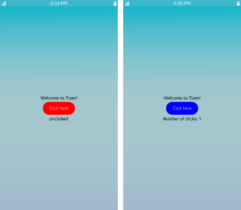
The following image shows what happens when you run the modified code.
At startup, the button is red and the text below the button is
unclicked. After a couple of clicks, the click counter is displayed
below the button, and the button color has changed.
A Tizen .NET application is deployed in the form of an installable
package, with the package file extension .tpk. A Tizen .NET package
has a relatively simple structure: internally it is a ZIP file with
content that matches the directory layout of the project.
The package contains the following:
The shared directory, which is for items that are considered
system-wide (shareable).
The application icon is packaged in the shared/res directory on
installation, and the icon appears on the home screen with the icons
for the other applications. You can either replace the icon (which
is just a copy of the default Tizen logo) with one of your own using
the file name generated by Visual Studio, or put a new icon in the
same project directory and update the package manifest to indicate
the new name.
The res directory, which is for application-private resources.
If the application needs a file to open at runtime, it can be
placed here.
The bin directory, which contains the generated
application executable.
The lib directory, which contains the generated application
support code.
If you use nugget libraries, they are imported in the lib directory.
The package manifest, which defines the application properties and
is used at the installation time.
2 signature files (author and distributor), which are checked at the
installation time.
The following figure shows the layout of the platform-specific (Tizen)
project. It includes the lib, res, and shared (with a res
subdirectory containing an image file) directories, and the
tizen-manifest.xml file. There is also the bin directory, which
Visual Studio only shows if you select the Show all files option for
the solution. These pieces all go into the package.
Figure: Project layout
Package generation (and in fact installation) is controlled by the
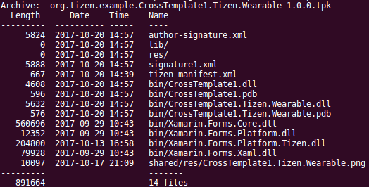
tizen-manifest.xml package manifest file. The following figure shows
the .tpk file for the initial application, to illustrate how the
combination of the directory layout and the package manifest leads to
the actual package.
Figure: Package content
When packaging your application, you also need to consider whether any
feature or privilege declarations are needed in the manifest file, and
how to place any language-specific files.
Manage Your Cookies
We use cookies to improve your experience on our website and to show you relevant
advertising. Manage you settings for our cookies below.
Essential Cookies
These cookies are essential as they enable you to move around the website. This
category cannot be disabled.
Company
Domain
Samsung Electronics
developer.samsung.com, .samsung.com
Analytical/Performance Cookies
These cookies collect information about how you use our website. for example which
pages you visit most often. All information these cookies collect is used to improve
how the website works.
Company
Domain
Samsung Electronics
.samsung.com
Functionality Cookies
These cookies allow our website to remember choices you make (such as your user name, language or the region your are in) and
tailor the website to provide enhanced features and content for you.
Company
Domain
Samsung Electronics
developer.samsung.com, google.account.samsung.com
Preferences Submitted
You have successfully updated your cookie preferences.